Every composite I build starts on paper. I sketch the light sources, the shadow angles, the rough silhouettes before I ever open Photoshop. But the dirty secret of that workflow is that no matter how carefully I plan, the real work happens in the masking panel. That is where a movie poster either breathes or dies. Sloppy masks make subjects look pasted. Tight, intelligent masks make them look like they were always there.
That is why I keep coming back to the fundamentals, and that is exactly what pulled me into Watch the full tutorial on YouTube by Matt Kloskowski. Matt covers seven masking tips for Lightroom Classic and Adobe Camera Raw, and while some of them read as beginner-friendly on the surface, a few of them hit me in that specific way where you realize you have been doing something the slow way for years. I am writing this for anyone who uses Lightroom or ACR as part of a compositing pipeline, whether you are doing your initial raw processing before jumping into Photoshop or doing full adjustments inside Lightroom itself.
Step 1: Use the Color Swatch to Push a Specific Color Into a Masked Region
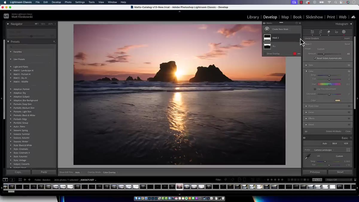 Linear gradient applied to bottom of landscape photo
When Matt applies a linear gradient to the lower portion of a landscape, his goal is to punch up the warm tones near the horizon. Temperature and tint sliders can get you close, but they have a ceiling. What most people miss is the small color swatch sitting at the bottom of the mask adjustment panel. Click it and you get a full color picker where you can select any hue you want, along with control over its saturation. For compositing work, this is enormous. When I need to warm the ground plane under a subject to match a golden-hour plate, I can dial in exactly the right amber without fighting the temperature slider into a corner. Think of it as painting light with intention rather than nudging a slider and hoping.
Linear gradient applied to bottom of landscape photo
When Matt applies a linear gradient to the lower portion of a landscape, his goal is to punch up the warm tones near the horizon. Temperature and tint sliders can get you close, but they have a ceiling. What most people miss is the small color swatch sitting at the bottom of the mask adjustment panel. Click it and you get a full color picker where you can select any hue you want, along with control over its saturation. For compositing work, this is enormous. When I need to warm the ground plane under a subject to match a golden-hour plate, I can dial in exactly the right amber without fighting the temperature slider into a corner. Think of it as painting light with intention rather than nudging a slider and hoping.
Step 2: Double-Click a Setting Name to Reset It Without Losing the Mask
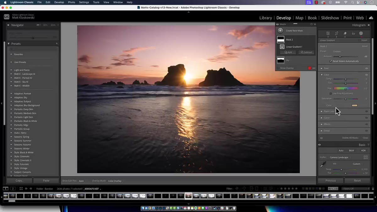 Double-clicking adjustment label resets value to default
This one is small but it saves real time. If you have made a color or tonal adjustment inside a mask and you want to clear that specific setting without deleting the entire mask, just double-click the name of the adjustment. The value snaps back to its default. This works on the color swatch too. Double-click it and the color resets to neutral. In practice, this means I can experiment aggressively with color overlays on a mask, know that one double-click gets me back to a clean slate, and not feel like I am gambling every time I push a setting to an extreme. It is a safety net that makes experimentation feel cheap in the best sense.
Double-clicking adjustment label resets value to default
This one is small but it saves real time. If you have made a color or tonal adjustment inside a mask and you want to clear that specific setting without deleting the entire mask, just double-click the name of the adjustment. The value snaps back to its default. This works on the color swatch too. Double-click it and the color resets to neutral. In practice, this means I can experiment aggressively with color overlays on a mask, know that one double-click gets me back to a clean slate, and not feel like I am gambling every time I push a setting to an extreme. It is a safety net that makes experimentation feel cheap in the best sense.
Step 3: Toggle and Cycle the Mask Overlay Color With Keyboard Shortcuts
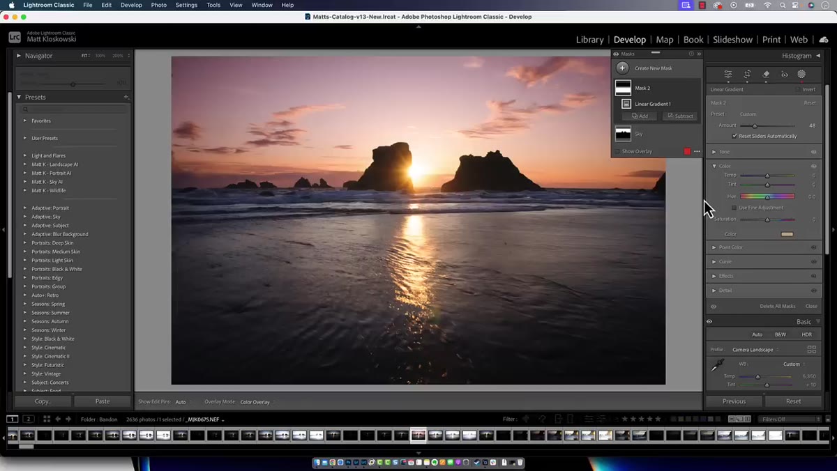 Red mask overlay showing on top of image
Press O to show or hide the mask overlay. That alone is worth knowing. But press Shift+O and Lightroom cycles through different overlay colors: red, green, white, and black. Matt notes that red and green are the most useful because they stand out against typical image content. White and black overlays are more subdued and work better when you need to evaluate refinement on complex edges. I tend to reach for green when working on images with heavy warm tones or skin, because red can visually blend into those areas and trick your eye. Cycling through with Shift+O takes less than a second and can immediately clarify whether your mask edge is where you think it is.
Red mask overlay showing on top of image
Press O to show or hide the mask overlay. That alone is worth knowing. But press Shift+O and Lightroom cycles through different overlay colors: red, green, white, and black. Matt notes that red and green are the most useful because they stand out against typical image content. White and black overlays are more subdued and work better when you need to evaluate refinement on complex edges. I tend to reach for green when working on images with heavy warm tones or skin, because red can visually blend into those areas and trick your eye. Cycling through with Shift+O takes less than a second and can immediately clarify whether your mask edge is where you think it is.
Step 4: Use the Pop-Out Menu to View Your Mask on White or Black
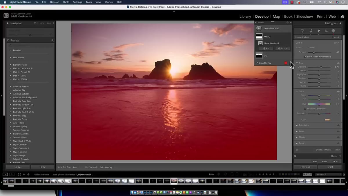 Mask overlay options menu showing white and black view modes
Next to the mask overlay button there are three dots that open a pop-out menu with additional view options. Beyond the color overlay, you can view your mask on white or on black, similar to the channel view in Photoshop. This is where you see the actual quality of your mask. Soft edges, hard edges, and semi-transparent areas all reveal themselves clearly when the mask sits on a pure white or pure black background. For any work involving hair, fur, or atmospheric elements like smoke or fog, I always check the mask this way before committing to an adjustment. It is the equivalent of holding a mask up to the light to check for pinholes.
Mask overlay options menu showing white and black view modes
Next to the mask overlay button there are three dots that open a pop-out menu with additional view options. Beyond the color overlay, you can view your mask on white or on black, similar to the channel view in Photoshop. This is where you see the actual quality of your mask. Soft edges, hard edges, and semi-transparent areas all reveal themselves clearly when the mask sits on a pure white or pure black background. For any work involving hair, fur, or atmospheric elements like smoke or fog, I always check the mask this way before committing to an adjustment. It is the equivalent of holding a mask up to the light to check for pinholes.
Step 5: Find Lost Gradient Handles by Checking the Edit Pins Setting in the Toolbar
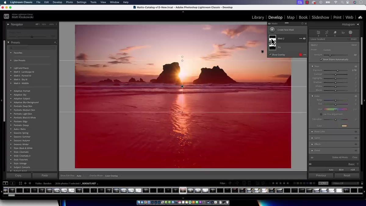 Toolbar showing Edit Pins dropdown set to Never
Matt frames this one as a public service announcement, and honestly, that is the right framing. A common confusion, especially among people newer to Lightroom, is applying a gradient and then not being able to find it afterward. The handle seems to vanish. The fix is in the toolbar below the image. Press T to show or hide the toolbar if it is not visible. Once it is up, look for the “Show Edit Pins” dropdown and make sure it is not set to Never. When set to Never, your gradient handles are invisible until you know to look for this. Changing it to Auto or Always brings them back. On a deadline, this is the kind of thing that can cost you twenty minutes of confused clicking.
Toolbar showing Edit Pins dropdown set to Never
Matt frames this one as a public service announcement, and honestly, that is the right framing. A common confusion, especially among people newer to Lightroom, is applying a gradient and then not being able to find it afterward. The handle seems to vanish. The fix is in the toolbar below the image. Press T to show or hide the toolbar if it is not visible. Once it is up, look for the “Show Edit Pins” dropdown and make sure it is not set to Never. When set to Never, your gradient handles are invisible until you know to look for this. Changing it to Auto or Always brings them back. On a deadline, this is the kind of thing that can cost you twenty minutes of confused clicking.
A Note From My Own Workflow
The tip about the color swatch changed something specific for me. I do a lot of work where a subject needs to be grounded into a scene with colored ambient light, a neon-lit street, a studio with colored gels, a magic-hour sky casting orange across a foreground. Before I understood that color swatch existed in the mask panel, I was doing extra work inside Photoshop with Color Balance or Selective Color layers just to push a tint onto a region. Now I handle a significant portion of that color grounding before the file ever leaves Lightroom. It is not a replacement for Photoshop’s toolset, but it compresses the pipeline in ways that matter when you are managing multiple assets on a single project.
One caveat worth naming: the mask overlay view modes are genuinely underused, and if you composite regularly, I would encourage you to build a habit of checking your masks on white before finalizing any adjustment. It takes five seconds. The number of times I have caught a rough, pixelated edge that looked fine under the color overlay but revealed itself clearly on white is too high to count. Precise masking is the difference between a composite that holds up at full resolution and one that falls apart the moment a client zooms in.
The single most transferable idea from this tutorial is that the masking panel in Lightroom and ACR is deeper than most people use it. The tools are there. The keyboard shortcuts exist. Most people just do not know to look for them.
Watch the full tutorial on YouTube and see Matt walk through all seven tips with live examples on actual photos. It is worth your time, even if you have been working with masks for years.
Comments (5)
Quality content like this is rare. Keep it up.
Would love to see a follow-up going deeper into this topic.
Simple but effective. Sometimes that's all you need.
Love how you break down complex stuff into manageable steps.
Couldn't agree more. I've seen this make a huge difference in color grading work specifically.
Leave a Comment