Video Tutorials Cutting Out Subjects the Right Way: A Working Guide to Photoshop's Select and Mask Workspace July 26, 2026
Video Tutorials You Don't Need a Studio to Light for Compositing — Here's What Actually Works July 25, 2026
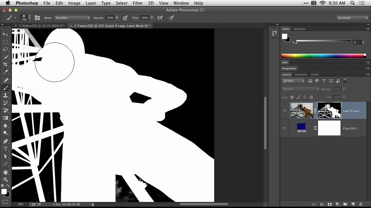
Video Tutorials Stop Fighting Your Masks: How the Hard Mix Brush Trick Changed My Cleanup Workflow July 25, 2026
Video Tutorials The Blue Ghost Problem: How Clipping Masks Eliminate Edge Fringe in Photoshop Composites July 24, 2026