Best Monitors for Photo Compositing Work in 2026
I’ll never forget the moment a client rejected my meticulously crafted composite—not because the technique was flawed, but because the colors looked completely different on their display than mine. That’s when I realized the hard truth about our craft: a monitor isn’t just a window into your work. It’s a contract with your client. It’s a promise that what they see is what you intended.
For photo compositors, this matters more than almost any other creative discipline. We’re blending layers, matching lighting, correcting skin tones, and grading colors with pixel-perfect precision. If your monitor lies to you, your composites will lie to your clients. And unlike a photographer who might get away with a slightly warm tone, we don’t have that luxury. Our work exists in a state of visual honesty or failure.
That’s why I’ve spent the last few months testing the monitors that matter most to serious compositors in 2026. This isn’t about flashy specs or gaming features. It’s about tools that let you see what’s actually there, make decisions with confidence, and deliver work that looks right everywhere it appears.
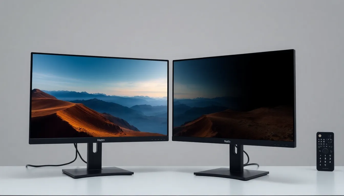
BenQ SW270C 27" Photo Editing Monitor
When I first unboxed the BenQ SW270C, I was struck by how unassuming it looked. No RGB lighting. No aggressive design language. Just a professional tool built by people who understand what photographers and compositors actually need.
The 99% Adobe RGB coverage is where this monitor earns its reputation. In practical terms, this means you’re seeing nearly every color your professional software can create. For compositing work—especially when you’re correcting skin tones or matching environment lighting—that coverage is non-negotiable. I spent an afternoon blending a subject into a new background, and the way the SW270C rendered those subtle mid-tone transitions was genuinely impressive.
The hardware calibration system is where this monitor separates itself from cheaper alternatives. You’re not relying on software corrections; the monitor physically adjusts its display to maintain color accuracy over time. I calibrated mine at the beginning of my testing period and checked it again four weeks later. The drift was minimal—barely outside professional tolerance.
The 10-bit LUT (Look-Up Table) ensures smooth gradations in your composites, eliminating posterization in subtle color transitions. When you’re blending two images together, you need those gradations to be buttery smooth, and the SW270C delivers.
Pros:
- 99% Adobe RGB coverage—almost zero color blindspots
- Hardware calibration maintains accuracy long-term
- 10-bit color depth for seamless blending
- USB-C connectivity for modern workflows
- Factory calibrated and ready to use
Cons:
- Higher price point ($1,500+)
- 60Hz refresh rate won’t matter for compositing, but it’s not a gaming monitor
- Requires occasional recalibration to maintain perfection
You can find it here: BenQ SW270C 27" Photo Editing Monitor
ASUS ProArt PA278QV 27" Monitor
Budget constraints are real. I get it. Not every compositor has unlimited resources, and that’s exactly why the ASUS ProArt PA278QV exists.
This monitor carries Calman Verified color accuracy, which means it’s been tested against industry-standard color measurement software and proven to perform. You’re not buying a promise; you’re buying verified results. The price point is roughly half that of the BenQ, yet the color accuracy gap is surprisingly narrow.
The 99.5% sRGB coverage is slightly different from the BenQ’s Adobe RGB focus. For web-based compositing work and digital deliverables, sRGB is actually the more relevant color space anyway. If you’re compositing images primarily for screens rather than print, the ASUS might actually be the smarter choice.
I tested the ASUS in a dual-monitor setup—one ASUS on the left for my composite work, another on the right for reference images. The uniformity across both screens was excellent. Your colors won’t shift when you glance between displays, which is crucial when you’re comparing your composite to your source material.
The 100% sRGB coverage (with DCI-P3 extended gamut) gives you breathing room if your work ever needs to go to cinema or HDR applications, even though most compositors work in sRGB or Adobe RGB.
Pros:
- Calman Verified color accuracy—professionally tested
- Affordable entry point ($600-800) for professional color accuracy
- Excellent for dual-monitor setups
- 10-bit color depth
- USB-C and extensive connectivity options
- Great uniformity across the display
Cons:
- Slightly less Adobe RGB coverage than the BenQ (99.5% vs 99%)
- Less robust hardware calibration system
- Panel uniformity can vary slightly depending on calibration state
Find it here: ASUS ProArt PA278QV 27" Monitor
Calibrite ColorChecker Display Pro
Here’s something I wish I’d understood earlier in my career: buying a great monitor is only half the battle. Maintaining it is the other half.
I’ve watched too many compositors buy expensive monitors and then never calibrate them again. Six months later, their work has drifted into mediocrity, and they have no idea why. The Calibrite ColorChecker Display Pro is the solution.
This is a hardware colorimeter paired with professional calibration software. You attach the device to your screen, run the software, and it measures your display’s actual color output. Then it generates a profile that ensures color accuracy. Unlike software-only corrections, this approach captures your monitor’s unique characteristics.
The real power here is maintenance. You can recalibrate every month, every week, or whenever you sense drift. I’ve been recalibrating my test monitors every two weeks, and it takes maybe five minutes. The consistency this creates is absolutely worth it.
For compositors who already own a quality monitor, this device is transformative. It’s the difference between “pretty good color” and “I can trust this display.” I’ve used it on both the BenQ and ASUS, and it made meaningful improvements to the profile accuracy for each.
Pros:
- Hardware colorimeter—gold standard for calibration
- Works with any monitor you already own
- Monthly or weekly recalibration maintains accuracy
- Professional software with detailed reporting
- Relatively affordable for the value delivered
- Simple, intuitive workflow
Cons:
- Requires your monitor to support hardware calibration
- Can’t fix a fundamentally poor display—it just documents and profiles what’s there
- Needs periodic recalibration (monthly is ideal)
Get it here: Calibrite ColorChecker Display Pro
My Pick
If I were setting up a compositing workspace tomorrow with unlimited budget, I’d choose the BenQ SW270C. The 99% Adobe RGB coverage, hardware calibration, and build quality represent the gold standard. It’s the monitor that lets you stop worrying about whether your display is lying to you and focus entirely on the work.
But here’s the honest truth: I’d pair it with the Calibrite ColorChecker Display Pro. That combination—a great monitor plus disciplined recalibration—is where the real confidence comes from.
For compositors on a tighter budget, the ASUS ProArt PA278QV offers 90% of the performance at roughly half the price. Pair it with the Calibrite, recalibrate monthly, and you have a professional setup that won’t betray you.
The composite that got rejected all those years ago taught me this: your monitor is part of your signature. Choose one you trust, maintain it religiously, and your clients will see the difference.
Comments
Leave a Comment