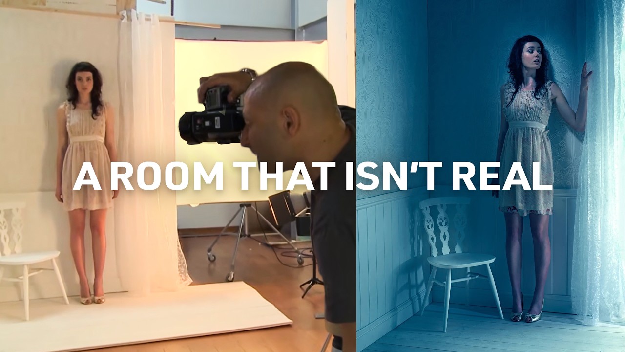
Every composite I’ve ever built starts with the same problem: the background I need doesn’t exist in my photo library, and I can’t afford to fly somewhere to shoot it. For years I collected reference images obsessively, hunting for the right corner of a room, the right quality of window light, the right texture on a floor. What I’ve gradually learned, and what this Visual Education tutorial makes explicit in a way that stuck with me, is that you can simply build the thing you’re looking for. A plywood wall, some wallpaper, painted floorboards. Materials that cost almost nothing, assembled into a set that photographs like a real place.
Watch the full tutorial on YouTube
In this Visual Education tutorial, the creator walks through the entire process of constructing a small room corner set and then lighting it to feel genuinely inhabited. The lesson underneath all of it isn’t really about the gear. It’s about understanding what each light is actually contributing and making deliberate choices rather than turning everything on and hoping for the best. As someone who sketches every composite on paper before I open Photoshop, that philosophy felt immediately familiar. Know what you’re trying to achieve before you start building.
For anyone doing compositing work, this tutorial is valuable in a specific way that goes beyond photography. The reference images you shoot yourself, in controlled conditions, with lighting you understand and can replicate, are worth ten times the stock footage you licensed in a hurry. When you know exactly where the light source was, you can match it in post. When you built the set yourself, you know every surface and how it behaves. That knowledge pays dividends every time you open the file.
Step 1: Build the Set From Simple, Paintable Materials
 Plywood wall panel with white wallpaper and fascia board assembled
The set in the tutorial is built from plywood sheeting covered in white wallpaper, with a fascia board running along the join between wall and floor. The floor is tongue-and-groove floorboards, painted white and locked together as a single base piece. A junk shop chair, also painted white, completes the scene. Everything is the same color family, which is deliberate. White surfaces catch and reflect light in ways that make the whole set feel coherent, and they give you maximum flexibility when you’re adjusting the lighting mood later.
If you’re building something similar, don’t overcomplicate the construction. The goal is a convincing corner of a room, not a film set. Two panels of plywood at a right angle, some inexpensive wallpaper, and a painted floor section will get you there. The paint and the wallpaper are doing the visual storytelling. The structure just needs to hold up.
Step 2: Add a Practical Detail That Implies Something Off-Frame
 Net curtains hanging at the edge of the set near the softbox
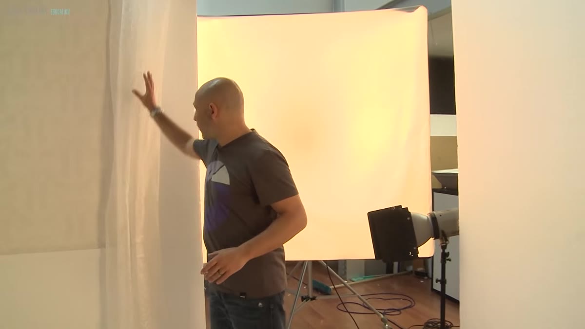
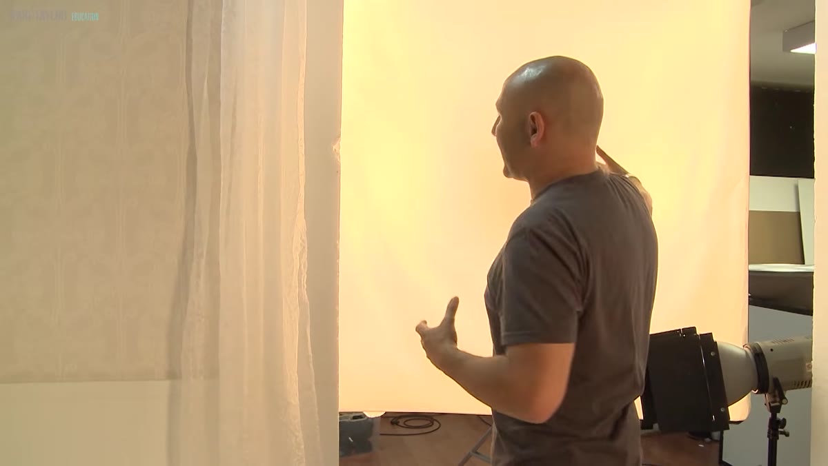
Net curtains are hung at the side of the set, just at the edge of where the camera will see. They don’t represent an actual window in the frame. They imply one. That distinction matters enormously, because the viewer’s brain fills in the rest. When you see a curtain catching light from the side, you assume a window. The tutorial uses this to great effect, and it’s a technique I apply constantly in compositing. You don’t have to show the light source. You show its effect, and you let the audience construct the narrative.
For your own set, think about what real rooms have at their edges. A curtain, a lamp cord, the edge of a bookshelf. One well-placed object can sell an entire environment.
Step 3: Start With the Window Light First
 Large quadra softbox positioned to emulate window light from the side
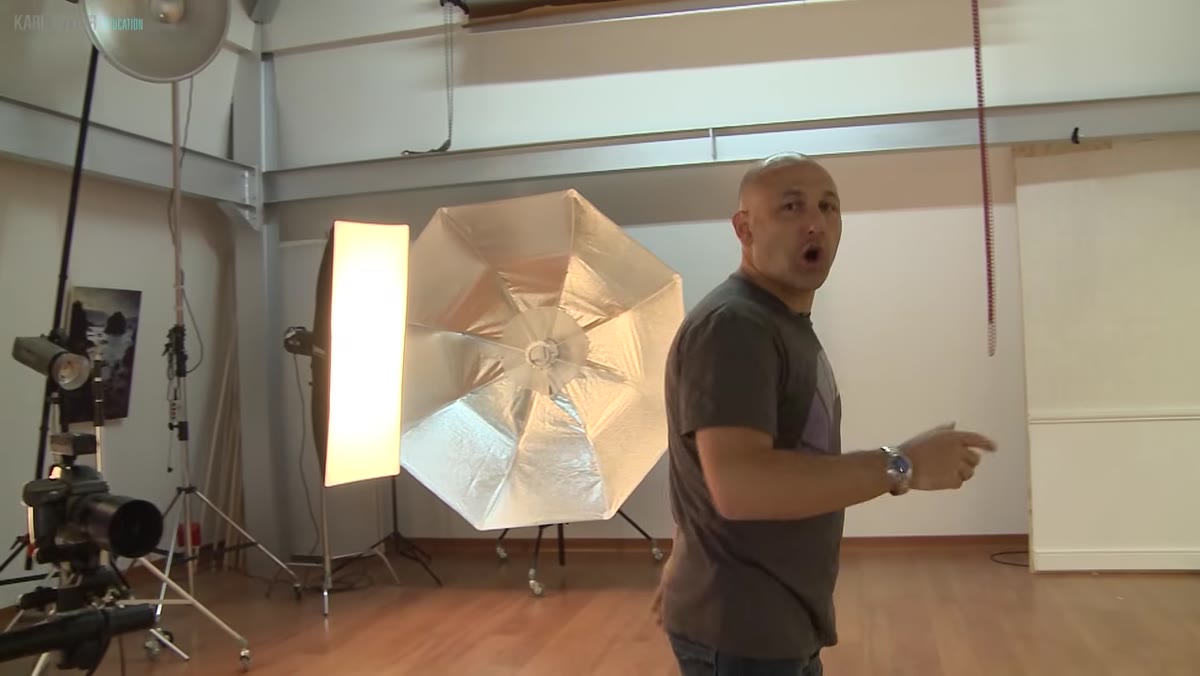
The primary light in the setup is a large softbox positioned to the side of the set, acting as the implied window. This gets placed and roughly powered before anything else is switched on. The logic is simple: in a real room, the window is the dominant light source, and everything else is secondary to it. If you establish your key light first and treat it as the anchor, every subsequent light you add can be evaluated against it.
For compositing reference, this matters even more than it does for straight photography. When I’m shooting plates for a composite, I spend the most time getting the key light right, because that’s the element I’ll be matching in Photoshop when I bring in other components. Get the direction, the softness, and the color temperature of that primary source locked in before you touch anything else.
Step 4: Use a Polyboard Reflector to Control the Fill
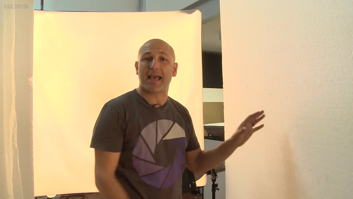 Large white polyboard positioned opposite the softbox as a reflector
A large white polyboard is placed opposite the softbox to bounce light back into the shadow side of the set. No second light, just a reflective surface. This is worth noting because it keeps the lighting logic clean. One source, one reflector, one coherent direction of light. The polyboard lets you dial in how much fill you want by moving it closer or further from the subject, without introducing a new light that might conflict with the window feeling you’ve already established.
Step 5: Add Focused Accent Lights Using Barn Doors
 Barn doors fitted to a reflector head, narrowing beam onto the net curtains
With the window light and fill established, the tutorial introduces smaller, focused lights to create what the creator calls “pockets of light.” The first uses a 21cm reflector fitted with barn doors. The barn doors fold inward to narrow the beam, letting you throw a tight pool of light onto a specific area, in this case the net curtains, without spilling onto the surrounding set.
The technique produces a bright patch on the curtains that looks like direct sunlight catching fabric. It’s a small detail that elevates the whole image. When you’re lighting for compositing reference, these accent lights are what make a set look genuinely three-dimensional in your final composite. Flat, even light gives you a clean plate. Deliberate accent light gives you a living environment.
Step 6: Use a Honeycomb Grid for Controlled Wall Light
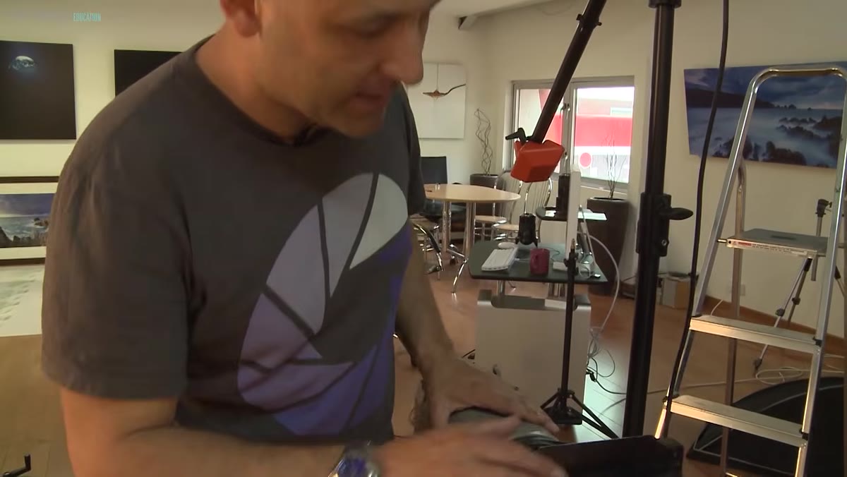 Honeycomb grid fitted to a light head, casting a concentrated circle on the wall
A second accent light uses a medium honeycomb grid instead of barn doors. The grid works differently. Where barn doors shape the light into an angular beam, a honeycomb grid concentrates it into a tighter, rounder pool while keeping the edges relatively soft. The tutorial demonstrates this by toggling the light on and off against the wall, so you can see exactly what it’s contributing.
This is the testing methodology I find most useful: evaluate each light in isolation before you assess it in combination. It’s easy to get lost adjusting a full setup. Turn lights off one at a time, and you immediately see what each one is doing and whether it belongs.
A Note on Shooting Your Own Compositing Reference
I’ve spent hours in stock libraries trying to find a background plate that matched the lighting in a foreground element I’d already shot. It almost never works perfectly, and the mismatch always shows. The first composite I ever published had a shadow going in the wrong direction, and while nobody else noticed, I still see it every time I look at the image.
Building your own set, even a simple one, eliminates that problem at the source. When you control the lighting, you can match it to whatever foreground subject you’re working with. You can also shoot multiple light variations in a single session and have them available for different projects. The investment in a few sheets of plywood and an afternoon of painting pays back across dozens of composites.
The single most important idea in this tutorial is also the simplest: test each light separately before you evaluate the full setup. It applies to set photography, it applies to compositing, and it applies to any situation where you’re combining multiple elements to create something that should look natural. Know what each piece is contributing. Make deliberate decisions. Don’t guess.
Watch the full tutorial on YouTube to see the complete set build, the lighting tests, and the final portrait session that takes the whole setup somewhere unexpected.
Comments (2)
Would love to see a follow-up going deeper into this topic.
Clear and practical. No fluff. Appreciate that.
Leave a Comment