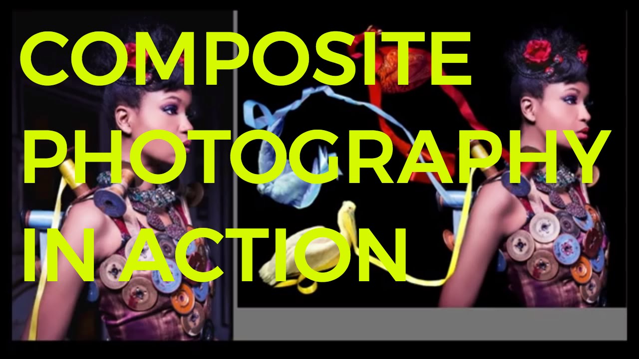
Every composite I build starts with the same problem: how do I give the final image enough physical space to breathe while still keeping the subject sharp and the background believable? For years I solved that by shooting wider, which meant compromising on lens choice or losing the compression I wanted on the subject. The real answer, it turns out, is a stitching workflow I had been underusing. Watching this CreativeLive tutorial on high fashion composite photography snapped a few things into place for me in a way that straightforward technique articles never quite did. Watch the full tutorial on YouTube
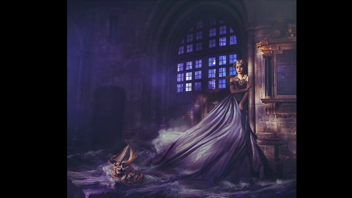
What makes this tutorial worth your time is that it shows a complete creative logic, not just a sequence of button presses. The instructor shoots a subject with full attention on getting her perfectly exposed and in focus, then deliberately tilts to capture the surrounding environment as a separate pass. Those two shots get stitched in post. That gives you a wide, detailed scene while preserving the quality you need on your hero element. Then the surreal additions, clouds, taxidermy birds, painted seascapes borrowed from Rembrandt, get layered into that foundation. The approach is modular in a way that mirrors how I sketch composites on paper before I ever open Photoshop. You design the stage first. Then you populate it.
The other thing I kept circling back to was how intentional the negative space decisions were. Not every panorama stitch adds environment on both sides. Sometimes one side stays empty, and that emptiness is doing compositional work. That single idea changed how I thought about three projects I had sitting in my queue.
Step 1: Plan the Stitch Before You Shoot
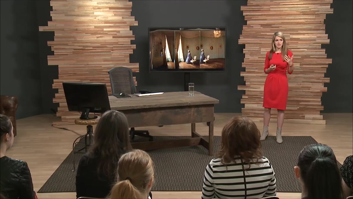
 Instructor explaining the panoramic stitching approach on set
This entire method lives or dies at the planning stage. Before you fire a single frame, read the room the way you would read a final composition. Decide where your subject sits in the eventual frame, not in the single shot. The instructor positioned the model toward one edge of the scene, knowing she would capture the rest of the environment in a separate pass. That means your model placement, your lighting, and your camera angle all need to account for the full stitched width, not just the crop in front of you.
Instructor explaining the panoramic stitching approach on set
This entire method lives or dies at the planning stage. Before you fire a single frame, read the room the way you would read a final composition. Decide where your subject sits in the eventual frame, not in the single shot. The instructor positioned the model toward one edge of the scene, knowing she would capture the rest of the environment in a separate pass. That means your model placement, your lighting, and your camera angle all need to account for the full stitched width, not just the crop in front of you.
Practically, this means shooting tethered or checking your horizon line carefully between passes. Any rotation shift between the subject shot and the environment shot makes the stitch harder and the geometry unconvincing. Use a tripod with a leveling head if you can. If you are shooting handheld, take multiple passes of the environment side so you have options when you bring everything into Photoshop’s Photomerge or into Lightroom’s panorama merge.
Step 2: Capture the Environment as a Separate Pass
 Camera tilting to capture the side of the room separately
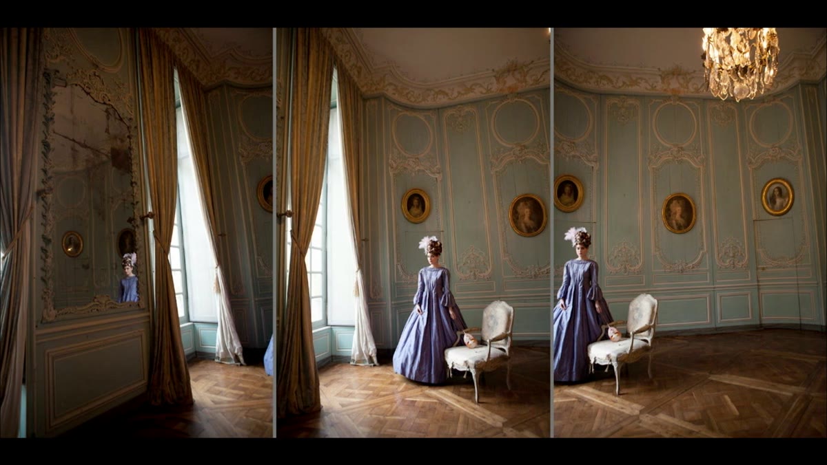
Once your subject is locked, tilt or pan to capture the rest of the scene. The instructor treated this almost like a second assignment, reading the ambient light, the window placement, the architectural detail, all of it independently from the hero shot. That separation matters because it lets you expose each element correctly rather than compromising both.
Camera tilting to capture the side of the room separately
Once your subject is locked, tilt or pan to capture the rest of the scene. The instructor treated this almost like a second assignment, reading the ambient light, the window placement, the architectural detail, all of it independently from the hero shot. That separation matters because it lets you expose each element correctly rather than compromising both.
Pay attention to what is in that environment pass that might inspire your surreal additions later. In one of the examples the instructor walks through, a large overexposed window sitting in the middle of the stitched scene became the entry point for adding a cloud and then birds. The problem, a blown-out rectangle of light, became the creative seed. I keep a folder of reference images large enough to embarrass most stock libraries, and this step is exactly where that habit pays off. What you see in the environment pass should start triggering ideas immediately.
Step 3: Stitch and Establish the Composite Foundation
 Stitched panorama showing model centered with expanded environment
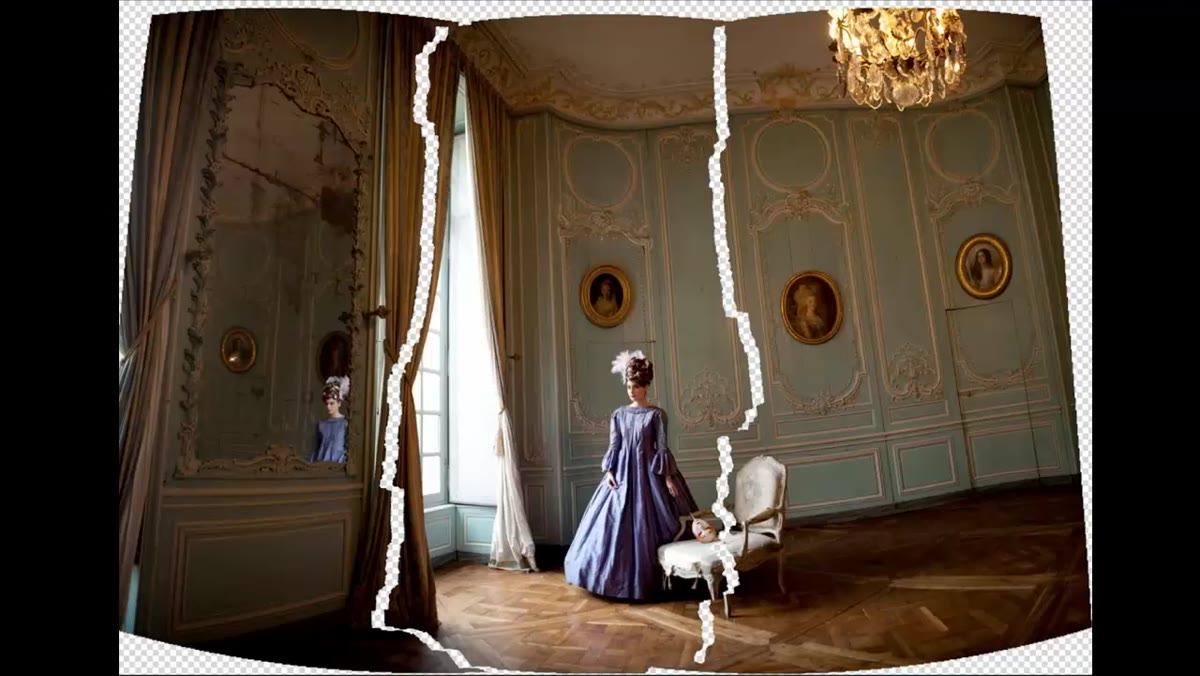
Bring your subject shot and environment pass into Photoshop and use Photomerge, under File, Automate, to let the software find the overlap. Auto mode handles most cases well. After the merge, flatten and clean up the seam manually using the Clone Stamp and Healing Brush on a separate layer. You want an invisible join, not a technically correct one. If there is a slight exposure difference between the two passes, use a Curves adjustment layer with a gradient mask to even it out before you commit to anything.
Stitched panorama showing model centered with expanded environment
Bring your subject shot and environment pass into Photoshop and use Photomerge, under File, Automate, to let the software find the overlap. Auto mode handles most cases well. After the merge, flatten and clean up the seam manually using the Clone Stamp and Healing Brush on a separate layer. You want an invisible join, not a technically correct one. If there is a slight exposure difference between the two passes, use a Curves adjustment layer with a gradient mask to even it out before you commit to anything.
This stitched image is your foundation. Everything else, the painted seascapes, the museum specimens, the borrowed dress fabric, gets built on top of this. Treat it like a stretched canvas. Nothing surreal goes in until the foundation is solid and the perspective reads correctly throughout the full frame.
Step 4: Steal Selectively from Your Other Frames
 Dress detail being warped and extended from a secondary image
One of the most practical ideas in this tutorial is raiding your secondary frames for usable elements. The instructor pulled a piece of the model’s dress from a different shot in the same session, then stretched and warped it to extend the garment across the composite. No separate dress shoot, no stock image search. The answer was already in the folder.
Dress detail being warped and extended from a secondary image
One of the most practical ideas in this tutorial is raiding your secondary frames for usable elements. The instructor pulled a piece of the model’s dress from a different shot in the same session, then stretched and warped it to extend the garment across the composite. No separate dress shoot, no stock image search. The answer was already in the folder.
Go through every frame from the session before you declare your hero image. Look for stray fabric movement, a better hand position, a cleaner background patch. In Photoshop, use Edit, Transform, Warp to reshape fabric or organic elements so they read naturally in the new context. Work on smart objects so you can return to the warp if the perspective drifts during later stages.
Step 5: Introduce the Surreal Element with Deliberate Placement
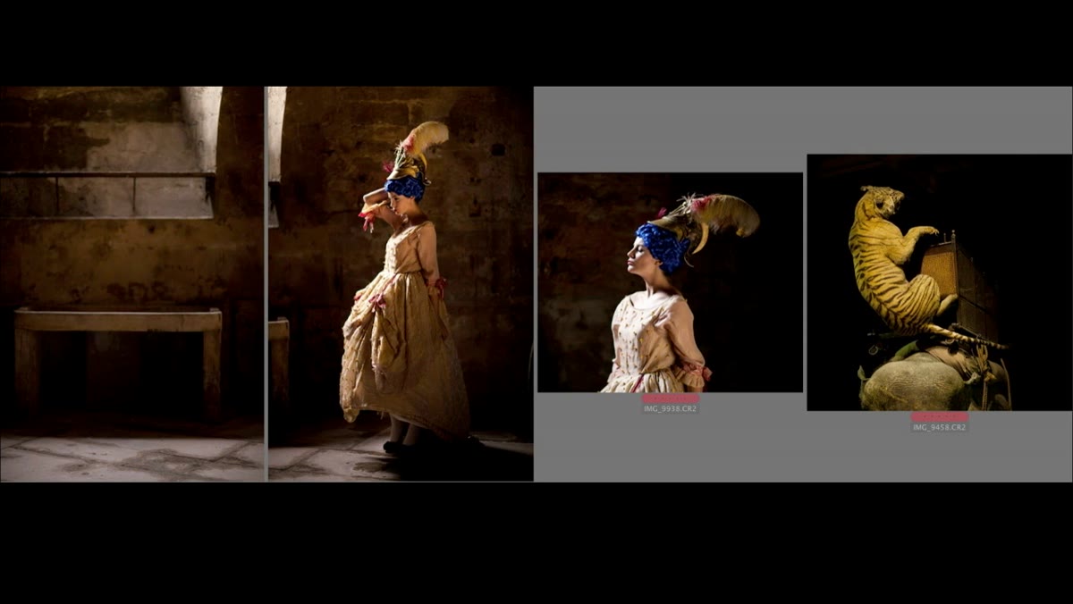 Tiger image being composited onto the model from museum reference
Every surreal addition in this tutorial, the tiger from the Natural History Museum in Paris, the butterfly cutouts, the bird wings enlarged and recolored, lands in a specific visual location that was already prepared by the composition beneath it. The instructor is not dropping elements in randomly and hoping they work. The window created a zone. The negative space created a direction for the eye. The surreal piece fills a gap that the composition was already pointing toward.
Tiger image being composited onto the model from museum reference
Every surreal addition in this tutorial, the tiger from the Natural History Museum in Paris, the butterfly cutouts, the bird wings enlarged and recolored, lands in a specific visual location that was already prepared by the composition beneath it. The instructor is not dropping elements in randomly and hoping they work. The window created a zone. The negative space created a direction for the eye. The surreal piece fills a gap that the composition was already pointing toward.
Cut your elements on a dedicated mask, using Select and Mask with the Refine Edge brush for anything with fine detail like feathers or fur. Keep your masking layer separate from any color work so you can return to it. Then place the element and do not touch color yet.
Step 6: Use Color as the Binding Agent
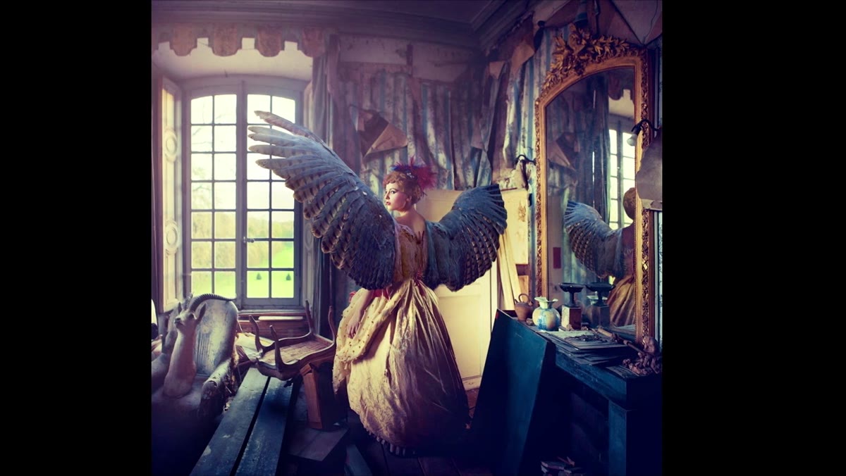 Blue and yellow color grading applied across the bird wings composite
Color grading is the last step and also the most important structural one. The instructor is explicit about this: color is the glue that makes a composite feel like a single photograph rather than a stack of layers. In the bird wings example, a consistent blue and yellow identity was built across the model, the wings, and the background until all three read as one light environment.
Blue and yellow color grading applied across the bird wings composite
Color grading is the last step and also the most important structural one. The instructor is explicit about this: color is the glue that makes a composite feel like a single photograph rather than a stack of layers. In the bird wings example, a consistent blue and yellow identity was built across the model, the wings, and the background until all three read as one light environment.
Use Hue/Saturation and Selective Color adjustment layers clipped to individual elements first to bring each piece into the same general family. Then add a global Color Lookup or Curves adjustment at the top of your stack to unify everything. The test I use is to squint at the image. If any element jumps forward as obviously foreign, it needs more color work before the composite is done.
What I Would Add from My Own Practice
The tutorial focuses on museum specimens and painted backgrounds as surreal source material, which works beautifully for editorial work. In commercial compositing, movie posters and album covers especially, I find the same stitching and color logic applies but the surreal elements often need to cast light as well as receive it. A tiger placed over a model should be bouncing light back onto her skin. Add a soft, low-opacity Overlay layer sampled from your surreal element’s dominant hue and paint it gently onto the model where the two surfaces meet. That contact point is where most composites get caught looking fake, and a single painted light pass fixes it.
The single idea I would carry out of this tutorial is the one about reading the room before you shoot. Every decision downstream, what you stitch, what you leave as negative space, what you pull from the museum, depends on how clearly you understood the final frame before the camera was ever raised. Build the composition in your head first. The software is just how you execute it.
Watch the full tutorial on YouTube and pay particular attention to how the instructor talks about the window as a compositional problem that became a creative opportunity. That shift in thinking is worth the whole runtime.
Comments (6)
I've watched a dozen tutorials on this and yours is the clearest by far.
Just used this on a wedding shoot edit. Client was thrilled.
The before and after really sells it. Incredible difference.
This should be required reading for anyone starting out.
Just used this on a wedding shoot edit. Client was thrilled.
This should be required reading for anyone starting out.
Leave a Comment