
Every composite I’ve built professionally starts with the same problem: how do you make something impossible feel inevitable? Movie posters, album art, book covers — the client always wants magic, but magic has to be believable. That means controlling every layer, every light source, every edge until the seams disappear. What I’ve found over the years is that the techniques that teach you the most aren’t always the most complex ones. Sometimes a relatively simple fantasy manipulation forces you to think carefully about depth, color harmony, and integration in ways that carry over to everything else you do.
I came across this butterfly manipulation tutorial by Jessica Kobeissi and watched it specifically because fantasy composites built around transparent stock are a fantastic teaching tool. The butterfly motif is almost beside the point. What Kobeissi is really demonstrating is a workflow for layering stock assets, controlling scale relationships to create a sense of depth, and then using blending and color to sell the whole thing as a unified image. Those are exactly the skills that separate a composite that looks pasted together from one that feels like it was always one photograph. Watch the full tutorial on YouTube alongside this breakdown if you want to follow along frame by frame.
The setup is straightforward: a portrait photograph, nebula textures, and transparent butterfly stock from a resource site like DeviantArt. Kobeissi made her own textures, which is worth noting. Knowing your assets deeply, even making them yourself, changes how you use them. Keep that in mind as we go through the steps.
Step 1: Gather and Organize Your Assets Before Opening Photoshop
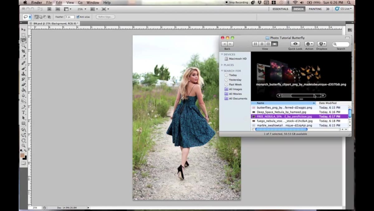 Portrait image open in Photoshop with butterfly stock imported
Kobeissi starts with her portrait already open and her transparent butterfly stock already imported. This sounds trivial but it reflects a real discipline. Before I open Photoshop on any job, I sketch the composite on paper and collect every asset I think I’ll need. Starting with disorganized assets leads to disorganized layers, and disorganized layers lead to mistakes you don’t catch until the file is three hours deep. Source your nebula textures and transparent PNG butterfly stock ahead of time. Transparent stock is the key word here. You want butterflies with no background so you can control placement without masking out a white or colored field around each wing.
Portrait image open in Photoshop with butterfly stock imported
Kobeissi starts with her portrait already open and her transparent butterfly stock already imported. This sounds trivial but it reflects a real discipline. Before I open Photoshop on any job, I sketch the composite on paper and collect every asset I think I’ll need. Starting with disorganized assets leads to disorganized layers, and disorganized layers lead to mistakes you don’t catch until the file is three hours deep. Source your nebula textures and transparent PNG butterfly stock ahead of time. Transparent stock is the key word here. You want butterflies with no background so you can control placement without masking out a white or colored field around each wing.
Step 2: Separate Each Butterfly Onto Its Own Raster Layer
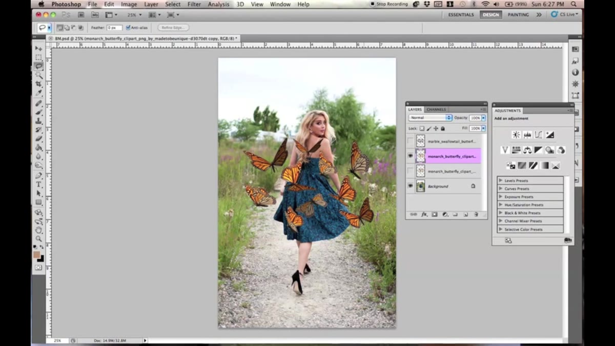 Lasso tool tracing around a single butterfly in the stock sheet
The butterfly stock arrives as a single image containing many butterflies grouped together. Kobeissi uses the Lasso tool (keyboard shortcut: L) to trace around one butterfly at a time, cuts it with Command+X, and pastes it back with Command+V. That paste drops the butterfly onto its own layer. Do this for each butterfly you want to use. It feels slow, but having individual layers gives you independent control over position, scale, rotation, and opacity for every single element. Trying to manage a cluster of butterflies as one merged object is a trap. You will always need to move one without moving the others.
Lasso tool tracing around a single butterfly in the stock sheet
The butterfly stock arrives as a single image containing many butterflies grouped together. Kobeissi uses the Lasso tool (keyboard shortcut: L) to trace around one butterfly at a time, cuts it with Command+X, and pastes it back with Command+V. That paste drops the butterfly onto its own layer. Do this for each butterfly you want to use. It feels slow, but having individual layers gives you independent control over position, scale, rotation, and opacity for every single element. Trying to manage a cluster of butterflies as one merged object is a trap. You will always need to move one without moving the others.
Step 3: Use Transform to Build Scale Variation and a Sense of Depth
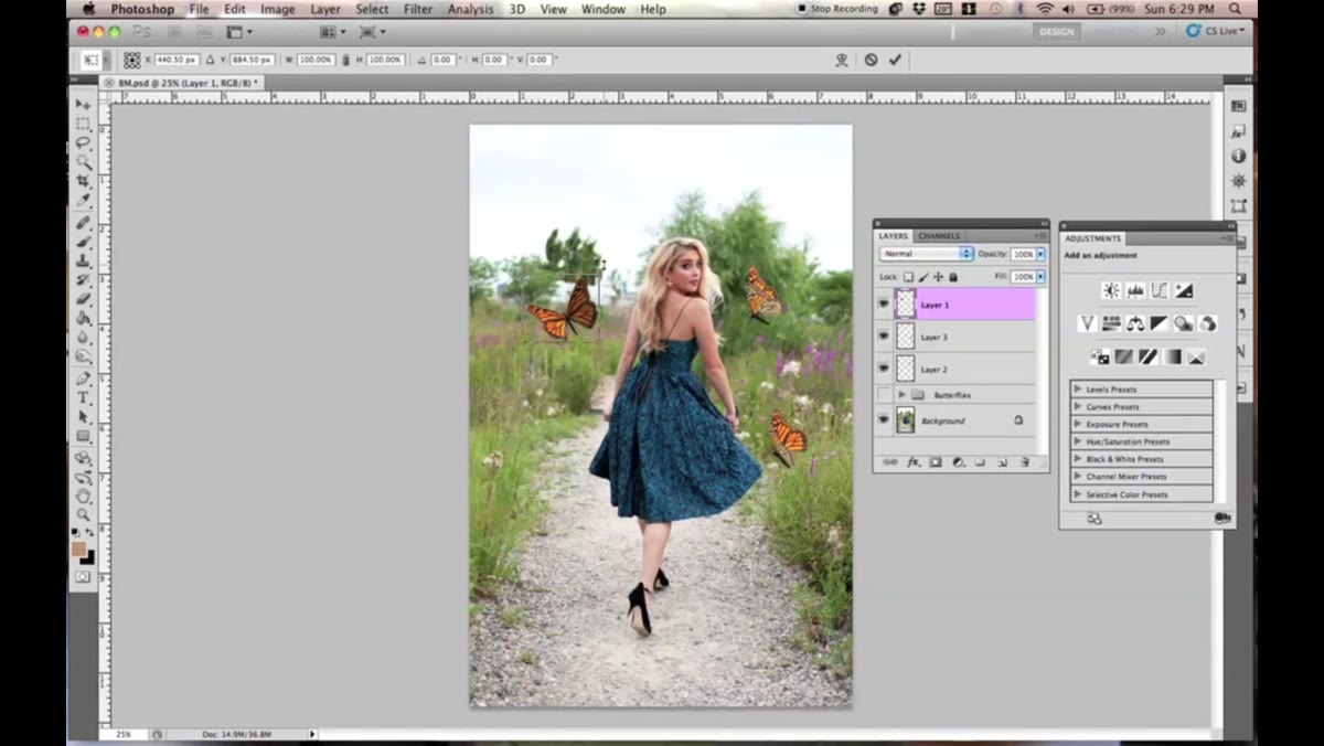 Command T transform handle active on a single butterfly layer
Once your butterflies are separated, press Command+T to enter Free Transform on each layer. Kobeissi right-clicks inside the transform bounding box and chooses Flip Horizontal to add variety, so not every butterfly is a mirror image of the last. She then scales each one differently, always holding Shift while dragging a corner handle to scale proportionally. This is critical habit to lock in. Scaling without Shift distorts the asset and you will see it immediately on something as symmetrical as a butterfly wing. The size variation between your butterflies is what creates the illusion that some are closer to the camera and some are farther away. A composition where every butterfly is the same size reads as a flat pattern. Vary them deliberately.
Command T transform handle active on a single butterfly layer
Once your butterflies are separated, press Command+T to enter Free Transform on each layer. Kobeissi right-clicks inside the transform bounding box and chooses Flip Horizontal to add variety, so not every butterfly is a mirror image of the last. She then scales each one differently, always holding Shift while dragging a corner handle to scale proportionally. This is critical habit to lock in. Scaling without Shift distorts the asset and you will see it immediately on something as symmetrical as a butterfly wing. The size variation between your butterflies is what creates the illusion that some are closer to the camera and some are farther away. A composition where every butterfly is the same size reads as a flat pattern. Vary them deliberately.
Step 4: Duplicate Layers to Create the “In the Lens” Effect
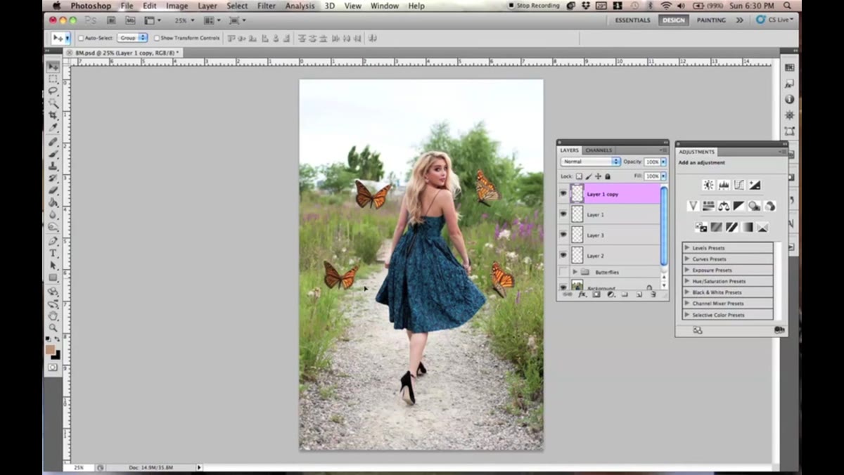 Duplicate butterfly layer scaled larger, partially cropped at frame edge
Here is one of the more interesting compositional choices in the tutorial. Kobeissi duplicates a butterfly layer with Command+J, then scales the duplicate larger with Command+T and positions it so it bleeds off the edge of the frame. The effect she’s going for is the feeling that a butterfly is so close to the lens it’s only partially in the shot. It’s a technique I’ve used on poster work to make objects feel like they exist in the same physical space as the camera, rather than floating in a digital void. The oversized, partially cropped element anchors the whole composition to a real point of view.
Duplicate butterfly layer scaled larger, partially cropped at frame edge
Here is one of the more interesting compositional choices in the tutorial. Kobeissi duplicates a butterfly layer with Command+J, then scales the duplicate larger with Command+T and positions it so it bleeds off the edge of the frame. The effect she’s going for is the feeling that a butterfly is so close to the lens it’s only partially in the shot. It’s a technique I’ve used on poster work to make objects feel like they exist in the same physical space as the camera, rather than floating in a digital void. The oversized, partially cropped element anchors the whole composition to a real point of view.
Step 5: Organize Butterfly Layers Into a Folder
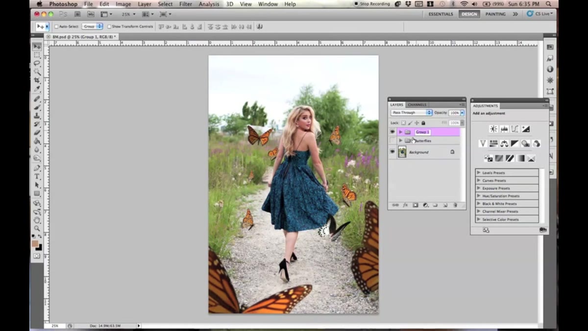 Multiple butterfly layers grouped into a labeled folder in the Layers panel
After building out the full arrangement of butterflies at different sizes and positions, Kobeissi groups them all into a layer folder. In Photoshop, select all the butterfly layers, then press Command+G to group them. Label the folder clearly. This keeps the Layers panel workable and lets you toggle visibility on the entire butterfly set without hunting through individual layers. On commercial jobs my layer folders are labeled and color-coded before I’ve placed a single asset. It sounds like overhead but it saves real time when revisions come in at 11 PM.
Multiple butterfly layers grouped into a labeled folder in the Layers panel
After building out the full arrangement of butterflies at different sizes and positions, Kobeissi groups them all into a layer folder. In Photoshop, select all the butterfly layers, then press Command+G to group them. Label the folder clearly. This keeps the Layers panel workable and lets you toggle visibility on the entire butterfly set without hunting through individual layers. On commercial jobs my layer folders are labeled and color-coded before I’ve placed a single asset. It sounds like overhead but it saves real time when revisions come in at 11 PM.
Step 6: Blend the Butterflies Into the Image Using a Soft Light Brush Layer
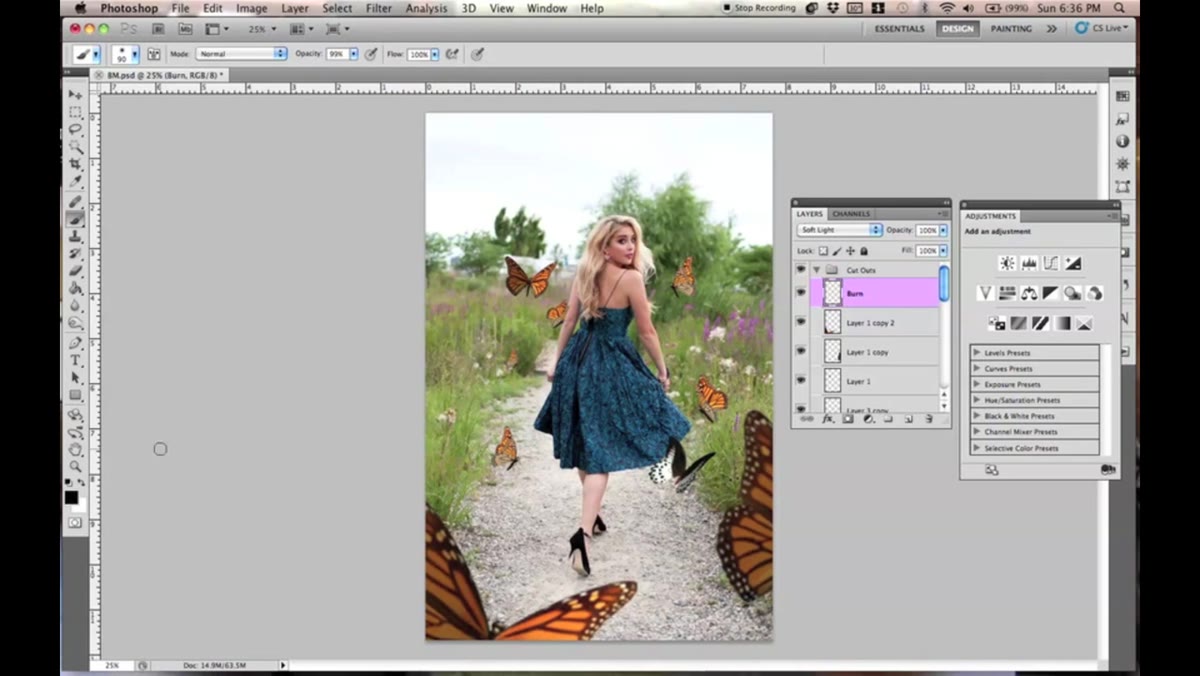 New layer set to Soft Light mode above butterfly layers in panel
This is the step where the composite either starts to feel cohesive or falls apart. Kobeissi creates a new layer above the butterflies (Command+Shift+N), sets its blend mode to Soft Light, and paints around the edges of the butterfly elements with a soft brush, black foreground color, opacity around 60%. The Soft Light mode means the black paint doesn’t cover anything. Instead it darkens and deepens the edges, making the butterflies feel like they share the same ambient light as the portrait rather than sitting on top of it. Keep your brush large and soft. You’re not masking. You’re shading. There’s a difference, and the difference shows.
New layer set to Soft Light mode above butterfly layers in panel
This is the step where the composite either starts to feel cohesive or falls apart. Kobeissi creates a new layer above the butterflies (Command+Shift+N), sets its blend mode to Soft Light, and paints around the edges of the butterfly elements with a soft brush, black foreground color, opacity around 60%. The Soft Light mode means the black paint doesn’t cover anything. Instead it darkens and deepens the edges, making the butterflies feel like they share the same ambient light as the portrait rather than sitting on top of it. Keep your brush large and soft. You’re not masking. You’re shading. There’s a difference, and the difference shows.
Step 7: Apply a Blur to the Largest Foreground Butterflies
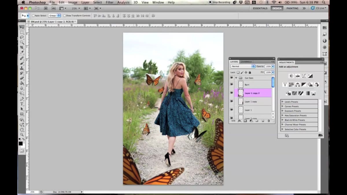 Filter Blur menu open with large foreground butterfly layer selected
For the oversized butterflies positioned closest to the “lens,” Kobeissi applies a blur through Filter - Blur. This mimics how a real lens behaves. Objects extremely close to the focal plane go soft. If your foreground butterfly is tack sharp and your subject is also tack sharp, the depth illusion collapses. A subtle blur on the closest elements is one of those small moves that most viewers never consciously notice but that makes the whole image feel photographically honest.
Filter Blur menu open with large foreground butterfly layer selected
For the oversized butterflies positioned closest to the “lens,” Kobeissi applies a blur through Filter - Blur. This mimics how a real lens behaves. Objects extremely close to the focal plane go soft. If your foreground butterfly is tack sharp and your subject is also tack sharp, the depth illusion collapses. A subtle blur on the closest elements is one of those small moves that most viewers never consciously notice but that makes the whole image feel photographically honest.
What I’d Add From My Own Practice
The workflow Kobeissi demonstrates is clean and transferable. If I were extending it for a more demanding brief, the one thing I’d add is a color grading pass that ties the butterflies to the nebula texture and the portrait at the same time. Drop a Hue/Saturation adjustment layer clipped above your butterfly folder and shift the butterfly colors toward whatever dominant hue lives in your background texture. On album art especially, that kind of tonal unity is what separates a composite that photographs like a single image from one that looks like a collage. The blending step Kobeissi covers gets you 70% of the way there. Color harmony gets you the rest.
The single most important takeaway from this tutorial is something Kobeissi demonstrates without making a speech about it: separate everything, label everything, and control each element independently before you start blending. Integration comes after structure. That order matters more than any individual technique in the video.
Watch the full tutorial on YouTube to see Kobeissi’s exact brush strokes and layer arrangements in motion. Some of this work only fully makes sense when you see the cursor moving.
Comments (2)
Great breakdown. The step-by-step approach really helps.
Couldn't agree more. I've seen this make a huge difference in gear work specifically.
Leave a Comment