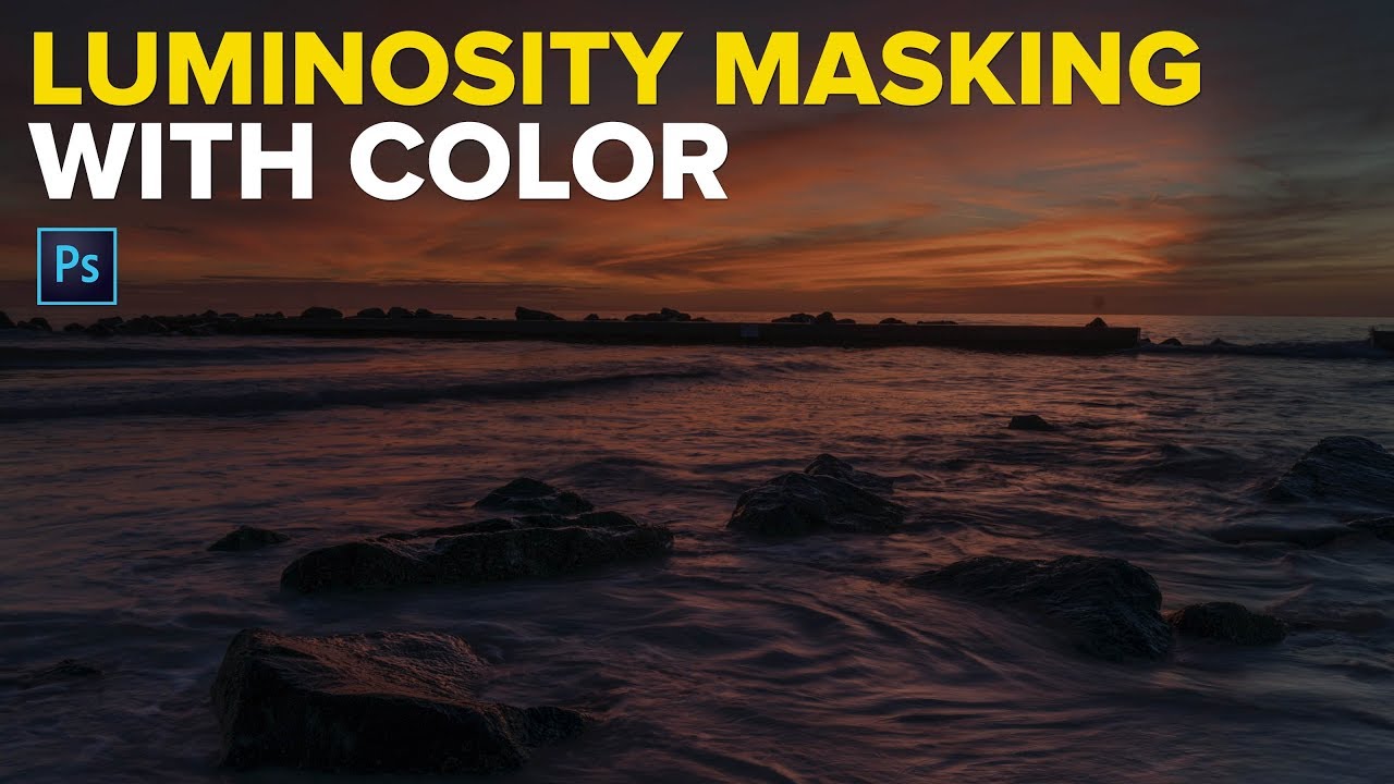
Every composite I build lives or dies on the quality of its masks. That’s not an exaggeration. I’ve spent entire afternoons on a single edge, because a ragged selection on a sky or a color spill bleeding into the wrong layer will collapse the realism of a piece no matter how good everything else looks. When I’m working on something like a movie poster or an album cover where the sky has to carry a specific emotional tone, I need precise control over color without flattening the luminance information underneath. Generic masking tools often force a choice between the two.
That’s exactly why this technique caught my attention. In this Matt Kloskowski tutorial on color luminosity masking, the core idea is elegant: instead of selecting based purely on brightness values (the way traditional luminosity masks work), you build the selection from a specific color in the image while still respecting the tonal variation within that color. The result is a floating layer that contains only that color information, which you can then push, blend, or stylize independently. It works on any color in any photo, not just skies.
Watch the full tutorial on YouTube
The workflow Matt walks through is clean and repeatable, which matters to me. I sketch every composite on paper before I open Photoshop, so by the time I’m sitting down with a file I want tools that match the precision I’ve already planned for. This one does.
Step 1: Open Color Range from the Select Menu
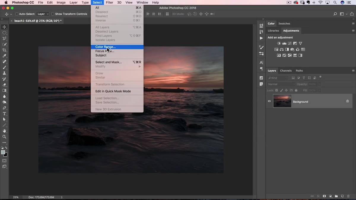 Color Range dialog opened from the Select menu
With your image open and your target layer active, go to Select in the top menu bar and choose Color Range. This opens a floating dialog with a black-and-white preview of your image. Black means not selected, white means selected. That preview is your working map for the entire process, so get comfortable reading it before you start clicking.
Color Range dialog opened from the Select menu
With your image open and your target layer active, go to Select in the top menu bar and choose Color Range. This opens a floating dialog with a black-and-white preview of your image. Black means not selected, white means selected. That preview is your working map for the entire process, so get comfortable reading it before you start clicking.
At the top of the dialog, you’ll see a dropdown that defaults to Sampled Colors. Leave it there. That mode lets you manually click the colors you want rather than pulling from a preset range, which gives you far more control over exactly what ends up in the selection.
Step 2: Sample Your Target Color with the Eyedropper
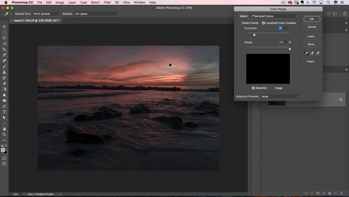 Eyedropper clicking a blue area in the sky
Click the standard eyedropper icon in the Color Range dialog (not the plus or minus variants, just the plain one). Then click directly on the color in your image that you want to select. If you’re working on a sky, click somewhere in the blue. The preview will update immediately, showing you white in the areas that fall within your sampled range.
Eyedropper clicking a blue area in the sky
Click the standard eyedropper icon in the Color Range dialog (not the plus or minus variants, just the plain one). Then click directly on the color in your image that you want to select. If you’re working on a sky, click somewhere in the blue. The preview will update immediately, showing you white in the areas that fall within your sampled range.
One click rarely captures the full color spread. Hold Shift and click additional areas of the same general color to expand the selection. Matt clicks across several parts of the sky to pick up the variation in blue tones across the gradient, from darker regions near the horizon to lighter areas higher up. Each Shift-click adds to the sampled range without replacing what you already have.
Step 3: Dial In the Fuzziness Slider
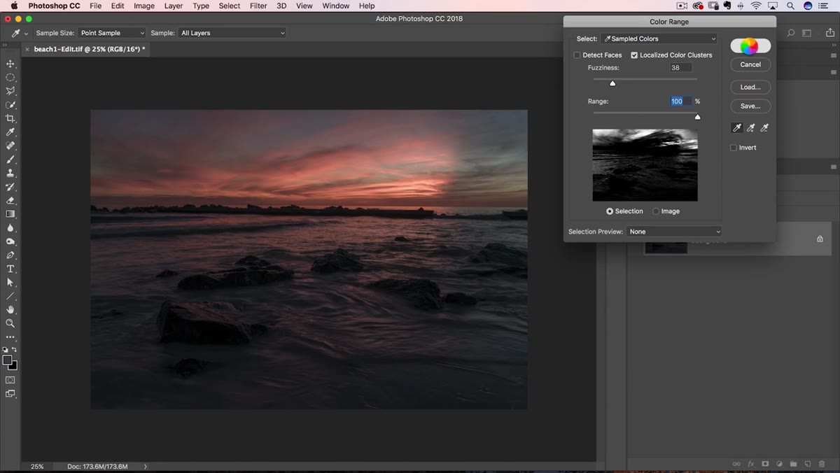
 Fuzziness slider adjustment in the Color Range dialog
The Fuzziness slider controls how far outside your sampled colors the selection is allowed to reach. Think of it as tolerance. A high fuzziness value will grab colors adjacent to what you clicked, which can pull in areas you don’t want. Matt keeps this low to stay tight to the actual sampled hues.
Fuzziness slider adjustment in the Color Range dialog
The Fuzziness slider controls how far outside your sampled colors the selection is allowed to reach. Think of it as tolerance. A high fuzziness value will grab colors adjacent to what you clicked, which can pull in areas you don’t want. Matt keeps this low to stay tight to the actual sampled hues.
The Range slider beneath it is related but distinct. Pulling it all the way down shows you only the exact pixels you clicked, with zero spread. Matt leaves Range at 100% after managing precision through Fuzziness, which means he lets the fuzziness do the limiting work. Experiment here with your own images, but lean conservative. You can always add to a selection later; cleaning up an overreaching one costs more time.
Step 4: Confirm the Selection and Click OK
 Marching ants selection visible on the sky in the canvas
Once the preview shows a clean white area over your target color and minimal white bleeding into areas you want to protect, click OK. Photoshop will generate a marching ants selection on your canvas based on everything the Color Range dialog identified. It won’t be pixel-perfect, and that’s fine. The next step handles the imperfection.
Marching ants selection visible on the sky in the canvas
Once the preview shows a clean white area over your target color and minimal white bleeding into areas you want to protect, click OK. Photoshop will generate a marching ants selection on your canvas based on everything the Color Range dialog identified. It won’t be pixel-perfect, and that’s fine. The next step handles the imperfection.
Don’t stress if some edges look rough or if a few stray areas are included. The real control comes after the selection is converted into a layer.
Step 5: Extract the Selection onto Its Own Layer with Cmd/Ctrl + J
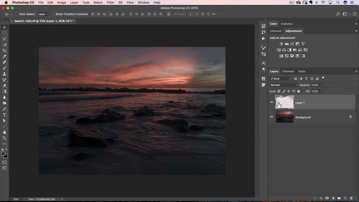 New layer created from selection visible in the Layers panel
With the selection still active, press Cmd+J on a Mac or Ctrl+J on Windows. Normally this command duplicates the entire layer, but when a selection is live it copies only the selected pixels up to a new layer. Open your Layers panel and you’ll see the result: a new layer sitting above the original, containing only the color data you selected.
New layer created from selection visible in the Layers panel
With the selection still active, press Cmd+J on a Mac or Ctrl+J on Windows. Normally this command duplicates the entire layer, but when a selection is live it copies only the selected pixels up to a new layer. Open your Layers panel and you’ll see the result: a new layer sitting above the original, containing only the color data you selected.
Click the eye icon on the original layer to hide it temporarily and look at what’s on the new layer. You’ll see the isolated color, shaped by its luminance variation, with transparent areas everywhere the selection didn’t reach. This is your color luminosity mask in its working form. From here you can adjust hue, saturation, blending modes, or apply a curve directly to that layer without touching the underlying image.
How I Use This in Compositing Work
The thing that makes this technique genuinely useful for compositing (not just photo editing) is that the extracted layer carries soft, graduated edges shaped by the tonal variation of the original color. When I’m building a composite where I need to key a specific color in a sky or a background element, a hard selection destroys the atmospheric depth. This method preserves it because the selection itself was built on the luminance variation within the color from the start.
I’ve also used this approach to isolate warm tones in foreground elements on album cover work, then shifted those tones in isolation to complement a new sky dropped in behind. Because the mask is generated from the actual image data rather than drawn by hand or built with a generic tool, it tends to sit more naturally within the composite. The edges don’t fight you.
One caveat: on images with heavy noise or complex color variation (a stormy sky, textured foliage), the Shift-click sampling can get messy fast. In those situations I’ll do two or three rounds of Color Range on separate layers and blend them, rather than trying to capture everything in one pass.
The single most important idea here is that luminosity masking doesn’t have to mean brightness only. Selecting by color while preserving tonal nuance gives you a mask that behaves like the image itself rather than like a shape drawn over it. That distinction matters every time you need a blend that looks like it belongs.
Watch the full tutorial on YouTube to follow along with Matt’s image and see the selection-building process in real time.
Comments
Leave a Comment