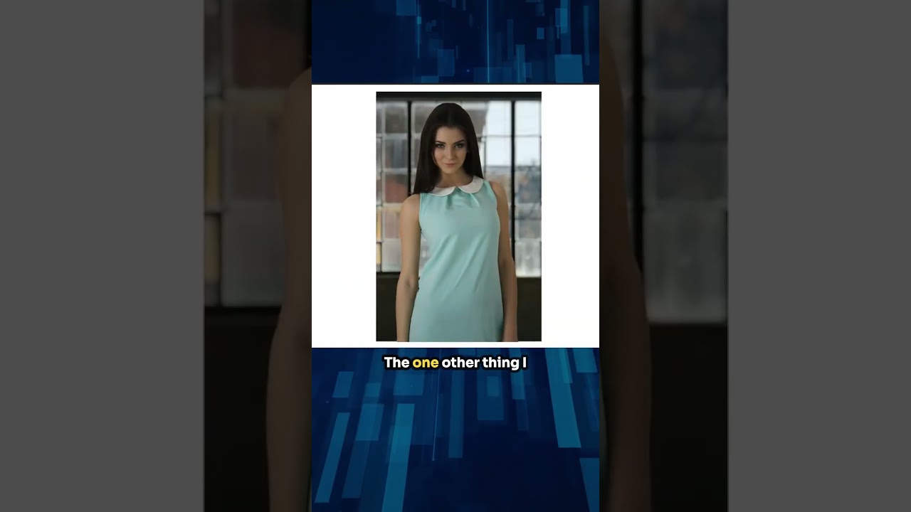
Every composite I’ve built professionally starts with the same brutal question: does she belong in that world? Not technically. Visually. Does the light hitting her face match the light in the background? Does the color temperature feel like they were photographed in the same universe? I’ve spent embarrassing amounts of time manually painting color corrections across subjects to make them feel grounded in a scene. So when I came across this KelbyOne tutorial featuring Dan Harlacher walking through a quick composite and color change in ON1 Photo RAW, I stopped what I was doing and watched the whole thing. Watch the full tutorial on YouTube
What Harlacher demonstrates is not a workaround or a trick. It is a clean, logical pipeline: remove the background, drop in a replacement, use a Color Match filter to pull the color and tone from the new scene onto your subject, then make targeted clothing adjustments with AI-assisted selection. The whole thing moves fast. But speed here is earned, not rushed. Each tool is doing exactly the job it was built for, and that efficiency is what I want to break down step by step.
I sketch every composite on paper before I open any software. What I love about this workflow is that it maps almost exactly onto how I think on paper: establish the scene, unify the light, adjust the wardrobe. Here is how to do it.
Step 1: Remove the Background with the Masking Pane
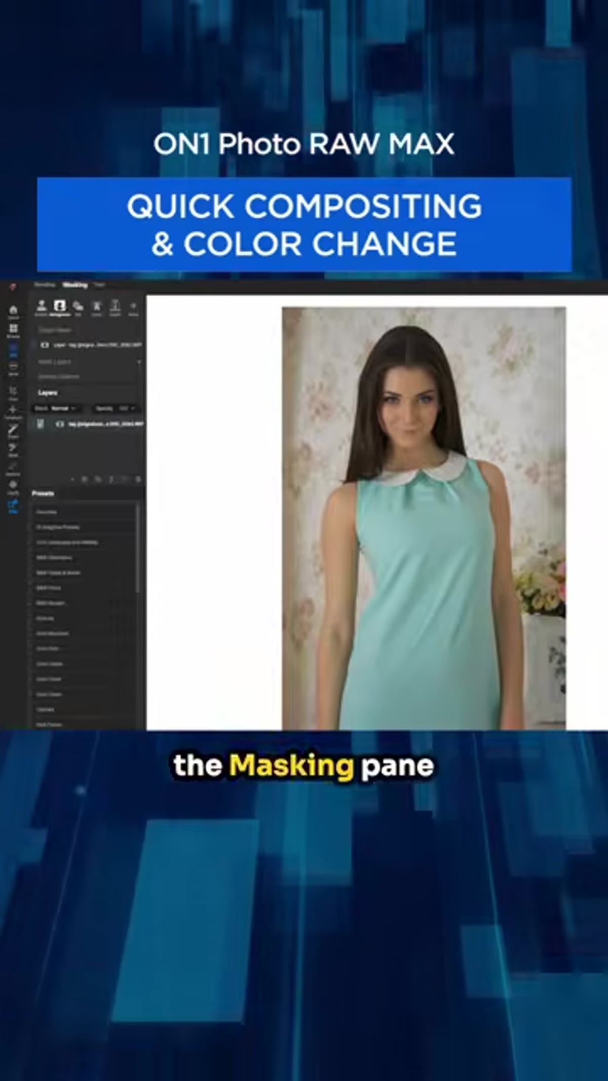 Clicking the masking pane to remove background
Open your subject photo in ON1 Photo RAW and navigate to the Masking pane. Click directly on the background area and ON1’s AI-driven masking will identify and remove it, isolating your subject on a transparent layer. This is not a lasso or a manual selection. The software reads the scene and makes the cut for you.
Clicking the masking pane to remove background
Open your subject photo in ON1 Photo RAW and navigate to the Masking pane. Click directly on the background area and ON1’s AI-driven masking will identify and remove it, isolating your subject on a transparent layer. This is not a lasso or a manual selection. The software reads the scene and makes the cut for you.
The quality of this initial mask sets the ceiling for everything that follows. If you are working with complex hair or fabric edges, zoom in after the mask is applied and check the fringe. You can refine from here before adding anything new to the scene.
Step 2: Add a New Background Layer
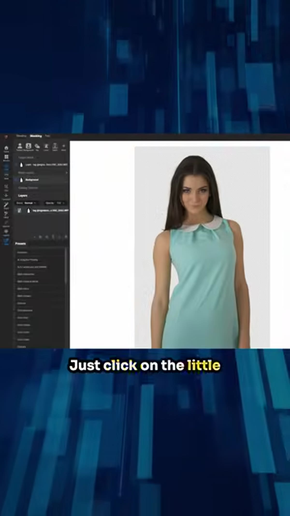 Clicking the plus button in the layers pane
Click the plus button in the Layers pane. This opens a photo chooser where you can browse your own library or use the background images included with ON1, many of which were photographed specifically for compositing. Harlacher selects a grungier, moodier scene to match the tone of the portrait.
Clicking the plus button in the layers pane
Click the plus button in the Layers pane. This opens a photo chooser where you can browse your own library or use the background images included with ON1, many of which were photographed specifically for compositing. Harlacher selects a grungier, moodier scene to match the tone of the portrait.
Double-click your chosen background and it drops in as its own layer. It will almost certainly be the wrong size. Drag it below your subject in the layer stack, then switch to the Transform tool. You can grab the corner handles and pull, or use the Scale scrubby slider in the tool options to resize until the background fills the frame cleanly. Get it close. Pixel-perfect alignment matters less at this stage than coverage and composition.
Step 3: Apply Color Match to Unify the Composite
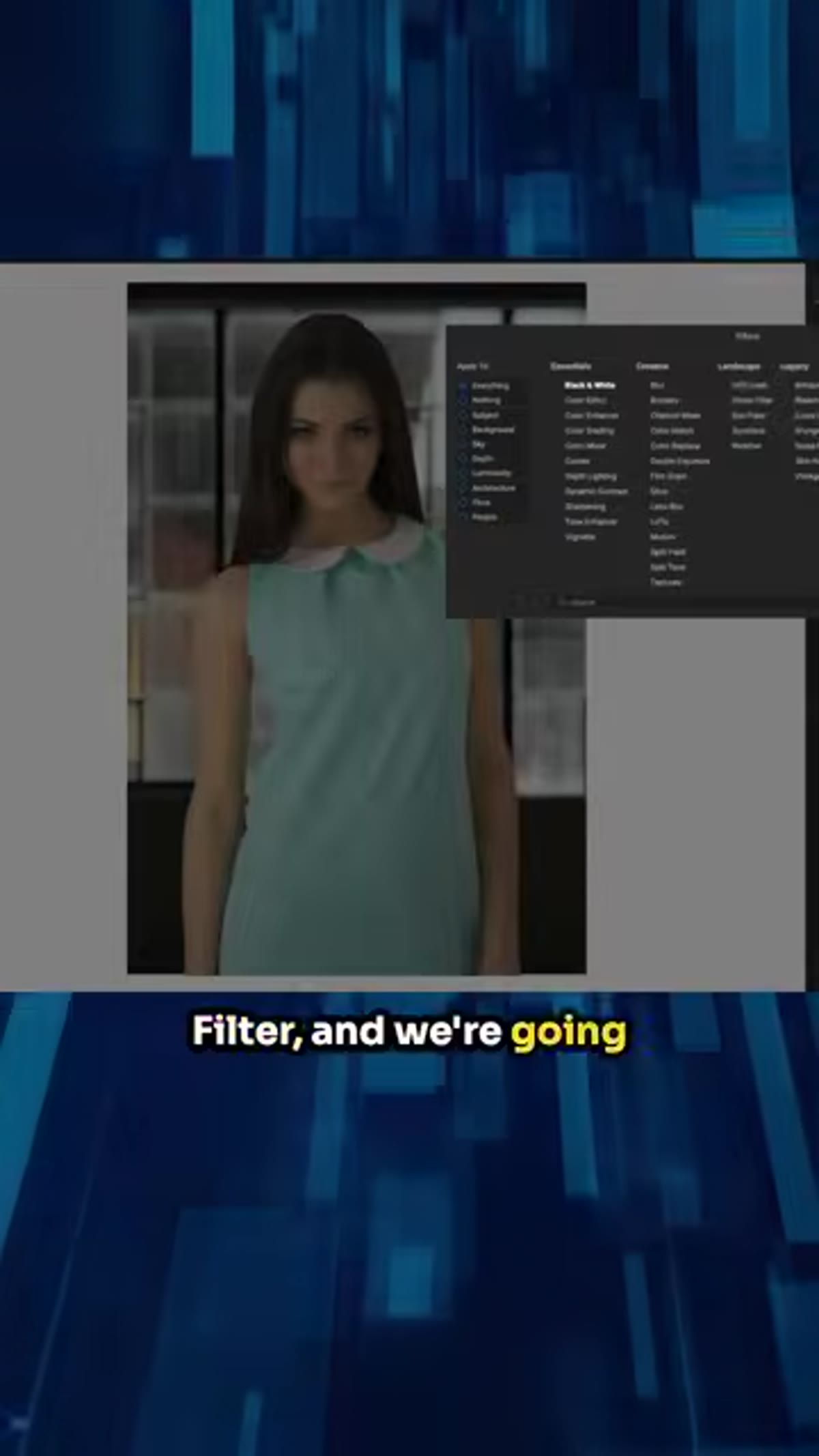 Opening the Effects tab and selecting Add Filter
This is the step that earns the whole tutorial. With your subject layer selected, go to the Effects tab and click Add Filter. Choose Color Match from the filter list. Color Match is built to take the color and tone characteristics of one image and apply them to another. It is the digital equivalent of studying how light falls across two photographs and forcing them into agreement.
Opening the Effects tab and selecting Add Filter
This is the step that earns the whole tutorial. With your subject layer selected, go to the Effects tab and click Add Filter. Choose Color Match from the filter list. Color Match is built to take the color and tone characteristics of one image and apply them to another. It is the digital equivalent of studying how light falls across two photographs and forcing them into agreement.
In the Reference section of the Color Match filter, you will see a list of the other layers in your file. Select your background layer. The software samples the color and luminosity from that scene and pushes it onto your subject. Toggle the filter on and off to see what it is doing. The subject, who may have been lit in a warm studio, starts to feel like she was actually standing in that grungy alley or industrial space.
Step 4: Dial In the Color and Luminosity Sliders
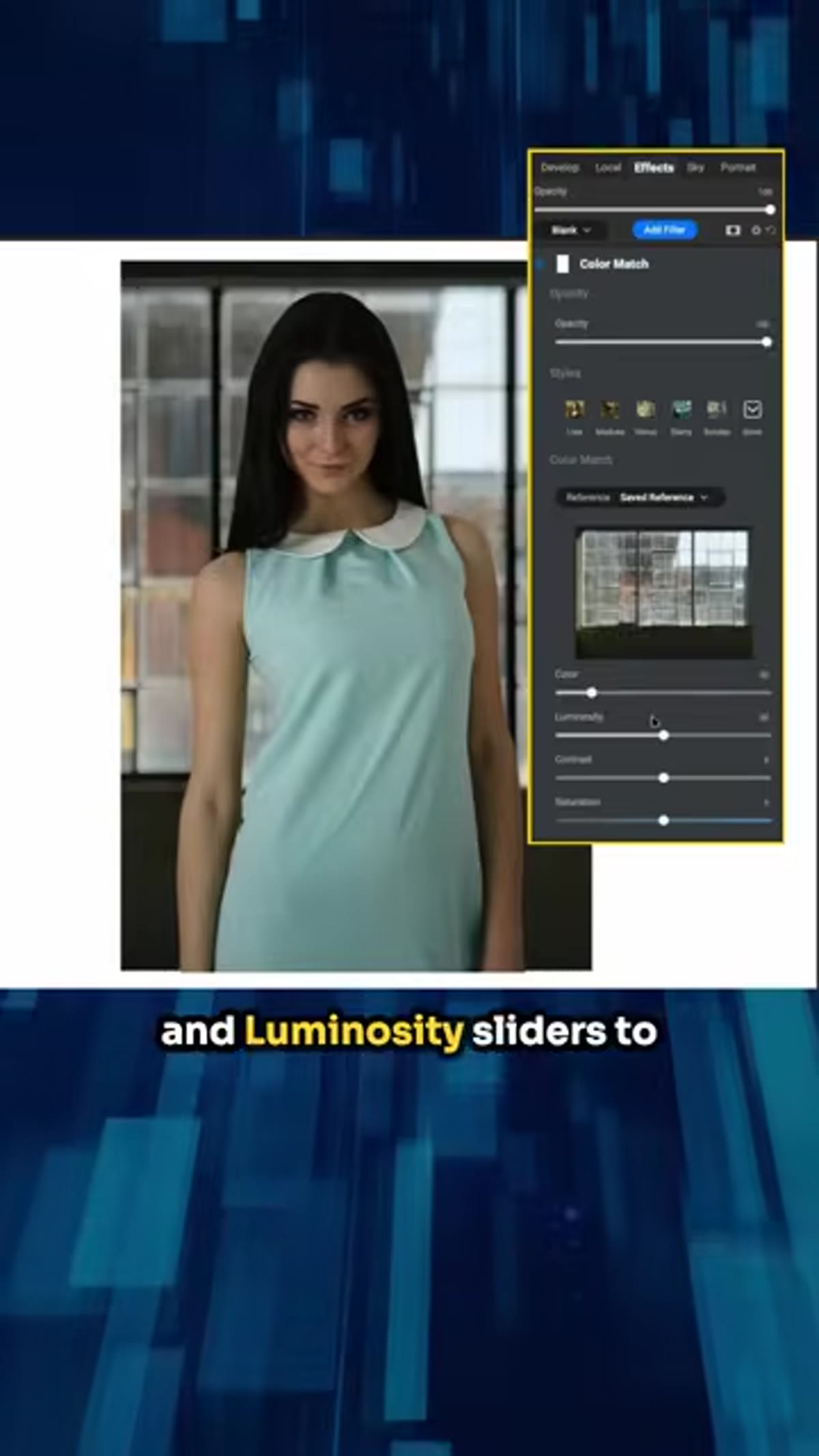 Adjusting Color and Luminosity sliders in Color Match
Color Match gives you two sliders: Color and Luminosity. Harlacher lands around 30 to 40 percent on both. That range is worth noting because it is almost never right to push Color Match to 100. Full strength tends to destroy the subject’s skin tones or flatten the image into something that looks filtered rather than composited.
Adjusting Color and Luminosity sliders in Color Match
Color Match gives you two sliders: Color and Luminosity. Harlacher lands around 30 to 40 percent on both. That range is worth noting because it is almost never right to push Color Match to 100. Full strength tends to destroy the subject’s skin tones or flatten the image into something that looks filtered rather than composited.
Start at 25 percent on both sliders and work up. Watch the midtones on your subject’s face as you drag. The moment the skin starts shifting toward the dominant color of the background, you’ve likely gone a touch too far. Back off five to ten percent and that usually lands in the believable zone.
Step 5: Select the Subject’s Clothing with Super Select AI
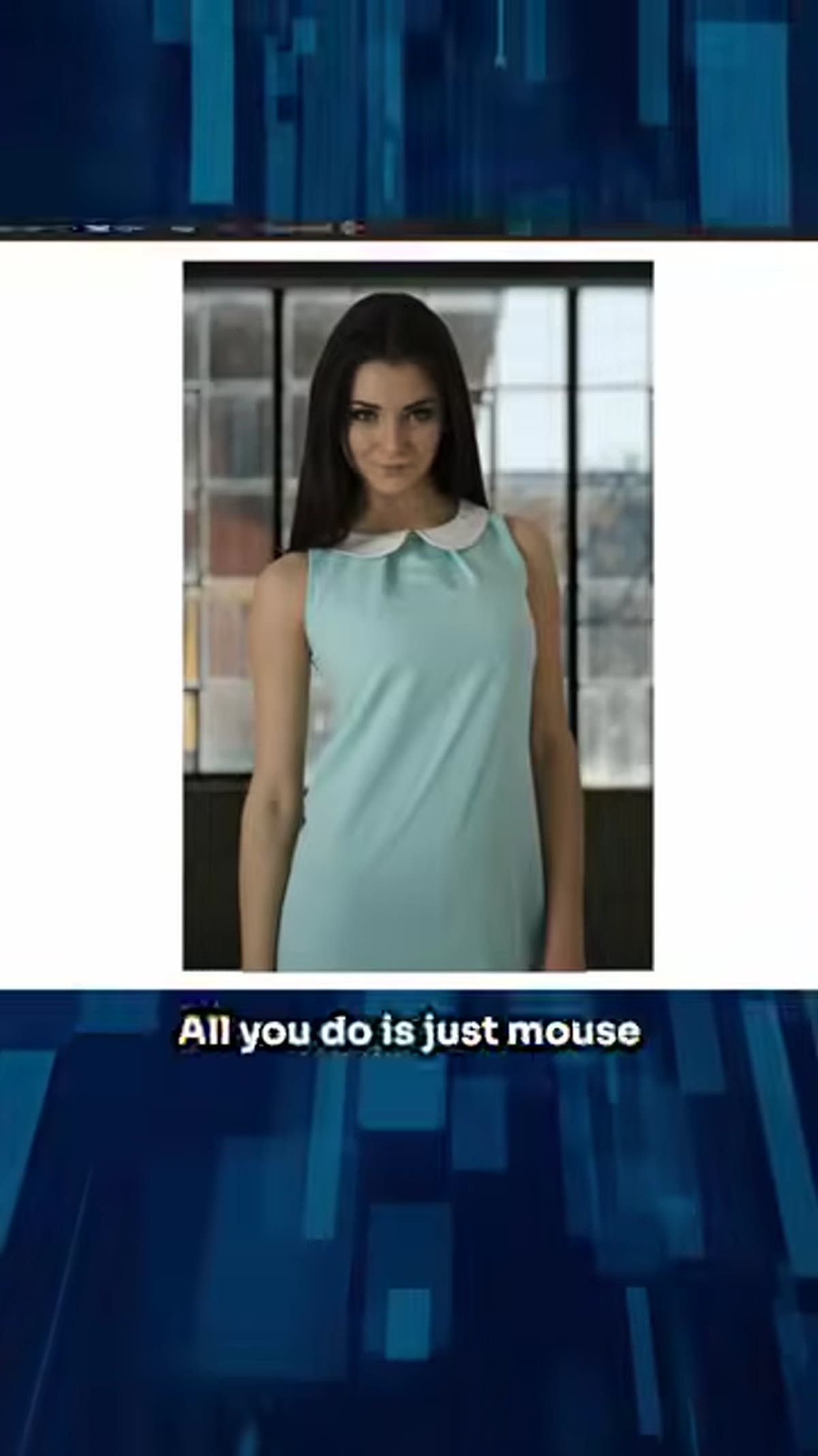 Using Super Select AI to isolate the dress
To change the color of the subject’s dress, Harlacher turns to Super Select AI under Local Adjustments. Hover your cursor over the photo and the tool will highlight distinct regions of the image automatically. Click on the clothing and it builds a selection around it. No painting, no pen tool, no refining edges manually.
Using Super Select AI to isolate the dress
To change the color of the subject’s dress, Harlacher turns to Super Select AI under Local Adjustments. Hover your cursor over the photo and the tool will highlight distinct regions of the image automatically. Click on the clothing and it builds a selection around it. No painting, no pen tool, no refining edges manually.
Right-click the selection and choose Add Adjustment Layer. The adjustment is now masked to the dress only. Anything you do with the sliders will affect the clothing without touching skin, hair, or background.
Step 6: Adjust Exposure and Saturation to Change the Clothing Color
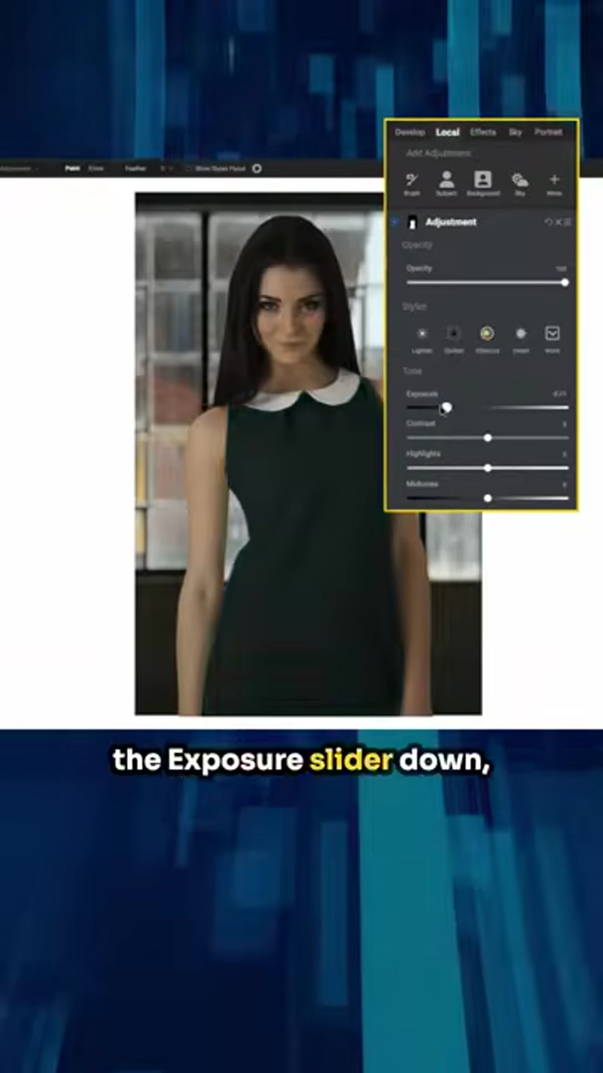 Pulling exposure slider down to darken the dress
Pull the Exposure slider down to darken the dress from its original light Tiffany blue toward black or dark gray. Then bring Saturation down to strip out the blue-green cast. Add a small amount of Contrast to restore the definition in the fabric folds and stitching.
Pulling exposure slider down to darken the dress
Pull the Exposure slider down to darken the dress from its original light Tiffany blue toward black or dark gray. Then bring Saturation down to strip out the blue-green cast. Add a small amount of Contrast to restore the definition in the fabric folds and stitching.
The result looks realistic because the adjustment preserves the existing texture and light variation in the cloth. You are not painting over the dress with a flat color. You are telling the software to treat the fabric as though it were always dark, which means the wrinkles and highlights survive and still read as cloth.
What I Would Add from My Own Work
The Color Match step is the one most compositors skip or undervalue. I skipped it for years. I would manually add a Color Balance or Photo Filter adjustment and try to eyeball my way to unity. The problem is that eyeballing privileges the color you are looking at most. You chase the skin tones and forget the shadows. You fix the highlights and ignore the midtones.
Using Color Match at a restrained percentage removes that bias. The software is not looking at what your eye is drawn to. It is averaging the full tonal and color distribution of the background and applying it consistently. When I started using this approach on commercial work, clients stopped asking me to “make it feel like she was really there.” That question went away because the question answered itself.
The single most important idea in this tutorial is that authenticity in a composite comes from shared color science, not just shared lighting direction. You can nail the shadows and still have a subject who reads as pasted in, because her midtones are from a different color world than the background. Color Match solves that in under a minute.
Watch Harlacher walk through the full sequence here: Watch the full tutorial on YouTube
Comments (11)
The before and after really sells it. Incredible difference.
This is the kind of content that keeps me coming back.
Solid advice. Especially the part about taking your time with it.
I tried this on a client project yesterday and the results were way better than expected.
Great article! I actually covered something related on my site — the business angle is really complementary to this.
Love how you break down complex stuff into manageable steps.
Wow, I had no idea you could do this. Mind blown.
Been doing this wrong for years apparently. Thanks for the wake-up call.
The tip about fast composites real results w was the missing piece for me. Thank you.
Never thought of approaching it this way. Really creative.
Love this. I referenced a similar technique in one of my recent posts. Always good to see other perspectives.
Leave a Comment