I have a problem with working too tight too early. Before I even have a rough composite assembled, I’m already fussing over edge detail and light direction. It’s a habit that slows everything down, and it comes from years of high-stakes work where a bad shadow costs you a revision cycle. But lately I’ve been forcing myself to study how other professionals approach the early, loose stage of a composite, because that’s where I’m losing time.
That’s what pulled me into this KelbyOne tutorial featuring Dan Harlacher walking through a quick composite and color transformation inside ON1 Photo RAW. If you haven’t watched it yet, do that first.
What Dan demonstrates isn’t a deep-dive compositing session. It’s closer to a proof-of-concept workflow, and that’s exactly what makes it useful.
The Composite Starts Before You Open the Software
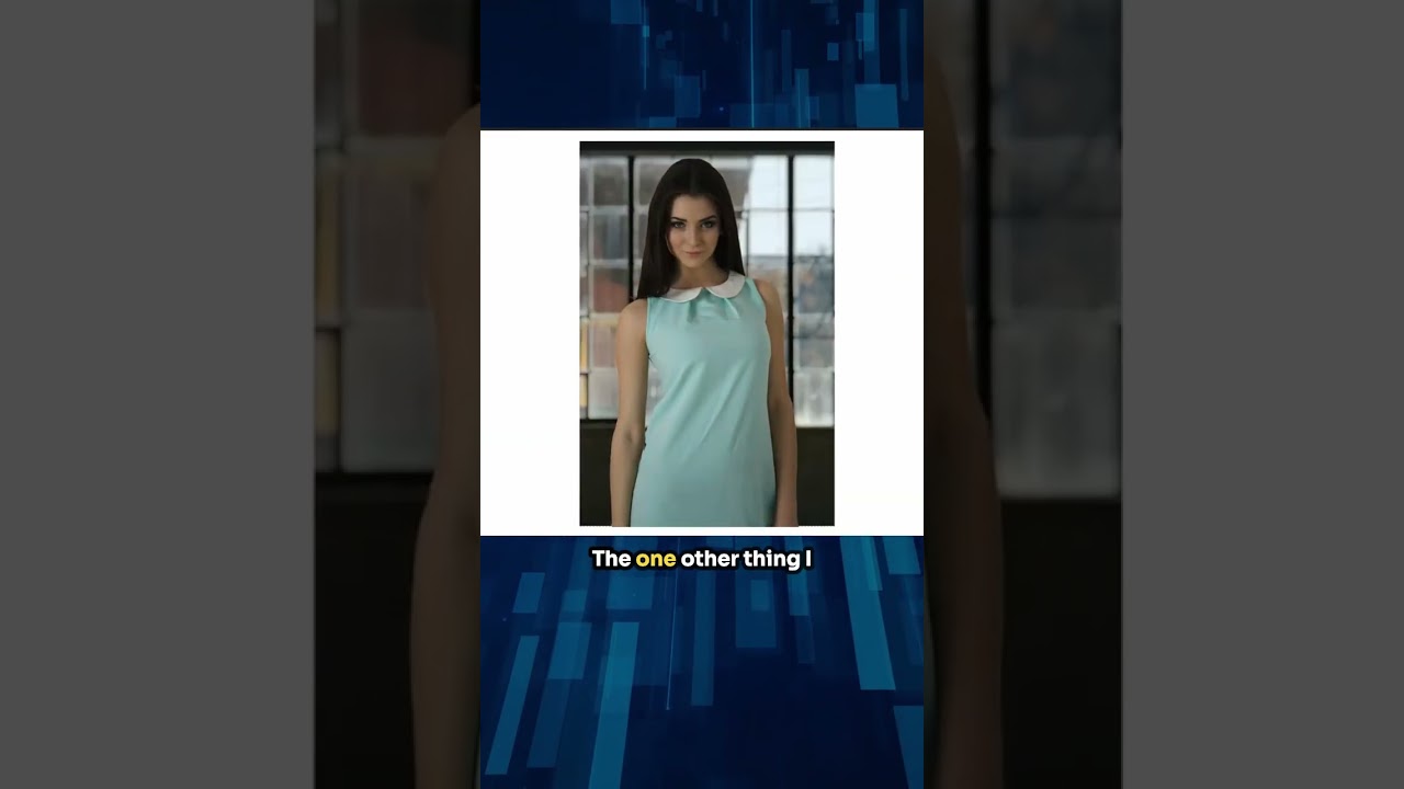
Dan’s approach begins with a clear intention: he knows what he wants to combine and roughly why. He’s working with a subject and a background that share compatible light, which is the first decision most beginners skip. The light source in both images reads as coming from roughly the same direction and has a similar quality. That single decision does more for a believable composite than any masking technique.
In ON1 Photo RAW, he brings his subject into the Layers panel and places it over his chosen background. The interface here works similarly to Photoshop’s layers, but the masking tools are built directly into the layer workflow rather than living in a separate panel. For anyone coming from Lightroom who hasn’t worked in a layered environment much, that’s a meaningful difference: you’re not switching modes, you’re staying in one place.
Masking the Subject Without Losing Your Mind
Dan uses ON1’s AI-powered masking to pull the subject away from its original background. He applies the subject mask, and the software makes a strong first pass. It’s not perfect on the edges, but it’s close enough to work with for a composite at this stage.
Here’s what I found instructive: he doesn’t immediately refine every pixel. He zooms out, evaluates the overall read of the image, and decides if the concept is working before spending time on detail. That’s the discipline. He uses the Refine Mask brush to clean up the obvious problem areas, particularly around hair and fine edges, but he’s selective about where he puts that effort.
The blend between subject and background is helped by a combination of the mask quality and a subtle adjustment to the subject layer’s color and tone. He brings the subject’s luminosity slightly closer to the background, which stops the layer from looking pasted on. This isn’t a dramatic change. It’s the kind of small tonal nudge that your eye registers as “this belongs here” without knowing why.
Changing Color to Redirect the Entire Mood
The second half of Dan’s tutorial is where it gets genuinely fun. He uses ON1’s Color Range masking tools to isolate specific colors in the image and shift them. In this case, he’s targeting a particular color in the subject’s wardrobe or scene element and pulling it in a completely different direction.
The process: select the Color Range mask option, use the eyedropper to sample the color you want to change, adjust the selection range so you’re capturing enough of the target without bleeding into adjacent tones, then apply a Hue/Saturation adjustment layer clipped to that mask. From there, dragging the Hue slider transforms the color while preserving the luminosity and texture underneath.
What he demonstrates is that you can do this non-destructively and quickly. The whole color change takes a few minutes. For client work where you’re exploring multiple colorways, this workflow could save a significant amount of time compared to rebuilding selections every time someone asks for “the same image but in burgundy instead of teal.”
Where I’d Push This Further (and Where I’d Be Careful)
I’ve been using a similar color isolation approach in Photoshop for years, but seeing it in ON1 made me think about one limitation that Dan doesn’t hit in this particular image: complex gradients within the target color.
When a piece of fabric has both a highlight and a shadow tone that read as different colors to the selection tool, you end up needing multiple Color Range passes to capture the whole thing. I’ve had this issue on a book cover where a character’s jacket was a deep navy in shadow but shifted toward a warmer mid-tone in the highlights. Selecting just the “navy” missed the highlights; broadening the range pulled in the sky behind them. The fix was two separate Color Range masks with different hue shift values applied at different opacities, blended together. It works, but it’s not as clean as Dan’s single-pass example, and it’s worth knowing that complexity is waiting for you in real-world projects.
That said, for what Dan is demonstrating, the single-pass approach handles the job cleanly and the result reads as cohesive.
The Actual Lesson Here
The fastest composites I’ve ever produced weren’t fast because I found a shortcut. They were fast because I made good decisions at the start: matching light, keeping the concept simple, and not refining detail before the overall image earned it. Dan’s workflow in this tutorial is a clean example of that discipline, and ON1’s toolset makes it more accessible than it’s ever been.
Watch the full tutorial on KelbyOne’s YouTube channel for the visual walkthrough, because seeing Dan’s mouse movements through the masking and color shift steps is worth more than any written description of them.
Comments
Leave a Comment