
Every composite I build starts with a problem: how do I make two images feel like one world? Most of the time, the answer lives in the mask. Not a rough selection, not a painted edge, but a mask that carries the actual texture and light information of the image it came from. That specificity is what separates a composite that reads as real from one that looks assembled.
I’ve spent a lot of time studying unconventional ways to build masks, especially for organic subjects like water, smoke, and hair, where a lasso or even a pen tool will destroy the very thing that makes the subject interesting. So when I came across Watch the full tutorial on YouTube from KelbyOne’s Jessica Maldonado, it clicked immediately. The technique she walks through uses Color Range selection and channel duplication to generate a mask with genuine tonal complexity. The result is a splash of color that feels like it’s erupting from a black-and-white portrait, rather than sitting on top of one. It’s the kind of effect that looks expensive and is actually rooted in solid masking fundamentals.
Here’s how it works, step by step.
Step 1: Set Up Your Base Document
 Black and white portrait layer open in Photoshop
Start with your main portrait image converted to black and white. This becomes your base layer. The concept depends on contrast between a desaturated image and a full-color element, so commit to the grayscale conversion now rather than trying to fake it later. Place your black-and-white layer at the bottom of your stack. You’ll be building everything above it.
Black and white portrait layer open in Photoshop
Start with your main portrait image converted to black and white. This becomes your base layer. The concept depends on contrast between a desaturated image and a full-color element, so commit to the grayscale conversion now rather than trying to fake it later. Place your black-and-white layer at the bottom of your stack. You’ll be building everything above it.
Step 2: Open Your Splash Image and Use Color Range to Select It
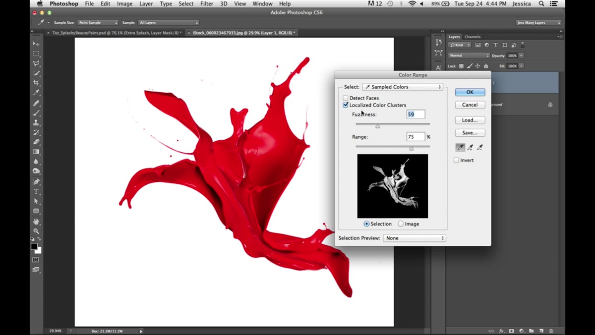 Color Range dialog open with eyedropper on red splash
Bring in a second stock image that features a liquid or paint splash with strong, saturated color against a relatively neutral background. A red paint or water splash on white works particularly well because the color contrast gives you something clean to work with. Go to Select > Color Range. With the eyedropper, click on a midtone area of the splash color, aiming for a point that captures the density of the subject without grabbing too much background noise.
Color Range dialog open with eyedropper on red splash
Bring in a second stock image that features a liquid or paint splash with strong, saturated color against a relatively neutral background. A red paint or water splash on white works particularly well because the color contrast gives you something clean to work with. Go to Select > Color Range. With the eyedropper, click on a midtone area of the splash color, aiming for a point that captures the density of the subject without grabbing too much background noise.
Once you have a starting point, adjust the Fuzziness slider until the mask captures the full form of the splash, including its semi-transparent edges. To evaluate what you’re building, switch the Selection Preview dropdown to Grayscale. In this view, white areas will be fully visible through the final mask, black areas will drop out entirely, and gray tones will show through partially. That gradation is the whole point. You want the splash to feel like it has depth and translucency, not like a cutout.
Step 3: Fill the Selection on a New Layer
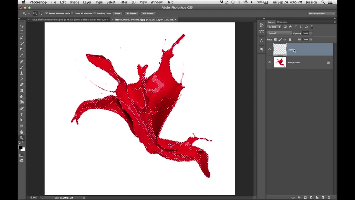 New layer filled with black, background hidden
Once you’re satisfied with the Color Range selection, create a new blank layer above your splash image. Press D to reset your foreground and background colors to black and white. Fill the active selection with black using Edit > Fill or Alt+Backspace (Option+Delete on Mac). Then hide your background layer. What you’re left with is a black silhouette of the splash shape sitting on a transparent layer. This is a staging step, but don’t skip it. That filled shape is about to be used as the source for a channel.
New layer filled with black, background hidden
Once you’re satisfied with the Color Range selection, create a new blank layer above your splash image. Press D to reset your foreground and background colors to black and white. Fill the active selection with black using Edit > Fill or Alt+Backspace (Option+Delete on Mac). Then hide your background layer. What you’re left with is a black silhouette of the splash shape sitting on a transparent layer. This is a staging step, but don’t skip it. That filled shape is about to be used as the source for a channel.
Step 4: Duplicate the Red Channel from the Splash Image
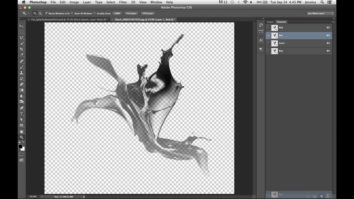 Channels panel open, red channel being duplicated
Open the Channels panel. You’ll see the individual RGB channels listed. Because your splash is red, the Red channel will carry the most contrast and the richest tonal information for this specific image. Drag the Red channel down to the New Channel icon at the bottom of the panel to create a duplicate. This gives you an alpha channel that holds the splash’s tonal range as grayscale values.
Channels panel open, red channel being duplicated
Open the Channels panel. You’ll see the individual RGB channels listed. Because your splash is red, the Red channel will carry the most contrast and the richest tonal information for this specific image. Drag the Red channel down to the New Channel icon at the bottom of the panel to create a duplicate. This gives you an alpha channel that holds the splash’s tonal range as grayscale values.
Now here’s the part that not everyone knows you can do: you can drag a channel from one document into another. Hold Command+Option+Shift (Ctrl+Alt+Shift on Windows) and drag the duplicated Red channel directly onto your main working document. It will land in the center of the canvas and appear as a new channel in your Channels panel. This is one of those moves that feels strange the first time and becomes indispensable immediately after.
Step 5: Clean Up the Channel Edges
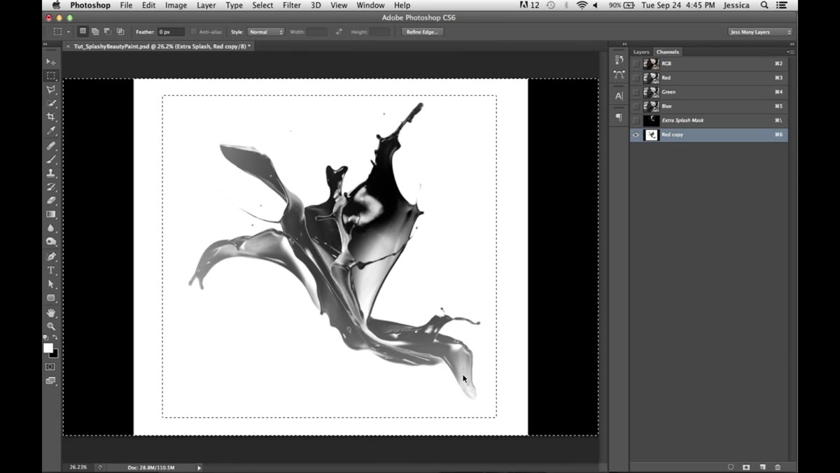 Alpha channel selected, edge areas being filled white
Inspect your new channel. You may find dark or gray areas around the outer edges where the selection didn’t fully reach. Select those areas with any selection tool and fill them with white to push them to full opacity in the final mask. Once the edges are clean, invert the entire channel with Command+I (Ctrl+I). This flips the tonal values so the splash itself becomes light and the surrounding area goes dark, which is the correct orientation for a luminosity-based mask.
Alpha channel selected, edge areas being filled white
Inspect your new channel. You may find dark or gray areas around the outer edges where the selection didn’t fully reach. Select those areas with any selection tool and fill them with white to push them to full opacity in the final mask. Once the edges are clean, invert the entire channel with Command+I (Ctrl+I). This flips the tonal values so the splash itself becomes light and the surrounding area goes dark, which is the correct orientation for a luminosity-based mask.
Step 6: Load the Channel as a Selection
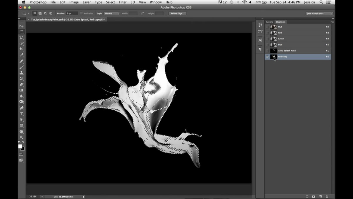 Channel icon being Command-clicked to load selection
Command-click (Ctrl-click) on the channel thumbnail to load it as an active selection. Photoshop reads the grayscale values and converts them into a selection where white equals fully selected, black equals not selected, and all the grays in between become partial selections. The marching ants won’t show you the full complexity of what’s selected, but trust that the subtlety is there. This is the selection that will define how your color splash bleeds into the portrait.
Channel icon being Command-clicked to load selection
Command-click (Ctrl-click) on the channel thumbnail to load it as an active selection. Photoshop reads the grayscale values and converts them into a selection where white equals fully selected, black equals not selected, and all the grays in between become partial selections. The marching ants won’t show you the full complexity of what’s selected, but trust that the subtlety is there. This is the selection that will define how your color splash bleeds into the portrait.
Step 7: Duplicate the Background and Apply the Mask
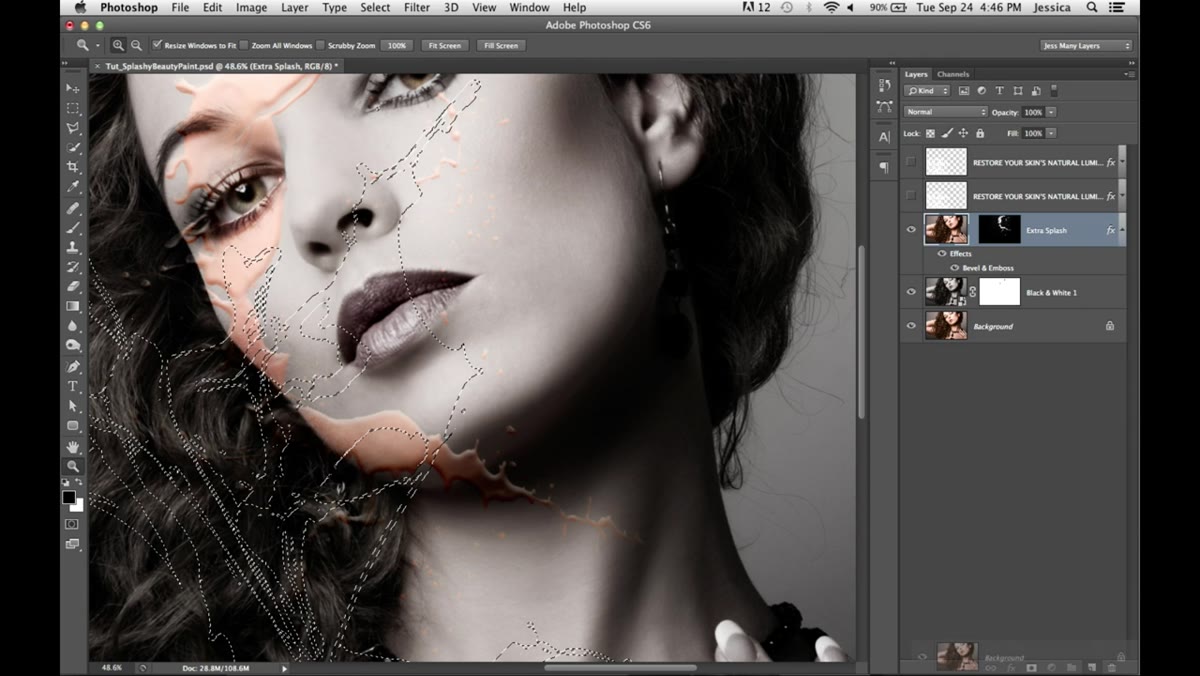 Color layer positioned above black and white, mask applied
Click back on the RGB composite channel and return to your Layers panel. Duplicate your original color splash layer and drag it to the top of the layer stack, above your black-and-white portrait. Keep your channel-based selection active. With the color layer selected, click the Add Layer Mask icon at the bottom of the Layers panel. Photoshop applies the selection directly as a mask. The result is a color splash that fades and flows according to the actual tonal values of the original image, not a hard edge, not a painted border.
Color layer positioned above black and white, mask applied
Click back on the RGB composite channel and return to your Layers panel. Duplicate your original color splash layer and drag it to the top of the layer stack, above your black-and-white portrait. Keep your channel-based selection active. With the color layer selected, click the Add Layer Mask icon at the bottom of the Layers panel. Photoshop applies the selection directly as a mask. The result is a color splash that fades and flows according to the actual tonal values of the original image, not a hard edge, not a painted border.
How I’d Take This Further
The technique as demonstrated is already production-ready, but in my own work I’d push the channel refinement further before applying the mask. After inverting the channel, I’ll often run Curves directly on it, pulling the whites brighter and pushing the darks deeper, to create harder separation in the areas where I want clean color and softer separation where I want the fade. I’ve also done this with multiple splash images stacked at different blend modes, each with its own channel-derived mask. The layering creates a sense of movement that a single splash can’t achieve on its own. If you’re building this for print, that extra refinement matters more than it does for web.
The real lesson in this tutorial isn’t the effect itself. It’s that channels hold information your selections are throwing away. Every time you use a standard selection tool, you’re reducing the image to a binary: in or out. Channels let you work with the full tonal spectrum of an image as a masking engine. Once that clicks, your compositing changes permanently.
Watch the full tutorial on YouTube and follow along with Jessica’s demonstration directly. Seeing the channel values shift in real time reinforces the logic in a way that reading alone won’t.
Comments (3)
This should be required reading for anyone starting out.
Just used this on a wedding shoot edit. Client was thrilled.
Couldn't agree more. I've seen this make a huge difference in landscape work specifically.
Leave a Comment