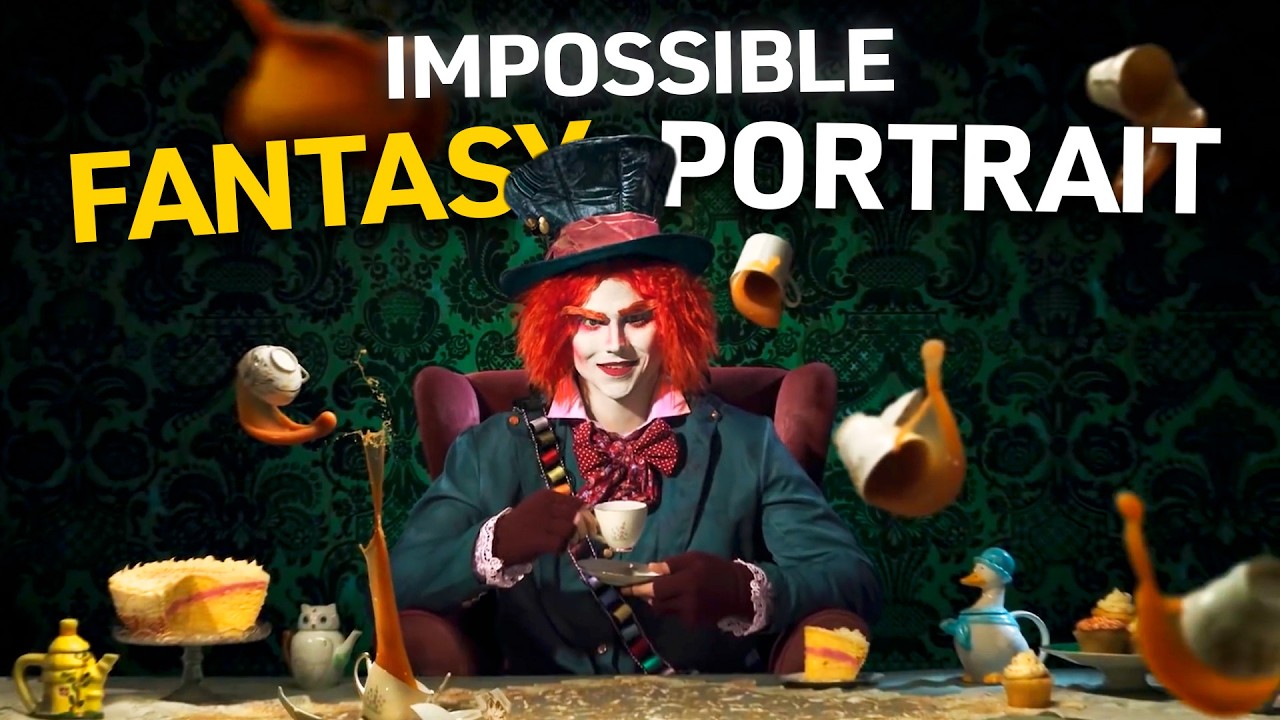
Every composite I’ve ever been proud of started with a problem I didn’t know how to solve. Usually it’s something like: how do I make flying liquid look like it actually belongs in the scene, and not like a PNG I dragged in from a stock site? I’ve spent more hours than I want to admit trying to paint convincing splashes in Photoshop, masking around water that never quite holds its edge, adjusting luminosity until the whole thing reads flat anyway. The honest answer I keep arriving at is that you can’t fully fake physics. At some point, you have to go capture it.
That’s exactly the philosophy behind this Visual Education tutorial on building a Mad Hatter’s Tea Party composite. Watch the full tutorial on YouTube. What makes it worth studying isn’t just the final image, which is genuinely striking. It’s the production thinking that precedes every Photoshop decision. The creator approaches this the way a film unit would approach a practical effects shot: pre-visualization, prop sourcing, costume, set dressing, and multiple rounds of destructive testing before a single hero frame is captured. For anyone building complex composites, this is the methodology that separates work that feels alive from work that looks assembled.
I sketch every composite on paper before I open Photoshop. Some people find that old-fashioned. I find that it forces me to commit to a lighting direction, a focal point, and a list of elements I actually need to shoot or source. This tutorial validated that instinct at every stage.
Step 1: Build a Pre-Visualization Before You Touch a Camera
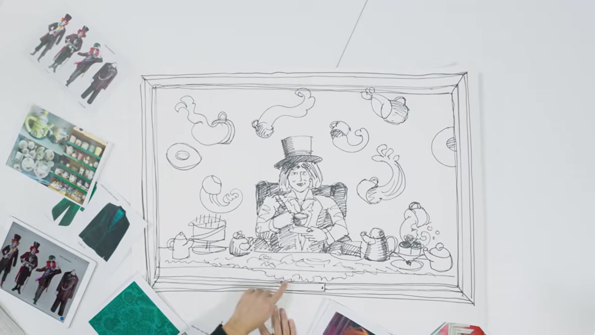 Pre-vis mood board or sketch for the Mad Hatter Tea Party
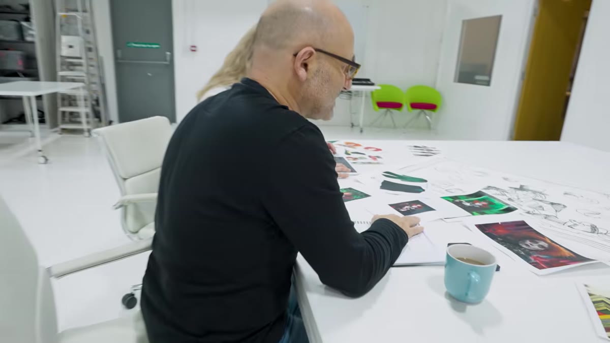
The project begins with a pre-vis session where the creative director walks his team through the intended final image: teacups and teapots suspended in mid-air, liquid arcing through the scene, a central figure with theatrical makeup seated in a painted chair, all framed within a gilded picture frame that appears as a physical prop in the shoot itself. Every element is called out by name before anyone goes shopping.
Pre-vis mood board or sketch for the Mad Hatter Tea Party
The project begins with a pre-vis session where the creative director walks his team through the intended final image: teacups and teapots suspended in mid-air, liquid arcing through the scene, a central figure with theatrical makeup seated in a painted chair, all framed within a gilded picture frame that appears as a physical prop in the shoot itself. Every element is called out by name before anyone goes shopping.
This is the step most compositors skip, and it costs them later. When you pre-visualize, you’re not just making a mood board for inspiration. You’re generating a shopping list, a lighting brief, and a set of constraints that will govern every capture decision downstream. If you know the chair needs to be red to hold against the green damask wallpaper background, you decide that in pre-vis, not while staring at a grey chair on shoot day wondering whether you can fix it in post. Spoiler: you can, but you’ll spend three hours doing it and the result will still be slightly wrong.
Step 2: Source Props with Character, Not Convenience
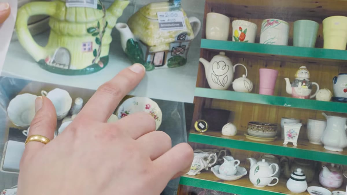 Collection of mismatched teacups and teapots from charity shops
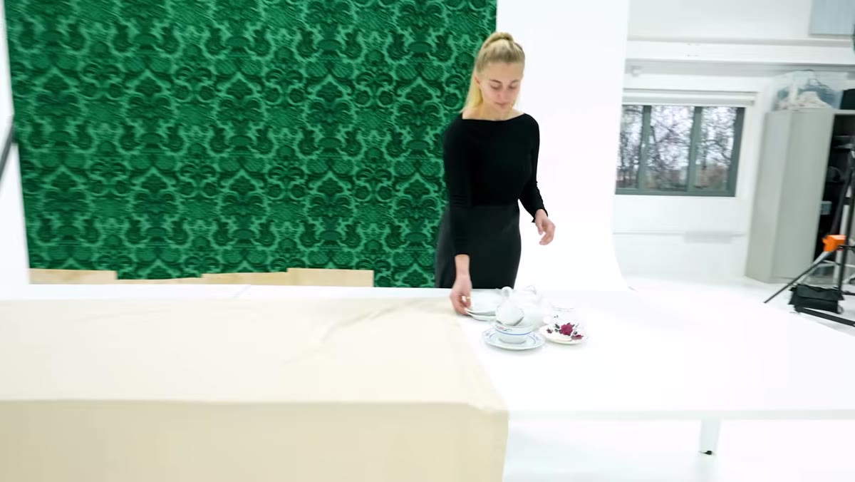
The production team sources teacups and teapots from charity shops rather than buying matching sets, specifically because the quirky, mismatched designs read as more visually interesting and tonally appropriate. The frame is built from cheap wood and painted gold rather than purchased as a finished piece, because a custom build gives exact control over size and weight.
Collection of mismatched teacups and teapots from charity shops
The production team sources teacups and teapots from charity shops rather than buying matching sets, specifically because the quirky, mismatched designs read as more visually interesting and tonally appropriate. The frame is built from cheap wood and painted gold rather than purchased as a finished piece, because a custom build gives exact control over size and weight.
This is a compositing decision dressed up as a prop decision. When you’re planning to isolate objects against a studio background and layer them into a scene, you want shapes with interesting silhouettes and surfaces with real texture. A mass-produced matching tea set gives you repetition and sameness. A collection of odd charity shop finds gives you variety in form, glaze, handle shape, and scale, which means your floating crockery layer will have genuine visual complexity rather than looking like a pattern tile. The homemade frame also allows the team to size it precisely to the compositional frame they’ve pre-visualized, so it functions as an in-camera compositional device rather than an afterthought.
Step 3: Distress Your Set Dressing Practically
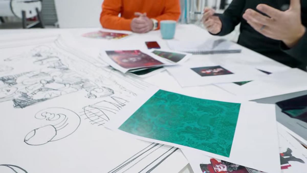 Green damask wallpaper being discussed for background dressing
The background wallpaper is green damask, chosen for its colour contrast with the planned costume. The immediate problem identified in pre-vis is that new wallpaper reads as new wallpaper. The solution proposed and adopted is to stain it with coffee and food before the shoot, adding age and grime that would take considerable time to paint convincingly in post.
Green damask wallpaper being discussed for background dressing
The background wallpaper is green damask, chosen for its colour contrast with the planned costume. The immediate problem identified in pre-vis is that new wallpaper reads as new wallpaper. The solution proposed and adopted is to stain it with coffee and food before the shoot, adding age and grime that would take considerable time to paint convincingly in post.
This is the kind of decision that distinguishes a compositor who has shot their own elements from one who hasn’t. Photoshop’s multiply blending mode and texture overlays can add grime, but they tend to sit on top of a surface rather than sinking into it. Real coffee on real paper has absorption, uneven spread, and tonal variation that reads as genuinely organic. If you’re planning a composite that requires aged or distressed surfaces, always ask whether you can achieve the distressing practically before you reach for an overlay. You’ll save time and gain credibility in the final image.
Step 4: Test Your Practical Effects Destructively and Iterate
 Team testing smashing crockery for height and spray dynamics
This is the section of the tutorial I found most useful and most honest. The team runs multiple rounds of smashing tests before the actual shoot: dropping teapots from various heights, experimenting with ladder positions, evaluating the height and spread of the shatter and liquid spray. Initial tests don’t produce enough vertical throw. They escalate, bring in more height, and keep evaluating until the physics produce what the pre-vis calls for.
Team testing smashing crockery for height and spray dynamics
This is the section of the tutorial I found most useful and most honest. The team runs multiple rounds of smashing tests before the actual shoot: dropping teapots from various heights, experimenting with ladder positions, evaluating the height and spread of the shatter and liquid spray. Initial tests don’t produce enough vertical throw. They escalate, bring in more height, and keep evaluating until the physics produce what the pre-vis calls for.
Two things to take from this. First, practical effects testing is iterative, not one-and-done. Budget for failure. Budget for a second ladder. Budget for broken crockery that doesn’t photograph the way you imagined. Second, the team makes a critical compositional observation during testing: pieces that hit the table don’t bounce dramatically, but the liquid that escapes on impact is spectacular on its own. They adjust their expectations around what each type of capture will contribute to the final image. That’s real pre-production thinking. You capture what physics actually gives you, and you build the composite around honest elements rather than fighting to manufacture something that the real world won’t produce.
Step 5: Plan Makeup and Costume as Compositional Elements
 Discussion of theatrical makeup with heavy eye color and whitened face
The costume and makeup direction is locked during pre-vis and treated with the same weight as lighting or set design. The brief calls for heavy colour around the eyes and lips, with a fully whitened face, because the pale base creates graphic contrast that reads clearly against the busy background and props. The costume design is chosen to complement rather than compete with the green wallpaper.
Discussion of theatrical makeup with heavy eye color and whitened face
The costume and makeup direction is locked during pre-vis and treated with the same weight as lighting or set design. The brief calls for heavy colour around the eyes and lips, with a fully whitened face, because the pale base creates graphic contrast that reads clearly against the busy background and props. The costume design is chosen to complement rather than compete with the green wallpaper.
In compositing terms, this is about managing visual hierarchy across a layered image. Your subject needs to read first. If the costume, the background, and the flying props all compete for attention at the same tonal and saturation level, the image becomes noise. The whitened face creates a near-neutral anchor in the centre of the frame that the eye finds immediately, which means all the surrounding chaos becomes context rather than competition.
What I’d Add from My Own Practice
The one thing I don’t see explicitly addressed here, and it’s something I learned the hard way early in my career, is establishing a single light source direction before any element is captured and committing to it across every session. If your hero shot is lit from camera left at roughly 45 degrees, your crockery smash tests, your prop captures, and your background all need to share that logic. Inconsistent light directions are the thing that makes a technically accomplished composite feel slightly off without the viewer being able to say why. Write the light direction on a piece of tape and stick it to your monitor for the duration of the project.
The central lesson of this tutorial isn’t about Alice in Wonderland or tea parties. It’s that the most convincing composites are built on real physics, captured practically, before Photoshop ever opens. Plan obsessively. Break things deliberately. Shoot what reality gives you, not what you wish it would give you. The digital work becomes easier, faster, and more convincing when the raw material is honest.
Watch the full tutorial on YouTube and pay particular attention to the testing sequences. That’s where the real education is.
Comments (7)
Clear and practical. No fluff. Appreciate that.
I've watched a dozen tutorials on this and yours is the clearest by far.
This is going in my reference folder. Incredibly useful.
This saved me so much time on my last edit. Wish I'd found this sooner.
Been doing this wrong for years apparently. Thanks for the wake-up call.
This is going in my reference folder. Incredibly useful.
Love this. I referenced a similar technique in one of my recent posts. Always good to see other perspectives.
Leave a Comment