Light Matching in Photo Composites: The Foundation of Believable Manipulations
I spent three days perfecting a composite once—color-correcting every pixel, blending edges seamlessly, adjusting shadows with surgical precision. When I stepped back, something felt fundamentally wrong. The subject looked pasted into the scene, lifeless, impossible. I’d ignored the most critical rule: the light source wasn’t matching.
That mistake taught me that light matching isn’t just another post-production step. It’s the invisible foundation that separates professional composites from obvious fakes. Without it, even flawless technical work fails.
Understanding the Light Story
Every photograph tells a light story. A key light establishes direction. A fill light softens shadows. The background receives its own illumination. When you composite elements from different sources, you’re essentially asking them to share the same story—and audiences have finely tuned BS detectors for photographs that don’t.
The challenge is that light matching requires you to observe and recreate something largely invisible to the untrained eye. You’re not just matching brightness; you’re matching direction, quality, color temperature, and the subtle way light wraps around three-dimensional forms.
Step One: Identify Your Light Sources
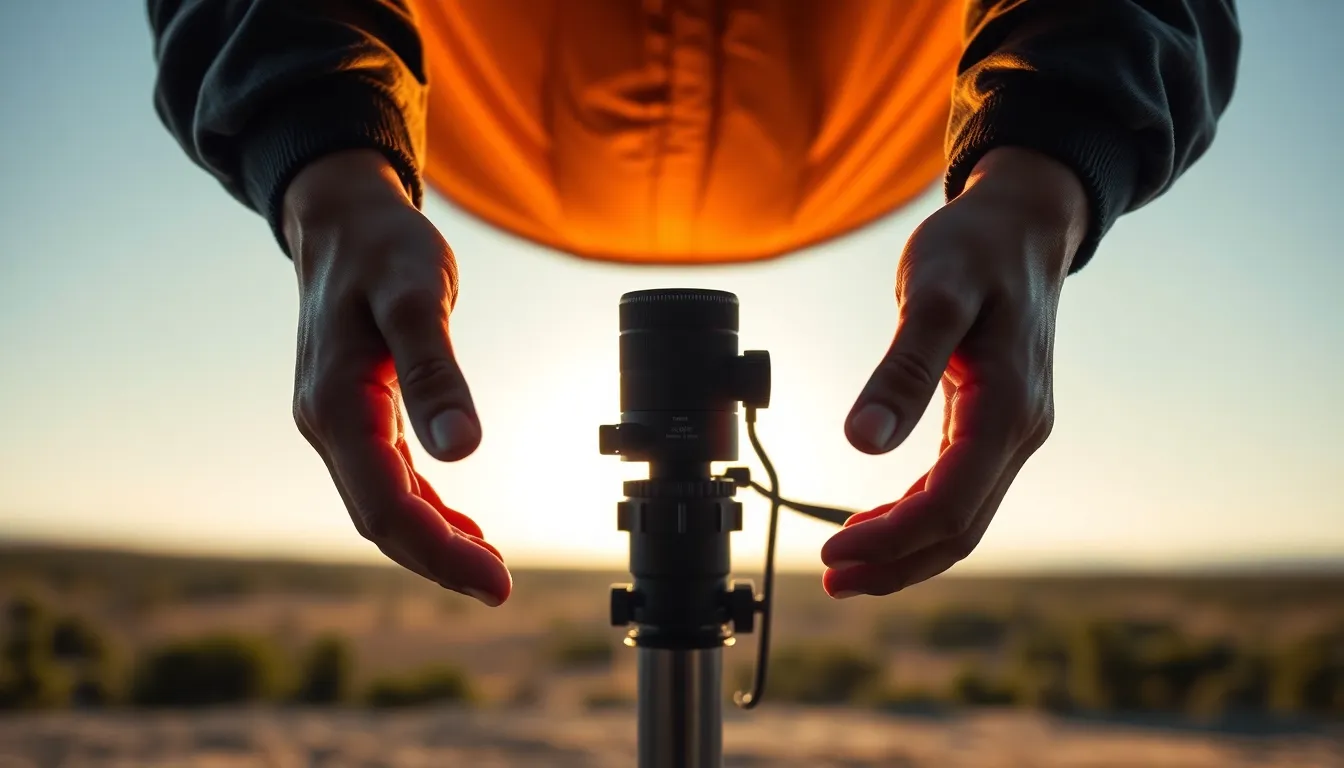
Before touching Photoshop or Lightroom, study both your background plate and your element as a detective. Where does the main light come from? Look at the shadows on your subject’s face or body. Shadows point backward toward the light source. If your background shows light from the left but your composited subject has shadows indicating light from the right, the viewer immediately senses something’s amiss.
I examine highlights on eyes and reflective surfaces first—these reveal light direction most clearly. Then I trace shadow patterns across the entire subject. A subtle shadow under a nose, the way cheekbones catch light, the direction of hair rim-lighting—all these details tell the truth about where light actually traveled.
Matching Direction and Quality
Once I’ve identified the light direction in both images, I adjust my composite element’s lighting to match. In Photoshop, this usually means using Dodge and Burn tools subtly, or creating shadow layers to strengthen existing shadows on the correct side of the face.
Light quality matters equally. Hard light from a small, distant source creates sharp shadows with distinct edges. Soft light from a large, close source creates diffuse, gradual shadows. Studio flash produces different quality than window light, which differs from overcast daylight. If your background shows soft, diffuse shadows but your composited element has hard-edged shadows, the mismatch screams artificiality.
Check your subject’s rim lighting—that bright edge that appears when light grazes the side of an object. If your background plate has rim lighting from the left, your composited subject needs identical rim lighting from the same direction.
Color Temperature Alignment
Light isn’t colorless. Window light leans cool. Tungsten bulbs lean warm. Sunset light is orange. Golden hour is different from midday. I always sample the color cast in the background using the eyedropper tool and cross-reference it against my composited element.
If your background is lit by cool, northern daylight but your subject appears warm and golden, they’re visibly in different locations. Adjust your element’s color temperature using Curves or Color Balance layers to match the surrounding light environment.
The Shadow Test
Here’s my final check: do the shadows make sense physically? If strong directional light from the left creates a sharp shadow on your subject, that same shadow should be visible on objects near them in the background. Conversely, if background shadows are soft and scattered, your element’s shadows should be similarly diffuse.
Light matching transforms composites from digitally constructed to photographically believable. It’s meticulous work, but it’s where the magic happens.
Comments
Leave a Comment