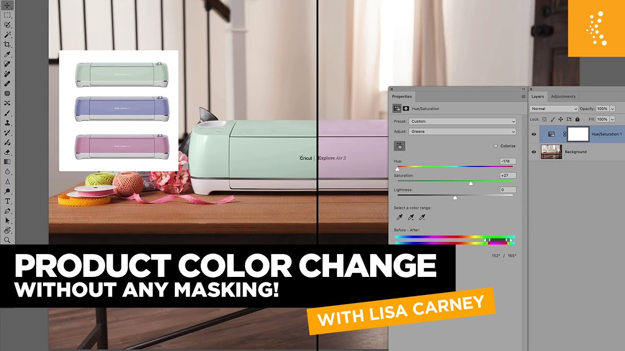
Every product campaign I’ve worked on eventually surfaces the same request: “Can we see it in three more colorways?” Sometimes the client has shots of each variant. More often, they don’t. You’re left with one hero image and a brief that wants five colors. For years my answer was masking, selection refining, layer juggling. It worked, but it was slow, and doing it cleanly across a whole campaign was the kind of job that made me question my life choices.
This KelbyOne tutorial with Lisa Carney reframed how I think about that problem entirely. Watch the full tutorial on YouTube. The core idea is simple: if your product was shot correctly, Photoshop’s Hue/Saturation adjustment layer already knows what colors belong to it. You don’t need to tell it with a mask. You just need to know where to click.
What Carney demonstrates here isn’t a workaround or a trick. It’s a smarter use of a tool most of us have been using at only a fraction of its capability. I’ve been compositing professionally for over a decade and I still picked up something I wasn’t fully leveraging. Here’s the walkthrough.
Step 1: Add a Hue/Saturation Adjustment Layer
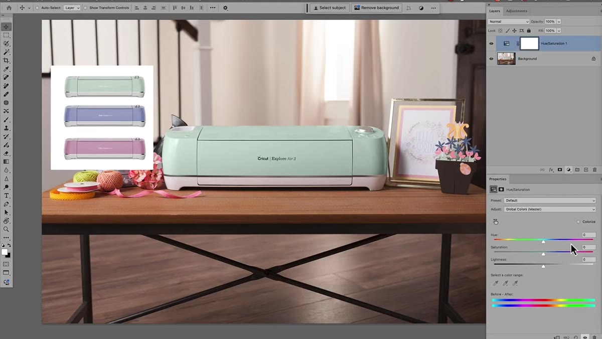 Hue Saturation adjustment layer added in Properties panel
Start by adding a Hue/Saturation adjustment layer above your product layer. Don’t touch the Hue slider yet. The default behavior shifts every color in the image at once, which is not what you want. If you’ve ever dragged that master Hue slider and watched your entire photo go psychedelic, you know the problem. The adjustment layer is just the entry point. The real work happens in the next step.
Hue Saturation adjustment layer added in Properties panel
Start by adding a Hue/Saturation adjustment layer above your product layer. Don’t touch the Hue slider yet. The default behavior shifts every color in the image at once, which is not what you want. If you’ve ever dragged that master Hue slider and watched your entire photo go psychedelic, you know the problem. The adjustment layer is just the entry point. The real work happens in the next step.
Step 2: Activate the Targeted Adjustment Tool
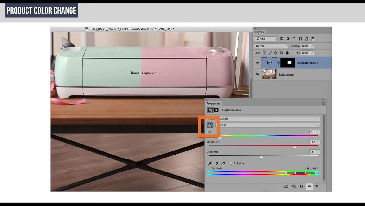 Targeted color button highlighted in Hue Saturation Properties panel
Inside the Properties panel for your Hue/Saturation layer, there’s a small icon in the upper left area of the panel that looks like a finger pointing at a gradient bar. This is the Targeted Adjustment tool, sometimes called the targeted image color picker. Click it. Now move your cursor over the image. When you click directly on your product, Photoshop samples the color under your cursor and automatically switches the active channel in the Properties panel to match. Click on a mint green bag and it jumps to Greens. Click on a red background and it selects Reds. No manual dropdown hunting required.
Targeted color button highlighted in Hue Saturation Properties panel
Inside the Properties panel for your Hue/Saturation layer, there’s a small icon in the upper left area of the panel that looks like a finger pointing at a gradient bar. This is the Targeted Adjustment tool, sometimes called the targeted image color picker. Click it. Now move your cursor over the image. When you click directly on your product, Photoshop samples the color under your cursor and automatically switches the active channel in the Properties panel to match. Click on a mint green bag and it jumps to Greens. Click on a red background and it selects Reds. No manual dropdown hunting required.
Step 3: Read the Color Range Bar at the Bottom
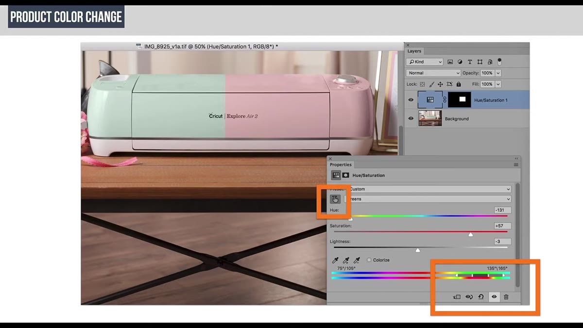 Before and after color gradient bars shown at panel bottom
Before you start shifting anything, look at the gradient bar running along the bottom of the Properties panel. There are two gradient strips. The top one shows the original color spectrum. The bottom one updates in real time to reflect where those colors are being shifted. The shaded region with the vertical bars shows the range of colors being affected. This is your map. You want to understand what the adjustment is targeting before you start moving sliders. Carney specifically calls this out, and it’s worth pausing on because most people blow right past it.
Before and after color gradient bars shown at panel bottom
Before you start shifting anything, look at the gradient bar running along the bottom of the Properties panel. There are two gradient strips. The top one shows the original color spectrum. The bottom one updates in real time to reflect where those colors are being shifted. The shaded region with the vertical bars shows the range of colors being affected. This is your map. You want to understand what the adjustment is targeting before you start moving sliders. Carney specifically calls this out, and it’s worth pausing on because most people blow right past it.
Step 4: Shift the Hue to the Target Color
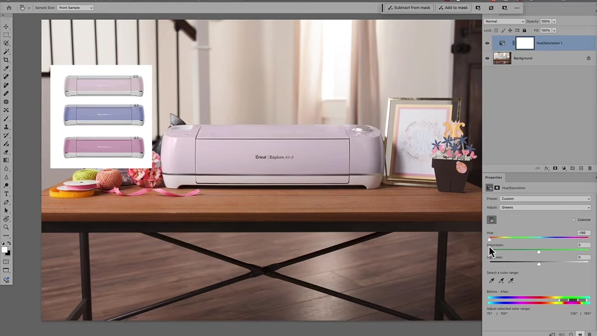 Hue slider being dragged to shift greens toward purple
With the correct color channel selected automatically by the targeted tool, drag the Hue slider. You’ll see your product color move through the spectrum. If your client needs the mint green version recolored to a warm purple, drag until you hit it. If the result looks washed out, bump the Saturation slider up. The adjustment is non-destructive and lives entirely on the adjustment layer, so you can revise it at any point. One layer per colorway is all you need. Toggle the layer visibility on and off to compare.
Hue slider being dragged to shift greens toward purple
With the correct color channel selected automatically by the targeted tool, drag the Hue slider. You’ll see your product color move through the spectrum. If your client needs the mint green version recolored to a warm purple, drag until you hit it. If the result looks washed out, bump the Saturation slider up. The adjustment is non-destructive and lives entirely on the adjustment layer, so you can revise it at any point. One layer per colorway is all you need. Toggle the layer visibility on and off to compare.
Step 5: Understand the Shoot Requirements for This Technique
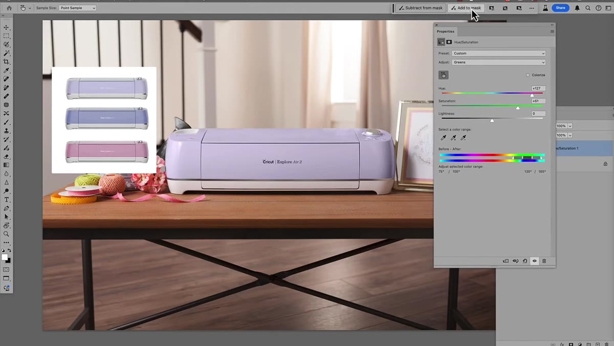 Attempting to shift reds in image affecting unintended areas
Here is the part of Carney’s tutorial that I think matters most, and it’s not a Photoshop step. It’s a production planning note. This technique only works cleanly when the product color is isolated enough in the image’s color space to be targeted without hitting other elements. She demonstrates what happens when you try to recolor a product that shares its hue with other things in the frame. You try to shift the reds in the product and suddenly the model’s skin tones are shifting too. The image has to be set up for this approach before it’s shot. If you’re advising a client or art directing a shoot, that conversation needs to happen before the photographer presses the shutter.
Attempting to shift reds in image affecting unintended areas
Here is the part of Carney’s tutorial that I think matters most, and it’s not a Photoshop step. It’s a production planning note. This technique only works cleanly when the product color is isolated enough in the image’s color space to be targeted without hitting other elements. She demonstrates what happens when you try to recolor a product that shares its hue with other things in the frame. You try to shift the reds in the product and suddenly the model’s skin tones are shifting too. The image has to be set up for this approach before it’s shot. If you’re advising a client or art directing a shoot, that conversation needs to happen before the photographer presses the shutter.
Step 6: Adjust the Range Sliders for Broader or Narrower Targeting
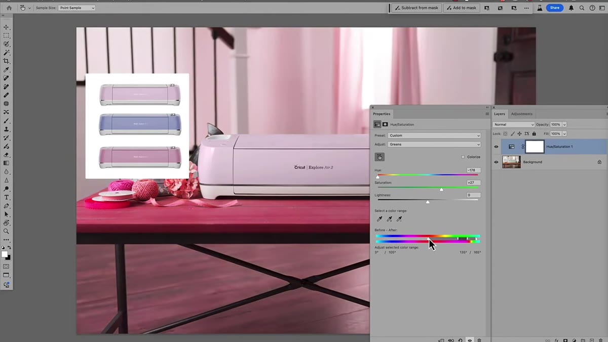 Range slider handles being dragged to widen color selection
On either side of the shaded color range region in the gradient bar, there are small vertical handles. Dragging these outward expands the range of colors the adjustment affects. Dragging them inward tightens it. If part of your product isn’t picking up the color shift, widen the range. If the adjustment is bleeding into areas you don’t want affected, narrow it. Carney notes that you can pull these in a single direction, so you have asymmetrical control. This is the fine-tuning step that separates a sloppy recolor from one that holds up at large format.
Range slider handles being dragged to widen color selection
On either side of the shaded color range region in the gradient bar, there are small vertical handles. Dragging these outward expands the range of colors the adjustment affects. Dragging them inward tightens it. If part of your product isn’t picking up the color shift, widen the range. If the adjustment is bleeding into areas you don’t want affected, narrow it. Carney notes that you can pull these in a single direction, so you have asymmetrical control. This is the fine-tuning step that separates a sloppy recolor from one that holds up at large format.
Step 7: Handle Problem Areas Without Masking
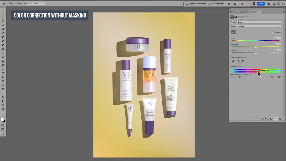 Color shift bleeding into product area during background recolor
The second product example in the tutorial introduces a realistic complication: recoloring a background when the background’s color partially overlaps with the product sitting in front of it. Carney’s approach is to use the same targeted tool, sample the background color, and widen or narrow the range handles to get as much coverage as possible without pulling in the product too aggressively. If some color contamination remains, the adjustment mask on the layer, which is generated automatically, can be painted on with a soft brush in just the areas where you need to exclude something. The mask becomes surgical touch-up rather than the primary method.
Color shift bleeding into product area during background recolor
The second product example in the tutorial introduces a realistic complication: recoloring a background when the background’s color partially overlaps with the product sitting in front of it. Carney’s approach is to use the same targeted tool, sample the background color, and widen or narrow the range handles to get as much coverage as possible without pulling in the product too aggressively. If some color contamination remains, the adjustment mask on the layer, which is generated automatically, can be painted on with a soft brush in just the areas where you need to exclude something. The mask becomes surgical touch-up rather than the primary method.
A Note on Shooting for the Edit
The technique Carney teaches reinforces something I try to say whenever I’m brought into a project early enough to matter: the composite starts at the shoot. I’ve sat in on enough post-production scrambles to know that problems which look like editing problems are often actually planning problems. When a client wants five colorways and only budgeted for one hero shot, this Hue/Saturation approach is a lifeline. But it only holds if the photographer chose a wardrobe, background, and lighting setup that keeps the product color reasonably isolated in the image’s hue space.
For my own work, I’ve started including a short note in my project briefs whenever I know a color variant campaign is coming. I flag which hues in the frame might conflict with the product, and I ask the photographer to avoid them if possible. An orange bag shot against a warm brown background is going to create headaches in post. The same bag shot against a muted gray or cool blue is going to be clean. That’s the kind of upstream thinking that keeps an editing session from turning into a frustrating hour of mask refinement.
The single most important thing this tutorial taught me is that the targeted adjustment tool does the selection work you used to do manually, as long as the image gives it a fair shot. When the color you want to change is distinct in the frame, the tool is faster, more flexible, and just as precise as any mask you’d paint by hand. Build that into how you plan shoots, and you’re not just saving time in post. You’re working smarter across the whole pipeline.
Watch the full tutorial on YouTube to see Lisa Carney walk through both product examples with the panels visible. Her pacing is clear and the second example especially is worth watching in motion.
Comments (3)
Never thought of approaching it this way. Really creative.
I've watched a dozen tutorials on this and yours is the clearest by far.
Great article! I actually covered something related on my site — the retouching angle is really complementary to this.
Leave a Comment