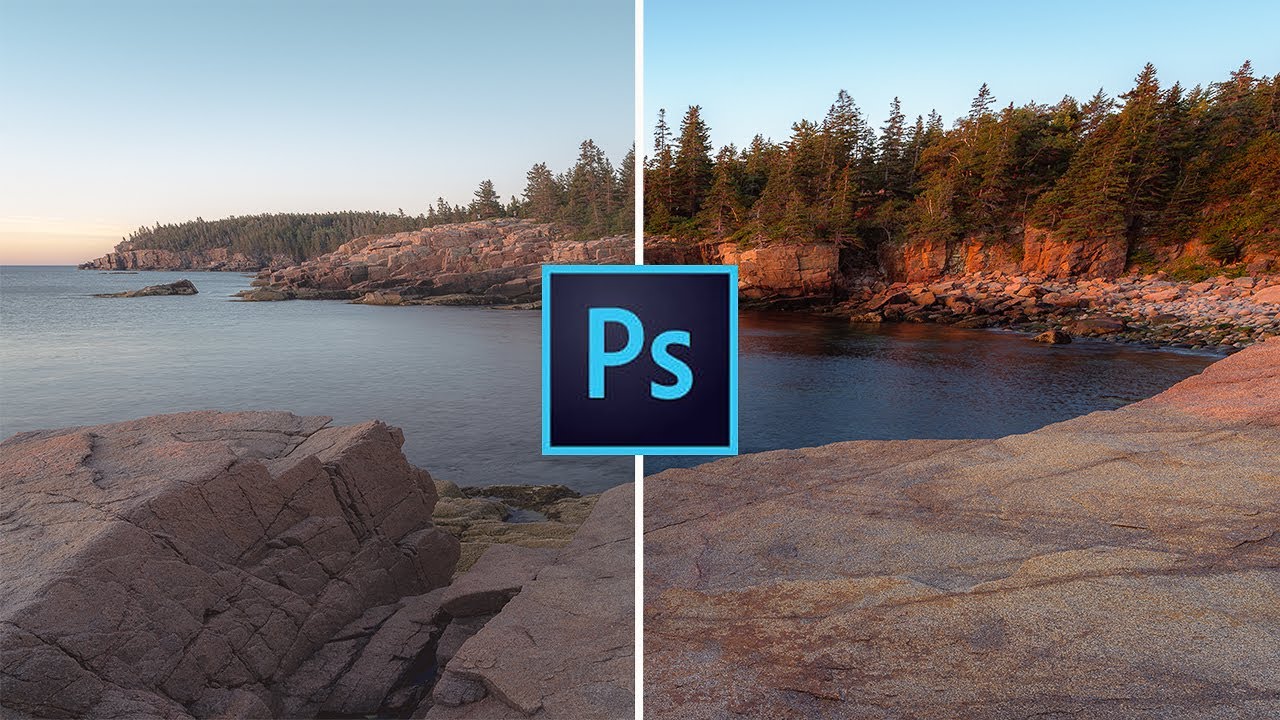
I keep a folder on my desktop called “failures.” Every month I open it and sit with the work I got wrong. It is not a pleasant exercise, but it is an honest one, and over the years it has taught me more than any single tutorial. The images from my first two years of compositing are in there, and the thing that embarrasses me most about them is not the obvious stuff, the sloppy selections or the mismatched grain. It is the contrast. Everything is either flat and lifeless or crushed and muddy, because I was treating contrast like a light switch instead of a scalpel.
Watch the full tutorial on YouTube
That blunt-instrument approach is exactly what landscape photographer Mark Denney describes at the opening of this tutorial, and it is the reason I kept watching. He talks about going back to his early work and cringing at how he used to throw the Lightroom contrast slider hard to the right and hope for the best. I did the same thing in Photoshop, except I used Curves adjustments applied to the entire image with no masks at all. The result was contrast that fought the image rather than served it. Luminosity masks fixed that for me, and in this Mark Denney tutorial on adding contrast with luminosity masks, he lays out exactly why and how. What follows is my breakdown of his process, written for anyone who works in Photoshop and wants contrast that feels like it belongs to the image.
Step 1: Install a Luminosity Masking Plugin
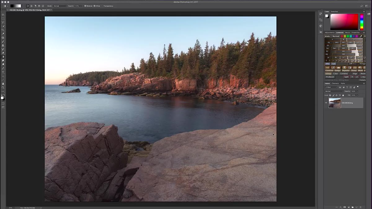 Plugin options listed: TK Actions, Lumenzia, Raya Pro
Before anything else, you need a luminosity masking panel. Denney points to three of the most established options: Tony Kuyper’s TK Actions, Greg Benz’s Lumenzia, and Jimmy McIntyre’s Raya Pro. Raya Pro offers a free version, which is the one Denney started with, and it is more than sufficient for learning this workflow. All three install as Photoshop panels. Download, follow the site’s installation instructions, restart Photoshop, and the panel appears in your Window menu. This takes under ten minutes.
Plugin options listed: TK Actions, Lumenzia, Raya Pro
Before anything else, you need a luminosity masking panel. Denney points to three of the most established options: Tony Kuyper’s TK Actions, Greg Benz’s Lumenzia, and Jimmy McIntyre’s Raya Pro. Raya Pro offers a free version, which is the one Denney started with, and it is more than sufficient for learning this workflow. All three install as Photoshop panels. Download, follow the site’s installation instructions, restart Photoshop, and the panel appears in your Window menu. This takes under ten minutes.
The choice between them matters less than actually picking one and committing to it. I use Lumenzia in my own compositing work because of how quickly I can build intersected masks, but for the technique Denney is teaching here, any of the three will do the job identically.
Step 2: Understand How Luminosity Masks Are Structured
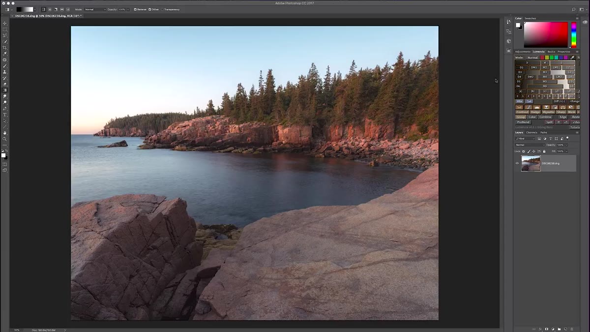 Plugin panel showing darks, midtones, and lights categories
Every luminosity masking plugin is organized around the same underlying logic: the tonal range of your image divided into darks, midtones, and lights, with each category broken into graduated levels. Denney’s panel shows these as D1 through D6 on the dark side and L1 through L6 on the light side, where the number indicates how selective the mask is. D6 isolates only the very deepest shadows. D2 starts pulling in areas that are dark but not extreme.
Plugin panel showing darks, midtones, and lights categories
Every luminosity masking plugin is organized around the same underlying logic: the tonal range of your image divided into darks, midtones, and lights, with each category broken into graduated levels. Denney’s panel shows these as D1 through D6 on the dark side and L1 through L6 on the light side, where the number indicates how selective the mask is. D6 isolates only the very deepest shadows. D2 starts pulling in areas that are dark but not extreme.
The key principle to hold onto here is that white reveals and black conceals. When you load one of these masks, the white areas of the mask correspond to the tonal region you selected. Everything the mask shows in white is where any adjustment you make will be applied. The mask is not a selection you drew by hand. It is generated directly from the luminance values of the pixels themselves, which means it transitions smoothly across tonal boundaries rather than cutting hard at an edge.
Step 3: Preview the Dark and Light Masks on Your Image
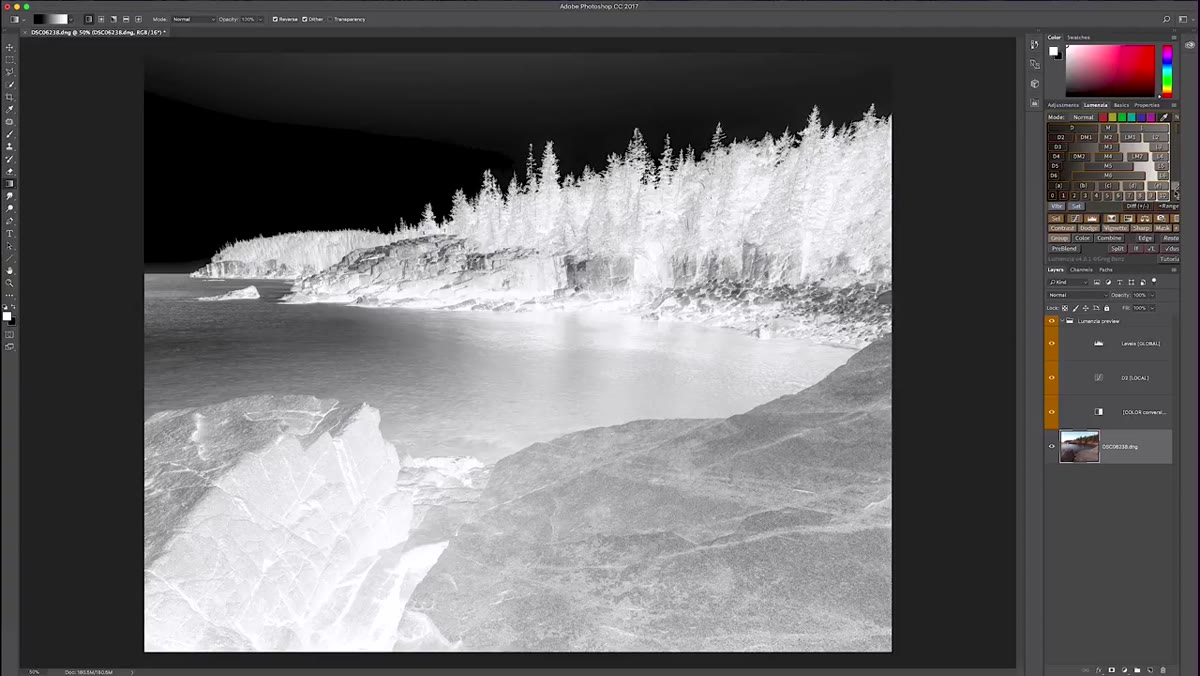
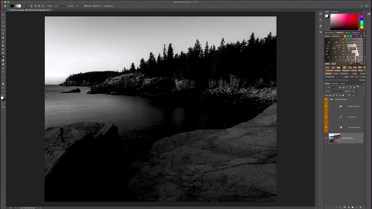
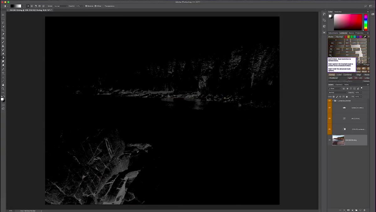 D6 mask loaded, darkest image areas shown in white
Click through several mask levels before you commit to one. Denney demonstrates this by loading D6 and showing how only the absolute darkest parts of the image appear white. Moving to D4, the mask expands slightly. At D2, even some moderately dark areas including parts of the sky begin to show. Then he switches to the light side: L6 isolates only the brightest zones, in his image the area where the sun is rising, while L5 begins to include more of the surrounding bright sky.
D6 mask loaded, darkest image areas shown in white
Click through several mask levels before you commit to one. Denney demonstrates this by loading D6 and showing how only the absolute darkest parts of the image appear white. Moving to D4, the mask expands slightly. At D2, even some moderately dark areas including parts of the sky begin to show. Then he switches to the light side: L6 isolates only the brightest zones, in his image the area where the sun is rising, while L5 begins to include more of the surrounding bright sky.
This previewing step is not optional. I spend real time here on every image, because the mask you choose determines where your contrast enhancement actually lands. If you pick a mask that is too broad, you lose the precision that makes luminosity masking worth using in the first place. Click each level, look at the distribution of white in the preview, and find the one that corresponds most closely to the tonal region you want to target.
Step 4: Apply a Curves Adjustment with Your Chosen Mask
 Curves adjustment layer created with luminosity mask applied
Once you have identified the mask that isolates the region you want to work with, apply it to a Curves adjustment layer. In Photoshop, create a new Curves adjustment layer, then load the luminosity mask into the layer mask by holding Alt and clicking the layer mask thumbnail while the mask channel is active, or use the plugin’s direct-to-layer function if it has one. The adjustment layer now only affects the pixels the mask has selected.
Curves adjustment layer created with luminosity mask applied
Once you have identified the mask that isolates the region you want to work with, apply it to a Curves adjustment layer. In Photoshop, create a new Curves adjustment layer, then load the luminosity mask into the layer mask by holding Alt and clicking the layer mask thumbnail while the mask channel is active, or use the plugin’s direct-to-layer function if it has one. The adjustment layer now only affects the pixels the mask has selected.
On the dark side, pull the curve down slightly in the shadows to deepen them. On the light side, with a lights mask applied, pull the bright midpoint of the curve upward to lift the highlights. The result is contrast that is added specifically where the image already has tonal separation, which means you are enhancing what the light actually did rather than applying a generic S-curve over everything.
Step 5: Adjust Mask Opacity and Layer Opacity for Subtlety
 Adjustment layer opacity slider being reduced
Luminosity masks are precise, but they are not always subtle at full strength. After applying the Curves adjustment, reduce the layer opacity to dial in the effect. Denney treats this as a standard part of the workflow rather than a correction. Starting at 100% opacity and backing off gives you a reference point: you can see the full effect and then moderate it to taste.
Adjustment layer opacity slider being reduced
Luminosity masks are precise, but they are not always subtle at full strength. After applying the Curves adjustment, reduce the layer opacity to dial in the effect. Denney treats this as a standard part of the workflow rather than a correction. Starting at 100% opacity and backing off gives you a reference point: you can see the full effect and then moderate it to taste.
If the mask itself feels slightly too broad or too narrow, you can also paint on the layer mask in white or black with a low-opacity soft brush to refine the transition areas. This is where the combination of luminosity precision and manual control becomes genuinely powerful.
A Note From My Own Practice
In compositing, I use this same approach to add depth to elements that were shot under flat studio lighting and need to feel like they exist in a scene with directional light. A luminosity mask on the shadow values of a figure, paired with a subtle Curves pull-down, reads as ambient occlusion without requiring any 3D rendering. The mask respects the existing tonal structure of the element and makes the added darkness look earned rather than painted on. That is the same principle Denney is applying to his landscapes: work with the luminance information that is already there, and the contrast you add will look like it was always part of the image.
The single most transferable idea from Denney’s tutorial is that contrast is a tonal relationship, not a global setting. Dragging a slider moves everything at once. A luminosity mask lets you move only the parts of the image that should move, which is the difference between an image that feels alive and one that feels processed. The technique is learnable in an afternoon and useful in almost every genre of photography and compositing.
Watch the full tutorial on YouTube to see Denney walk through this on an actual landscape image with the plugin panel open the whole time.
Comments
Leave a Comment