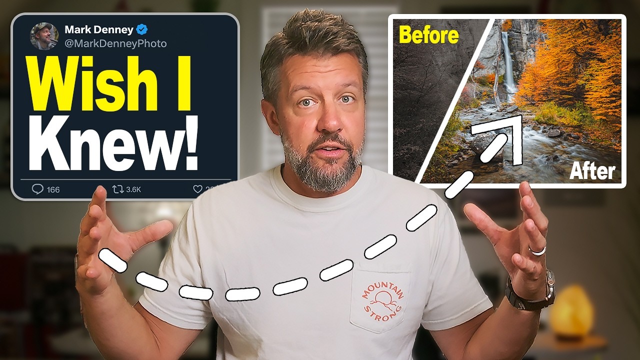
There’s a particular kind of frustration that hits after you’ve spent an hour on an image and it still looks wrong. You’ve moved every slider in the Basic panel. The histogram looks reasonable. The white balance is dialed. And yet the photo feels like a photocopy of what you saw. I know that feeling from my compositing work, where the difference between something that reads as real and something that reads as “digital” almost always comes down to localized light and shadow control, not global corrections. You can’t make a foreground rock feel grounded with a global shadows slider. You need to treat it like the specific object it is.
That’s exactly the problem Mark Denney addresses in this tutorial, which focuses on five Lightroom masks he now applies to every image he edits. Watch the full tutorial on YouTube. His framework maps almost perfectly onto how I think about separation in compositing work, where every element in a scene needs to feel like it belongs to its own light environment before the whole thing holds together. The tools are different, the language is different, but the underlying logic is identical. And his breakdown of the thinking behind each step, not just the settings, is what makes this one worth studying.
Step 1: Use Object Selection to Isolate Your Foreground Anchor
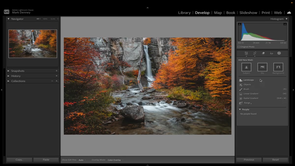 Drawing a marquee around the foreground rock in Lightroom
In Lightroom’s Masking panel, the Object Selection tool lets you draw a rough rectangle around any subject and lets the software identify the edges automatically. Mark demonstrates this on a prominent foreground rock in his Patagonia waterfall image. The goal is not a perfect mask on the first pass but a usable starting selection you can refine. After drawing the marquee, he boosts exposure, increases contrast, lifts the shadows, nudges the white point up, and adds both texture and clarity to make the rock visually separate from the rest of the scene.
Drawing a marquee around the foreground rock in Lightroom
In Lightroom’s Masking panel, the Object Selection tool lets you draw a rough rectangle around any subject and lets the software identify the edges automatically. Mark demonstrates this on a prominent foreground rock in his Patagonia waterfall image. The goal is not a perfect mask on the first pass but a usable starting selection you can refine. After drawing the marquee, he boosts exposure, increases contrast, lifts the shadows, nudges the white point up, and adds both texture and clarity to make the rock visually separate from the rest of the scene.
The logic here is sound regardless of your subject. A foreground element without its own tonal treatment will always feel pasted in, whether you’re editing a landscape or assembling a composite. Treat it like a layer with its own light source.
Step 2: Subtract by Color Range to Refine the Mask
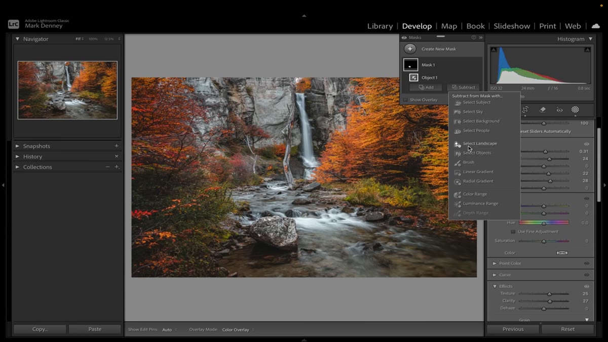 Using Subtract Color Range to clean up the rock selection
Once the initial object selection is applied, Mark zooms in and uses the Subtract by Color Range option to remove colors from the mask that don’t belong there. Practically, this means clicking on the colors inside your selection that are actually part of the background or other elements you don’t want affected. Lightroom removes those hues from the masked region, sharpening the boundary without manual brushwork.
Using Subtract Color Range to clean up the rock selection
Once the initial object selection is applied, Mark zooms in and uses the Subtract by Color Range option to remove colors from the mask that don’t belong there. Practically, this means clicking on the colors inside your selection that are actually part of the background or other elements you don’t want affected. Lightroom removes those hues from the masked region, sharpening the boundary without manual brushwork.
This is one of the more underused tools in the panel. When I’m working in Photoshop and a selection is bleeding into adjacent colors, I reach for Select and Mask or Color Range automatically. The Lightroom equivalent is faster for raw files and doesn’t require jumping into a separate workspace. The result is a mask that actually follows the physics of the scene rather than a geometric approximation of it.
Step 3: Apply a Linear Gradient to the Sky
 Adding a Linear Gradient mask across the upper sky region
Mark’s second major mask is a Linear Gradient targeted at the sky. He pulls the highlights down and brings in some blue saturation to add depth and separation from the midtones. The key is keeping the transition zone natural so the gradient doesn’t produce a hard line where it meets the treeline or horizon.
Adding a Linear Gradient mask across the upper sky region
Mark’s second major mask is a Linear Gradient targeted at the sky. He pulls the highlights down and brings in some blue saturation to add depth and separation from the midtones. The key is keeping the transition zone natural so the gradient doesn’t produce a hard line where it meets the treeline or horizon.
For anyone coming from compositing, this is the same principle as a luminosity dodge and burn pass on a sky layer. You’re not just darkening the top of the frame, you’re restoring the sky’s natural behavior as a light source rather than a blown-out region. A flat sky in a landscape image is the equivalent of a composite where you forgot to put a rim light on your subject. The scene won’t cohere.
Step 4: Target the Shadows with a Luminance Range Mask
 Luminance Range mask isolating the darkest shadow areas
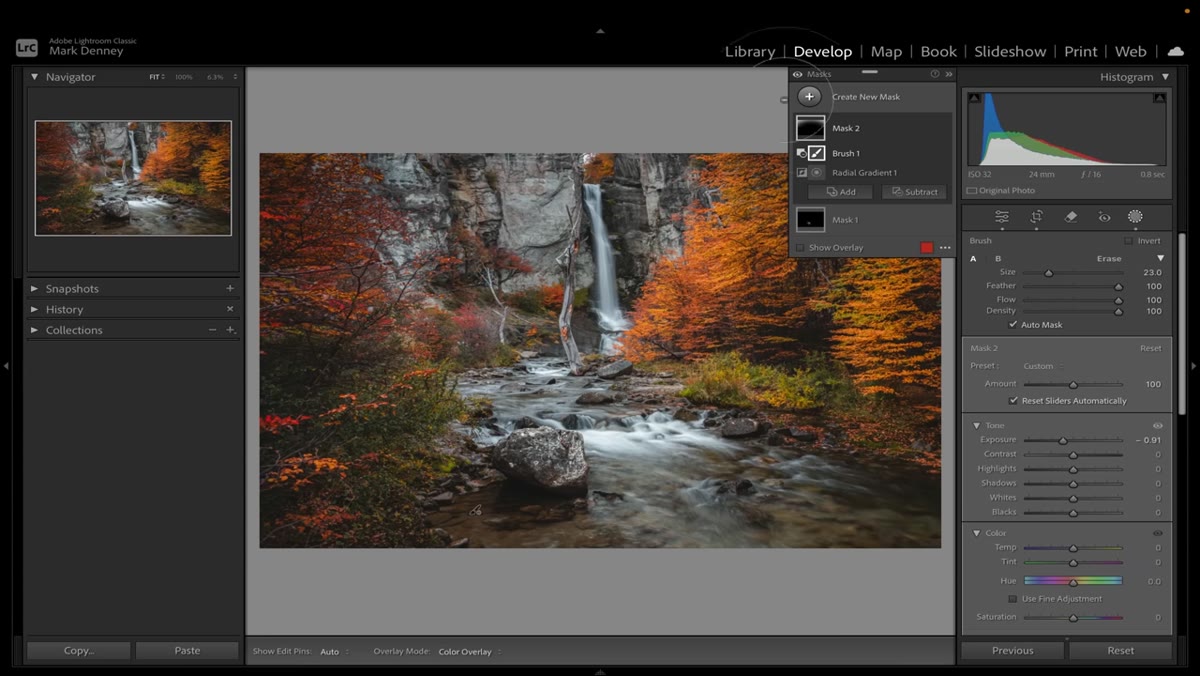
This step is where global editing completely breaks down. Mark creates a mask that targets only the darkest tonal values in the scene using a Luminance Range selection. The luminance slider lets you define exactly which tonal range the adjustment affects, so lifting shadows in this mask won’t touch the midtones or highlights at all.
Luminance Range mask isolating the darkest shadow areas
This step is where global editing completely breaks down. Mark creates a mask that targets only the darkest tonal values in the scene using a Luminance Range selection. The luminance slider lets you define exactly which tonal range the adjustment affects, so lifting shadows in this mask won’t touch the midtones or highlights at all.
He adds warmth and lifts detail specifically in these shadow areas, which keeps the image from feeling like it was shot on an overcast day. In composite work, ignored shadows are almost always what reveal the seam. They carry color information from the ambient environment, and if you treat them as pure black, the image reads false. Same rule applies here.
Step 5: Separate the Midtones with a Secondary Luminance Mask
 A second Luminance Range mask focused on the midtone region
Using another Luminance Range mask, this time aimed at the middle tonal values, Mark makes a separate round of adjustments to the greens and earth tones in the foliage. This is where the fall color in his image starts to feel three-dimensional rather than flat. He adjusts hue and saturation selectively so the warmth in the midtones doesn’t contaminate the cooler shadow areas he treated in the previous step.
A second Luminance Range mask focused on the midtone region
Using another Luminance Range mask, this time aimed at the middle tonal values, Mark makes a separate round of adjustments to the greens and earth tones in the foliage. This is where the fall color in his image starts to feel three-dimensional rather than flat. He adjusts hue and saturation selectively so the warmth in the midtones doesn’t contaminate the cooler shadow areas he treated in the previous step.
The willingness to mask by luminosity rather than by region is a significant conceptual shift. Most people think of masks as geographic, covering this part of the frame or that part. Luminance masking is tonal, which means a single mask can respond to the natural structure of the light in the image. It’s a more honest way to edit.
Step 6: Add a Radial Gradient to Guide the Eye
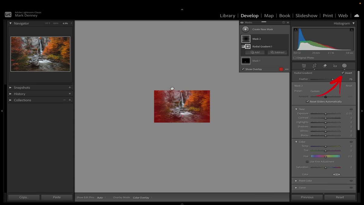
 Radial Gradient centered on the waterfall to direct viewer attention
Mark’s final mask is a Radial Gradient centered on the waterfall, the visual heart of the composition. He darkens the outer region slightly to create a natural vignette that pulls attention inward without the heavy-handed look of a post-crop vignette applied to the whole frame. He also boosts the whites slightly inside the gradient to make the water feel luminous.
Radial Gradient centered on the waterfall to direct viewer attention
Mark’s final mask is a Radial Gradient centered on the waterfall, the visual heart of the composition. He darkens the outer region slightly to create a natural vignette that pulls attention inward without the heavy-handed look of a post-crop vignette applied to the whole frame. He also boosts the whites slightly inside the gradient to make the water feel luminous.
The effect is subtle on its own. But stacked on top of the four previous adjustments, it’s the thing that makes the image feel finished. This is the compositing equivalent of a color grade pass after all the elements are placed. It doesn’t add information, it directs attention.
How This Applies Outside of Lightroom
I work in Photoshop and Procreate, not Lightroom, but I came away from this tutorial with a cleaner vocabulary for how to sequence local adjustments. Mark treats each mask as solving one specific problem, foreground separation, sky depth, shadow warmth, midtone color, directional focus. That single-problem-per-mask discipline keeps the edit from becoming a pile of competing decisions.
My one addition for compositors: run your luminance masking logic before you merge your layers, not after. Identify which tonal zones need separate treatment and build masks for them early. Retrofitting luminance masks on a flattened composite is possible but significantly harder than planning for them from the start.
The single most important idea in this tutorial is also the simplest one: global adjustments affect everything, which means they can’t fix anything precisely. If your edit still feels unfinished after hitting every slider in the Basic panel, you haven’t edited the image yet. You’ve just set a starting point.
Watch the full tutorial on YouTube to see Mark walk through each mask on the actual Patagonia image, including the overlay views that show exactly which areas each selection is targeting.
Comments (2)
This is going in my reference folder. Incredibly useful.
This is fantastic. I've been recommending this approach to my readers too.
Leave a Comment