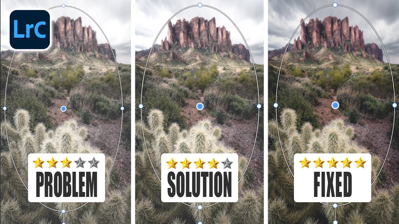
There is a specific kind of frustration that comes from making an adjustment you can feel is wrong but cannot quite see. I have spent entire afternoons chasing a bad sky selection, toggling edits on and off, staring at a red overlay that bleeds into highlights and wondering whether the mask edge is soft, broken, or just hidden under the color. For a long time I assumed this was the cost of working in Lightroom rather than jumping straight into Photoshop. It turns out I was just using the masking panel on its defaults and ignoring a set of controls that were sitting there the whole time.
In this Mark Denney tutorial, Watch the full tutorial on YouTube, he walks through a set of masking customizations inside Lightroom that most people, including me until recently, scroll right past. The title calls it “the problem with Lightroom masks” and the problem is not that the tools are weak. The problem is that the default viewing experience hides information you need to make clean decisions. Once you know where to look, the whole panel feels like a different piece of software.
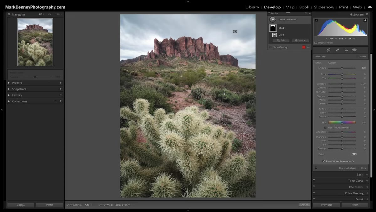
This matters especially if you are doing any kind of compositing prep inside Lightroom before handing files off to Photoshop. Getting your selections and tonal adjustments right at this stage saves you from patching problems later in a more destructive environment. Denney uses a landscape shot from Arizona to demonstrate, but every technique here applies directly to any masked adjustment layer you are building before a composite merge.
Step 1: Open the Masking Panel and Create a Test Selection
 Lightroom masking panel open with Select Sky active
Start with any image and open the masking panel in Lightroom’s Develop module. Denney uses the AI-powered Select Sky option as his test case, not because sky selections are particularly tricky, but because it produces a clear, readable result quickly. Click “Select Sky” and let Lightroom build the mask. The goal here is not the selection itself. You are just creating something visible to work with as you explore the display controls in the next steps.
Lightroom masking panel open with Select Sky active
Start with any image and open the masking panel in Lightroom’s Develop module. Denney uses the AI-powered Select Sky option as his test case, not because sky selections are particularly tricky, but because it produces a clear, readable result quickly. Click “Select Sky” and let Lightroom build the mask. The goal here is not the selection itself. You are just creating something visible to work with as you explore the display controls in the next steps.
Step 2: Access the Mask Overlay Modes via the Three-Dot Menu
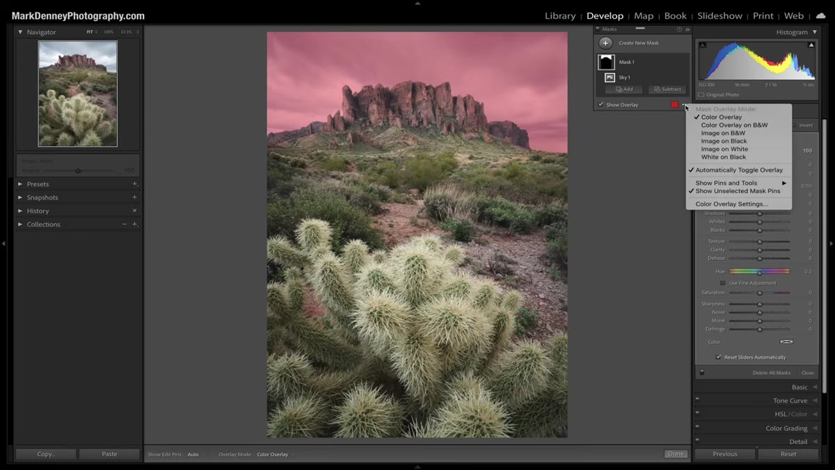 Three-dot menu open showing overlay mode options
Once a mask exists, look for the three small dots in the masking panel. Clicking them drops down a menu of overlay display modes. This is the feature most users never touch. Denney walks through each one and the logic behind when to use them. The default is a colored overlay on top of your image, which is fine for rough checks but hides edge detail and can be hard to read on busy backgrounds.
Three-dot menu open showing overlay mode options
Once a mask exists, look for the three small dots in the masking panel. Clicking them drops down a menu of overlay display modes. This is the feature most users never touch. Denney walks through each one and the logic behind when to use them. The default is a colored overlay on top of your image, which is fine for rough checks but hides edge detail and can be hard to read on busy backgrounds.
The modes worth knowing are: color overlay on black and white, which isolates the masked area in color while desaturating everything else; image on black, which shows the actual photograph only where the mask is active and renders everything else as pure black; and white on black, which mirrors the Photoshop convention where white equals selected and black equals excluded. That last one is the view I default to when I need to evaluate an edge precisely. It removes all color noise from the evaluation and shows you exactly what is selected.
Step 3: Change the Overlay Color to Match Your Image
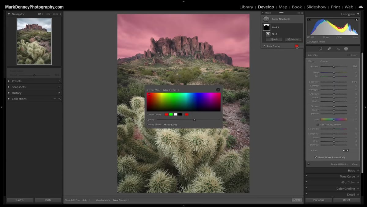 Color picker open, changing overlay color from red to another hue
The default overlay color in Lightroom is red. For most images this is readable, but the moment you are working on a scene with strong red tones, a sunset, fire, autumn foliage, anything in that range, the overlay becomes nearly invisible against the image content. Denney points out the small color swatch in the overlay controls. Click it and you get a full spectrum picker. Shift it to something with no presence in your image: blue for warm scenes, green for skies, whatever creates contrast against your subject.
Color picker open, changing overlay color from red to another hue
The default overlay color in Lightroom is red. For most images this is readable, but the moment you are working on a scene with strong red tones, a sunset, fire, autumn foliage, anything in that range, the overlay becomes nearly invisible against the image content. Denney points out the small color swatch in the overlay controls. Click it and you get a full spectrum picker. Shift it to something with no presence in your image: blue for warm scenes, green for skies, whatever creates contrast against your subject.
This sounds like a minor preference setting but it is genuinely practical. I have wasted real time thinking a mask edge was clean because I could not see the overlay bleeding into similar-colored areas. Changing the overlay color takes three seconds and eliminates that problem entirely.
Step 4: Use the Opacity Slider to Control Overlay Intensity
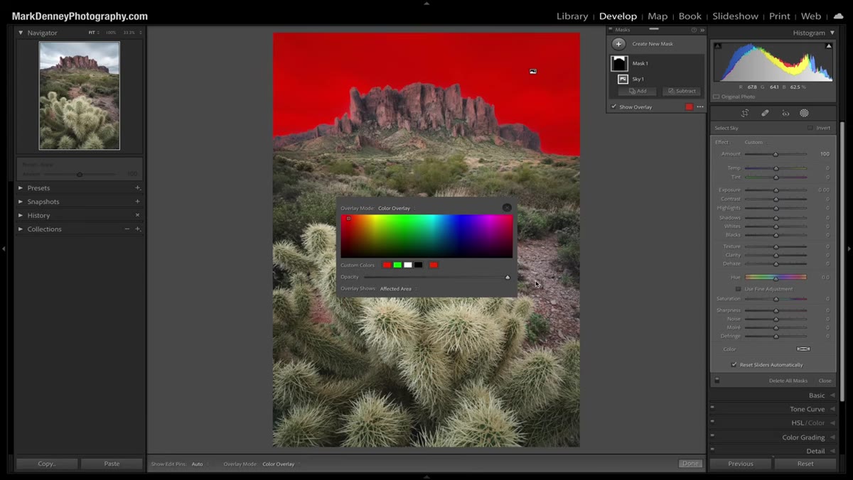 Opacity slider being adjusted in the mask overlay settings
Directly alongside the color picker is an opacity slider for the overlay itself. Denney recommends experimenting with this rather than leaving it at 100 percent. At full opacity the overlay can obscure the edge detail you are actually trying to evaluate. Pulling it down to somewhere between 50 and 70 percent lets the image show through the overlay, which makes it much easier to judge how the mask is tracking fine detail like hair, foliage, or atmospheric haze at a horizon.
Opacity slider being adjusted in the mask overlay settings
Directly alongside the color picker is an opacity slider for the overlay itself. Denney recommends experimenting with this rather than leaving it at 100 percent. At full opacity the overlay can obscure the edge detail you are actually trying to evaluate. Pulling it down to somewhere between 50 and 70 percent lets the image show through the overlay, which makes it much easier to judge how the mask is tracking fine detail like hair, foliage, or atmospheric haze at a horizon.
You can also flip the targeting here. The overlay can highlight either the affected area or the unaffected area. Denney keeps it on the affected area as his default, which means the color sits on top of whatever the mask is selecting. That orientation is more intuitive when you are building up a complex mask from multiple intersecting selections.
Step 5: Use the “O” Shortcut to Toggle Overlays On and Off Instantly
 Mask overlay toggling off and on with keyboard shortcut O
The single most useful shortcut in this entire workflow is the letter O. Pressing it toggles the mask overlay on and off without you touching the mouse. Denney says he uses this constantly, and after adopting it I understand why. When you are refining an adjustment, you need to move rapidly between seeing the mask and seeing the actual effect of the adjustment. Clicking a checkbox every time breaks that rhythm. The O key keeps your eyes on the image and your hands moving.
Mask overlay toggling off and on with keyboard shortcut O
The single most useful shortcut in this entire workflow is the letter O. Pressing it toggles the mask overlay on and off without you touching the mouse. Denney says he uses this constantly, and after adopting it I understand why. When you are refining an adjustment, you need to move rapidly between seeing the mask and seeing the actual effect of the adjustment. Clicking a checkbox every time breaks that rhythm. The O key keeps your eyes on the image and your hands moving.
Combine this with the white-on-black overlay mode and you have a fast, clean evaluation loop: overlay on to check mask coverage, overlay off to check the visual result, back on to refine. That cycle becomes second nature within a single editing session.
A Note from My Own Workflow: Overlay Modes as a Pre-Export Check
Before I export any layered file for compositing, I now run through each mask in the white-on-black overlay mode as a final check. It functions like a proof stage. What looks fine under the default red overlay often reveals gaps or bleeding edges when you strip the color out and look at pure values. This habit came directly from getting burned on a book cover project where a hair mask that looked perfect in Lightroom had a cluster of missed pixels that only appeared against the composite background in Photoshop. Catching that at the Lightroom stage costs nothing. Catching it after a merge costs time and sometimes forces a rebuild.
The single most important thing Denney demonstrates here is that the masking panel has a complete visual evaluation system built into it, and most users are working with a fraction of it. Switching overlay modes, customizing your color, adjusting opacity, and using the O key shortcut will not change how your masks are calculated. They will change how clearly you can see what those masks are actually doing. And in compositing work, seeing clearly is the whole job.
Watch the full tutorial on YouTube to see Denney walk through these controls on his Arizona landscape image, including additional tips from his Lightroom masking course.
Comments
Leave a Comment