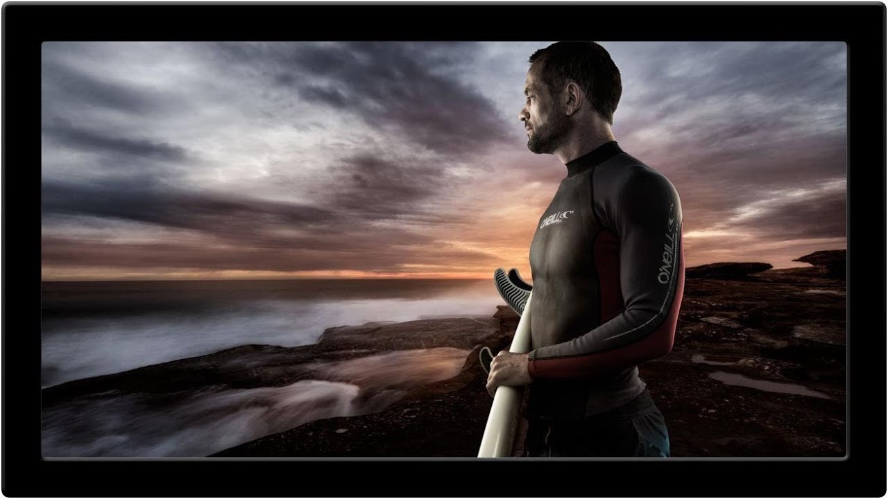
There’s a specific kind of failure that lives in my head rent-free. My first published composite had a shadow going the wrong direction, and not one person caught it except me. I still see it every time I look at that piece. That experience is what made me obsessive about the invisible seams, the subtle mismatches that the eye feels before the brain registers them. Color integration is one of the biggest offenders. You can cut a subject perfectly, match the light direction down to the degree, and still end up with something that reads as “off” because the color relationship between foreground and background is wrong. That wrongness is hard to name, which makes it hard to fix.
In this Aaron Nace (PHLEARN) tutorial, Watch the full tutorial on YouTube, Aaron walks through a diagnostic and correction workflow that solves exactly this problem. The approach is elegant because it separates the problem into parts. Instead of staring at a composite and asking “what’s wrong with it,” you ask two specific questions: do the tones match, and do the saturations match? Two questions, two layers, one significantly more believable composite.
Working on movie poster composites and album art, I’ve learned that the difference between a polished piece and an amateur one usually isn’t craft, it’s diagnosis. Most people try to fix color problems by feel, cycling through Color Balance and Hue/Saturation adjustments until something looks better. Aaron’s method gives you actual visual evidence before you touch a single correction. Here’s how it works.
Step 1: Convert to Black and White With Channel Mixer
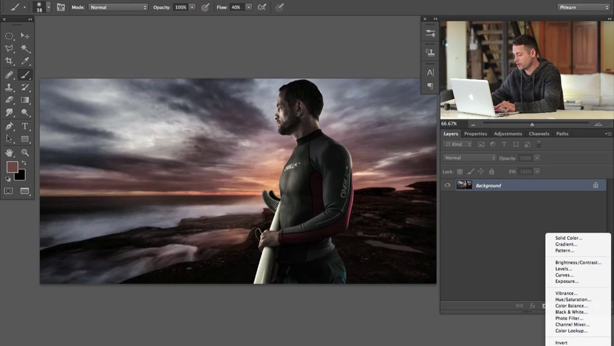 Channel Mixer adjustment layer with Monochrome checkbox enabled
Create a Channel Mixer adjustment layer at the top of your layer stack and check the Monochrome box. This instantly strips away all color information and shows you only luminosity values, meaning only light and dark. At this stage, you’re asking one question: does your subject sit naturally in the scene in terms of brightness and contrast?
Channel Mixer adjustment layer with Monochrome checkbox enabled
Create a Channel Mixer adjustment layer at the top of your layer stack and check the Monochrome box. This instantly strips away all color information and shows you only luminosity values, meaning only light and dark. At this stage, you’re asking one question: does your subject sit naturally in the scene in terms of brightness and contrast?
If the foreground element looks like it was lit by a different sun than the background, you’ll see it clearly here without color distracting you. If everything reads as cohesive in black and white, you can confidently move on knowing tone isn’t your problem. This is a step I now use at the very start of every composite review, before I touch any color work.
Step 2: Create a Solid Color Fill Layer Set to Red
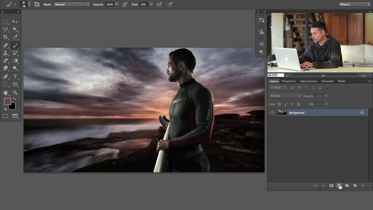 Solid Color layer dialog with bright red selected
Add a new Solid Color fill layer above your Channel Mixer layer and choose a bright, fully saturated red. The specific shade doesn’t matter much, but it needs to be vivid. On its own this looks alarming and useless, which is exactly why the next step matters.
Solid Color layer dialog with bright red selected
Add a new Solid Color fill layer above your Channel Mixer layer and choose a bright, fully saturated red. The specific shade doesn’t matter much, but it needs to be vivid. On its own this looks alarming and useless, which is exactly why the next step matters.
Step 3: Change the Solid Color Layer Blend Mode to Hue
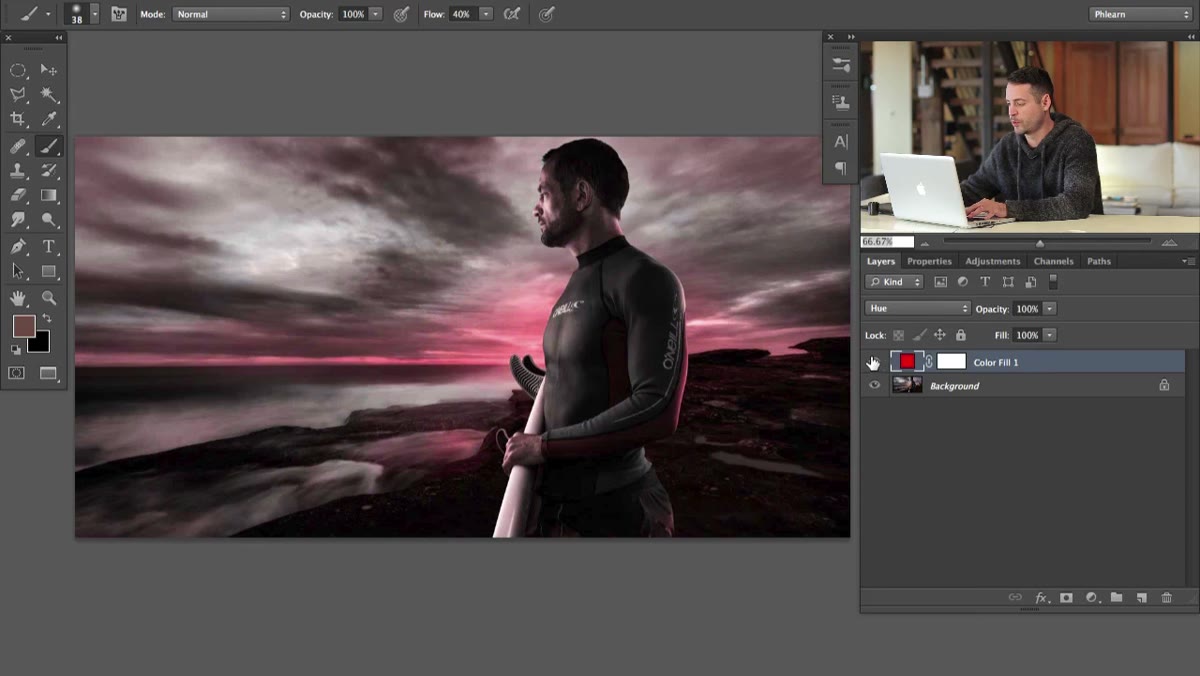 Layer blend mode dropdown showing Hue selected
Change the blend mode of that red fill layer from Normal to Hue. This is where the diagnostic magic happens. What Hue blend mode does is replace the hue of every pixel in your document with red, while preserving each pixel’s original luminosity and saturation values. Because every pixel is now literally the same hue, the only thing you can see is how saturated or desaturated different areas are. Highly saturated areas glow a deep, rich red. Desaturated areas appear gray or nearly colorless.
Layer blend mode dropdown showing Hue selected
Change the blend mode of that red fill layer from Normal to Hue. This is where the diagnostic magic happens. What Hue blend mode does is replace the hue of every pixel in your document with red, while preserving each pixel’s original luminosity and saturation values. Because every pixel is now literally the same hue, the only thing you can see is how saturated or desaturated different areas are. Highly saturated areas glow a deep, rich red. Desaturated areas appear gray or nearly colorless.
Think of it as a saturation map rendered in a single color. With all the competing hues stripped away, you can compare the saturation level of your subject directly against the saturation level of your background without your eye getting confused by different color families.
Step 4: Read the Saturation Map
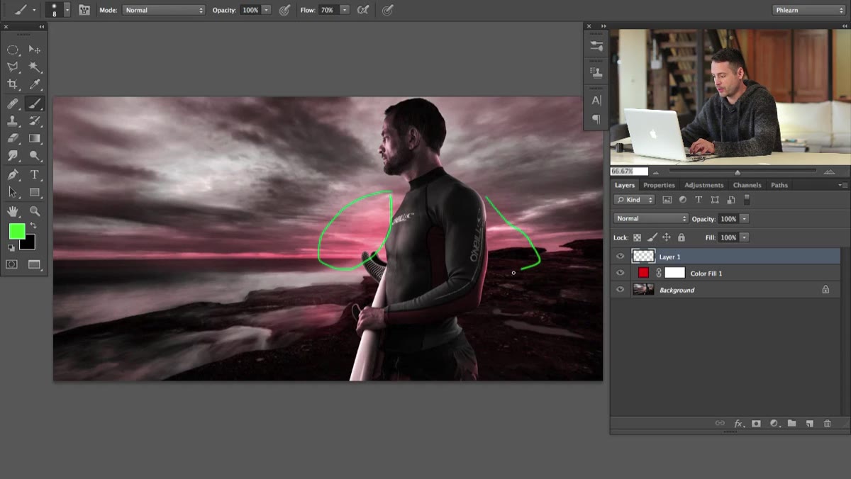 Composite viewed through Hue blend mode showing saturation variation
Toggle the red Hue layer on and off while studying different regions of your image. Look at the background, identify areas that are clearly saturated versus areas that are relatively neutral. Then look at your foreground subject and compare. The goal is for the subject’s saturation level to feel consistent with where it sits in the scene.
Composite viewed through Hue blend mode showing saturation variation
Toggle the red Hue layer on and off while studying different regions of your image. Look at the background, identify areas that are clearly saturated versus areas that are relatively neutral. Then look at your foreground subject and compare. The goal is for the subject’s saturation level to feel consistent with where it sits in the scene.
In Aaron’s example, certain areas of the background show distinct saturation while the sky reads as much grayer and more neutral. If your subject is glowing with rich color but is placed against a desaturated background, the mismatch will be obvious here in a way it simply isn’t obvious when you’re looking at a full-color image with multiple competing hues.
Step 5: Use What You See to Guide Your Corrections
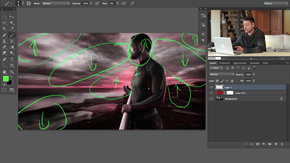 Saturation comparison between foreground subject and background element
Once you’ve identified the mismatch, turn off both diagnostic layers and apply targeted corrections. A Hue/Saturation adjustment layer clipped to your subject is the most direct tool here. If the saturation map showed your subject is more saturated than the background, pull the Saturation slider down. If the subject reads as flat and gray against a rich background, bring it up.
Saturation comparison between foreground subject and background element
Once you’ve identified the mismatch, turn off both diagnostic layers and apply targeted corrections. A Hue/Saturation adjustment layer clipped to your subject is the most direct tool here. If the saturation map showed your subject is more saturated than the background, pull the Saturation slider down. If the subject reads as flat and gray against a rich background, bring it up.
The key difference from guessing is that you now know the direction and approximate magnitude of the problem before you start adjusting. You’re correcting with information, not intuition.
A Note From My Own Workflow
I’d push this technique one step further for composites that involve significant color temperature differences between the shot subject and the background plate. The saturation map catches intensity mismatches beautifully, but it won’t show you when a subject was shot under warm tungsten light and is being composited into a cool blue-hour exterior. For that, I add a third diagnostic step: a Hue/Saturation layer with the Colorize option checked, cycling through different hues to see how each element responds. Subjects shot under different light sources will reveal themselves by looking “wrong” in different hue ranges even when their saturation levels match.
Another habit I’ve built is keeping a reference version of the composite open in a second window at 25% zoom while I work. Saturation mismatches that are subtle at 100% often become glaring at a thumbnail view, the same way a client or a viewer would first encounter the image. The two-diagnostic-layer approach Aaron demonstrates gives you the technical read, and the thumbnail view gives you the gut check. Together they cover both the analytical and the perceptual sides of the problem.
The single most important lesson in this tutorial is that color matching in compositing is a diagnostic problem before it’s a correction problem. Most of the time spent struggling with a composite that “feels off” is wasted time because the problem hasn’t been properly identified. Aaron’s channel mixer black-and-white check and the Hue blend mode saturation map give you a fast, visual, objective way to locate the issue. Once you know what you’re looking at, the fix is usually straightforward.
Watch the full tutorial on YouTube to see Aaron demonstrate the technique on a real composite and walk through his complete thought process.
Comments
Leave a Comment