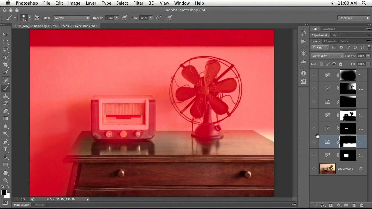
Every composite I’ve built professionally starts with the same silent contract I make with myself: don’t touch the original pixels. That sounds simple until you’re three hours deep into a movie poster, your client calls with a revision, and you realize you’ve flattened two adjustment layers you can no longer separate. I learned that lesson the hard way early in my career, and it’s why a tutorial like this one stopped me mid-scroll and made me watch the whole thing.
In this CreativeLive tutorial, instructor Ben Willmore walks through advanced adjustment layer and masking techniques using a real-world editorial image — an old radio and antique fan — as his working file. Watch the full tutorial on YouTube. What he demonstrates isn’t flashy. It’s the foundational discipline that separates compositors who deliver clean, revisable files from those who deliver one-way-door PSDs nobody else can open. As someone who sketches every composite on paper before I touch Photoshop, I recognize this kind of structural thinking immediately. Willmore builds files the way an architect builds a building: with the end in mind from the first layer.
Step 1: Lock Your Original Layer at the Bottom
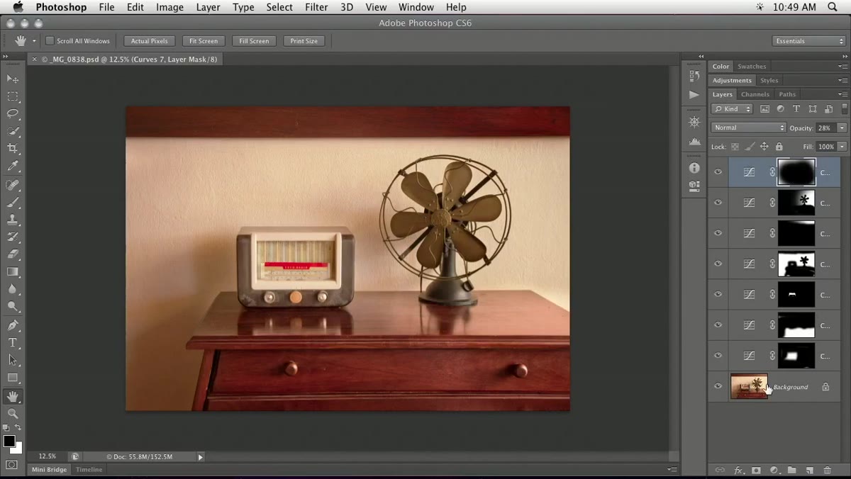 Layers panel showing original image locked at bottom
The first principle Willmore establishes is non-negotiable: the original image lives at the bottom of the layer stack and never gets edited directly. Every adjustment, every mask, every correction happens above it. His reasoning is practical rather than philosophical. If a print reveals something you missed on screen, or a client requests a rollback weeks later, your original data is intact and retrievable.
Layers panel showing original image locked at bottom
The first principle Willmore establishes is non-negotiable: the original image lives at the bottom of the layer stack and never gets edited directly. Every adjustment, every mask, every correction happens above it. His reasoning is practical rather than philosophical. If a print reveals something you missed on screen, or a client requests a rollback weeks later, your original data is intact and retrievable.
In practice this means the moment you open an image and before you do anything else, you lock that background layer or rename it clearly as “SOURCE - DO NOT EDIT.” Build the habit until it’s automatic. For composite work, I extend this further by also preserving each raw element on its own locked layer before I start blending anything.
Step 2: Understand the Stack as a Viewer, Not a Timeline
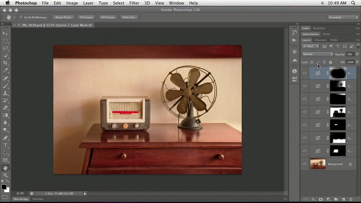 Layers panel showing multiple adjustment layers stacked above original
Willmore uses a spatial metaphor that I find genuinely useful: imagine you’re standing above the layer stack, looking down through everything toward the original image at the bottom. Each adjustment layer is like a pane of tinted glass between your eyes and the source. A darkening curve is like putting on sunglasses. The image underneath hasn’t changed, but your view of it has.
Layers panel showing multiple adjustment layers stacked above original
Willmore uses a spatial metaphor that I find genuinely useful: imagine you’re standing above the layer stack, looking down through everything toward the original image at the bottom. Each adjustment layer is like a pane of tinted glass between your eyes and the source. A darkening curve is like putting on sunglasses. The image underneath hasn’t changed, but your view of it has.
The critical operational rule that follows from this is: always make the topmost layer active before adding a new adjustment layer. If you insert a new adjustment below an existing one, its effect becomes unpredictable because it’s only influencing what sits beneath it, not the full composite output. Keeping new adjustments at the top ensures they’re applied last, which is what you almost always intend.
Step 3: Use Eyeball Toggling to Audit Your Progression
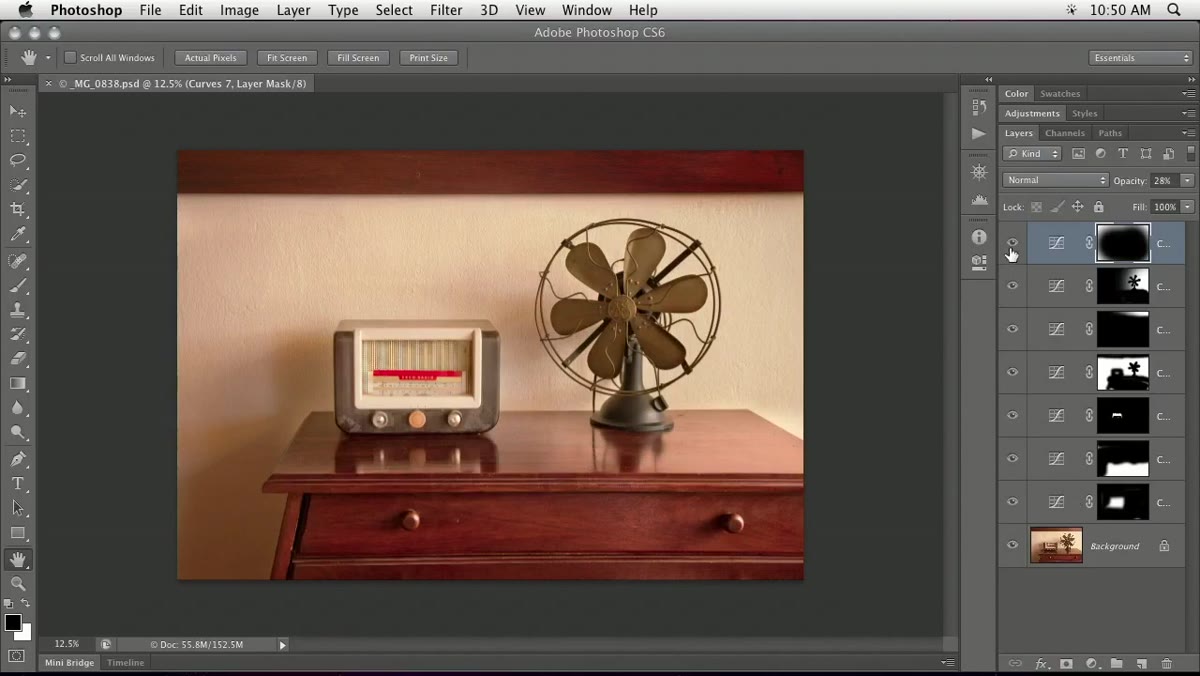 Eyeball icons being toggled on layers panel one by one
Willmore demonstrates something that sounds minor but becomes a critical QC habit: toggling individual layer visibility to walk backward through your edit history. Clicking the eyeball icon on any adjustment layer disables it temporarily, letting you see the image state before that correction was applied. You can also click and drag up or down the eyeball column to toggle multiple layers at once.
Eyeball icons being toggled on layers panel one by one
Willmore demonstrates something that sounds minor but becomes a critical QC habit: toggling individual layer visibility to walk backward through your edit history. Clicking the eyeball icon on any adjustment layer disables it temporarily, letting you see the image state before that correction was applied. You can also click and drag up or down the eyeball column to toggle multiple layers at once.
The power move here is the Option-click (Alt-click on Windows) on the original layer’s eyeball. That single action hides every other layer instantly, showing only the unedited source. Option-click it again and everything returns. For complex composites with 30 or 40 layers, this is the fastest sanity check you have.
Step 4: Read Masks as Visual Thumbnails, Not Afterthoughts
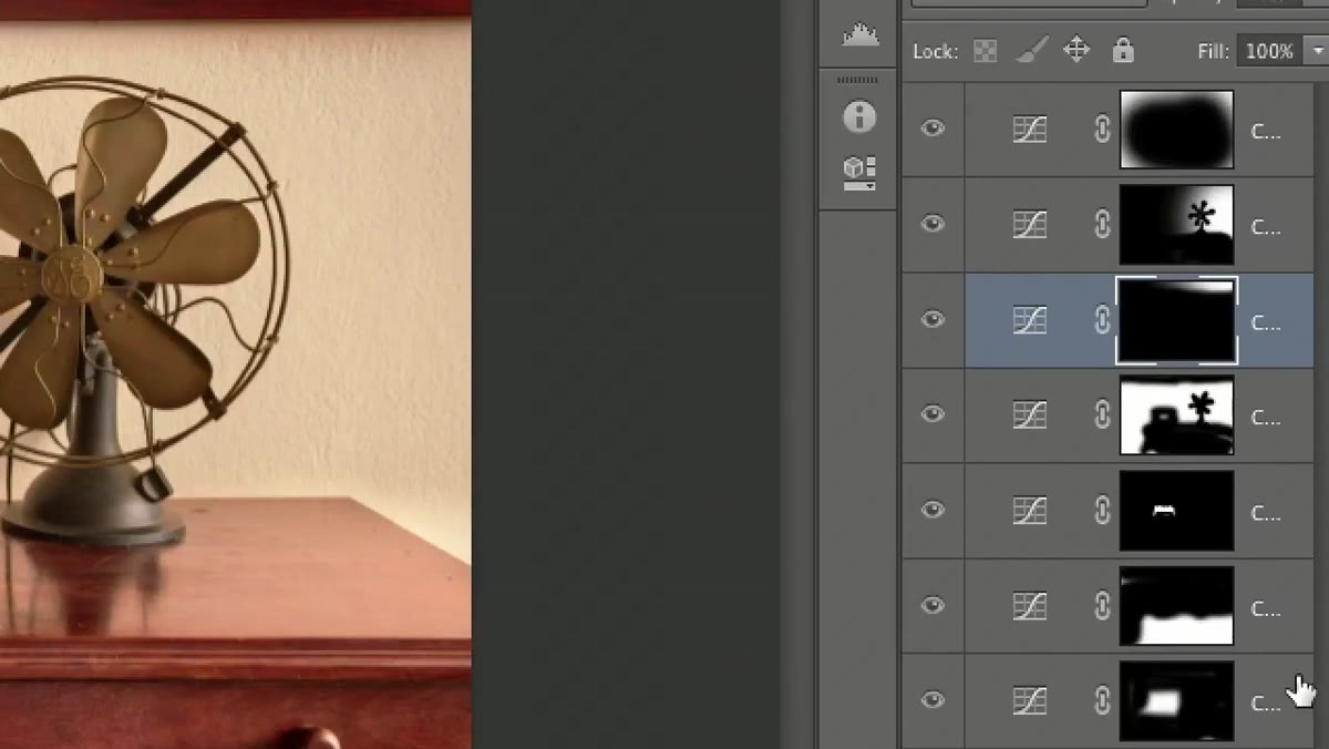 Mask thumbnails in layers panel showing white areas of adjustment coverage
This is where Willmore’s tutorial earns its “advanced” label. He points out that if you train yourself to glance at the mask thumbnails in the layers panel, you can immediately read what each adjustment is doing without clicking on anything. White areas in a mask thumbnail are where the adjustment is active. Black areas are where it’s blocked.
Mask thumbnails in layers panel showing white areas of adjustment coverage
This is where Willmore’s tutorial earns its “advanced” label. He points out that if you train yourself to glance at the mask thumbnails in the layers panel, you can immediately read what each adjustment is doing without clicking on anything. White areas in a mask thumbnail are where the adjustment is active. Black areas are where it’s blocked.
Looking at his working file, he can identify a vignette layer (white around the edges), a localized correction on the right side of the image (white zone shaped around the subject), and a corner-specific darkening pass, all just from scanning the thumbnail column. For my own compositing work, this diagnostic habit has saved hours. When something looks wrong in a composite, the first place I look is those mask thumbnails, not the settings.
Step 5: Use Mask Thumbnails to Locate and Refine Specific Corrections
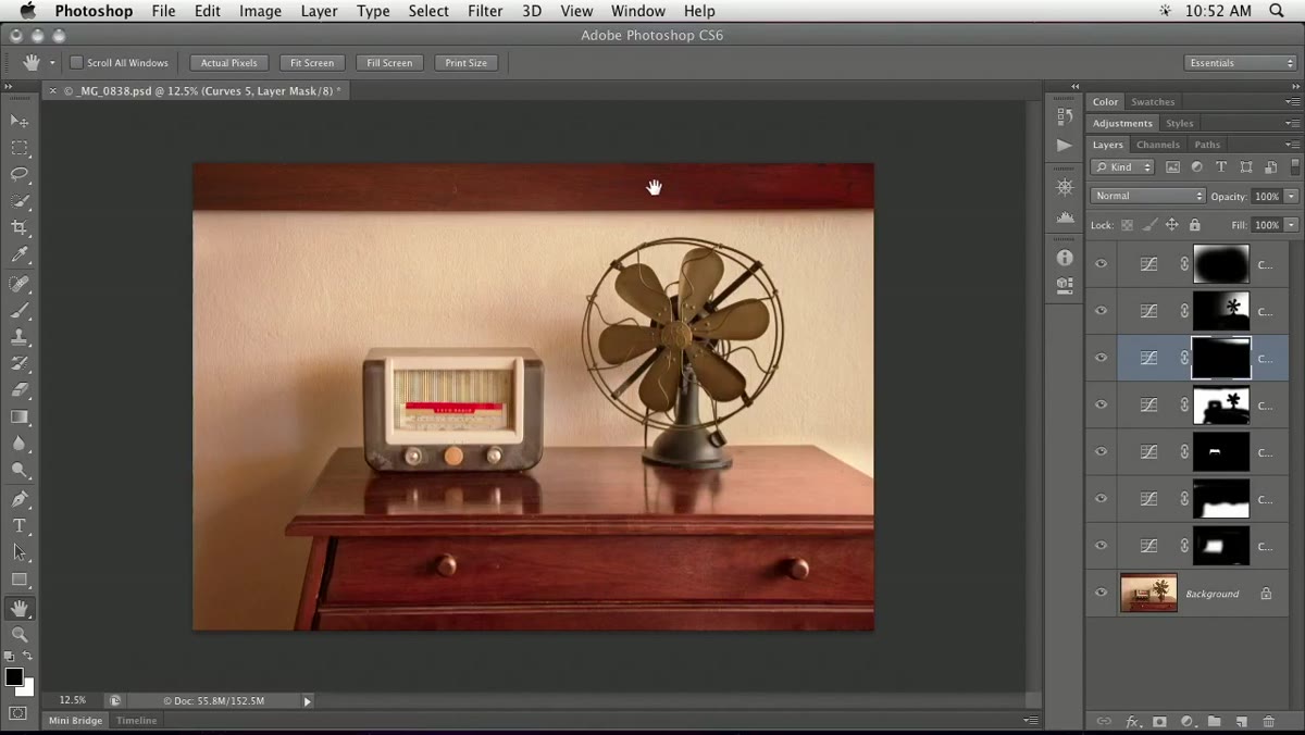 Identifying which mask controls a specific region of the image
Once you understand how to read mask thumbnails, you can use them to surgical precision. Willmore’s example is simple but instructive: he notices a wood surface in the image that’s been darkened slightly too much by one of his adjustment layers. Rather than guessing which layer is responsible, he scans the thumbnail column for the one that shows that region in white.
Identifying which mask controls a specific region of the image
Once you understand how to read mask thumbnails, you can use them to surgical precision. Willmore’s example is simple but instructive: he notices a wood surface in the image that’s been darkened slightly too much by one of his adjustment layers. Rather than guessing which layer is responsible, he scans the thumbnail column for the one that shows that region in white.
When he finds it, he can click on that mask and paint with a reduced-opacity black brush to roll back the adjustment in just that area, without affecting anything else. This is the compositing workflow at its best: localized, reversible, and readable to anyone who opens the file later. No destructive edits. No mystery.
What I’d Add From My Own Practice
The technique Willmore doesn’t explicitly address, but which I think belongs in any serious discussion of this workflow, is naming your masks descriptively before you move on. “Layer 3 copy mask” tells the next person nothing. “Vignette - edges only” or “Darken - wood panels right side” takes ten seconds to type and makes the file legible to a collaborator, a client, or your future self six months from now.
I also keep a note layer at the top of any complex PSD with a brief edit log, the date, what each major adjustment group does, and any decisions I made deliberately. It sounds obsessive, but when I’m maintaining a movie poster file that gets revised over a three-month campaign, that note layer is what keeps the file from becoming archaeology.
The single most important takeaway from Willmore’s tutorial is this: a well-structured layer stack is a document, not just a working state. Every mask thumbnail, every stacking decision, every naming choice is a sentence in a language that describes what you did and why. If you can read your own layers panel like a story, you’re working the way professionals work.
Watch the full tutorial on YouTube to follow along with Willmore’s full demonstration, including his approach to adjusting color with curves, which builds directly on the layer discipline covered here.
Comments (2)
This saved me so much time on my last edit. Wish I'd found this sooner.
Would love to see a follow-up going deeper into this topic.
Leave a Comment