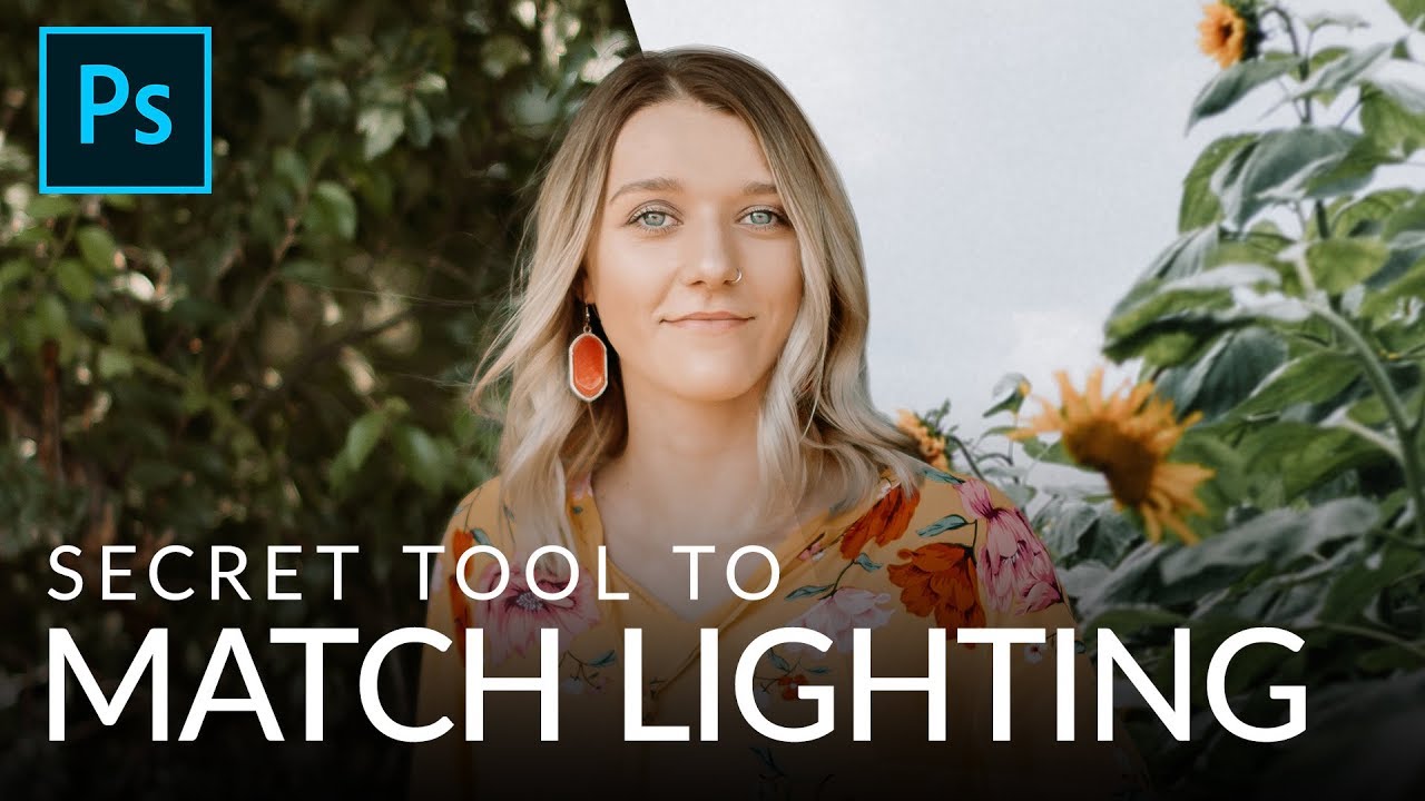
There’s a shadow in my first published composite that goes the wrong direction. Nobody caught it before print. Nobody mentioned it after. It still bothers me every time I open that file. The light was close, close enough to fool everyone, but not close enough to fool physics. That gap between “looks about right” and “actually correct” is where composites live or die, and for years I closed that gap using nothing but my eyes and intuition. That approach works until it doesn’t.
The problem is that human vision is a terrible judge of absolute luminance. We adapt. We compensate. We look at a composite with a subject that’s two stops brighter than the background and we tell ourselves it’s a color problem, a color grading problem, a hair masking problem, anything except the actual culprit: the highlight and shadow levels simply don’t match. I’ve watched other artists spend hours pushing hue and saturation sliders when the real issue could have been identified in about thirty seconds with the right tool.
That tool is a Threshold adjustment layer, and I learned to use it properly from Watch the full tutorial on YouTube - Aaron Nace’s PHLEARN tutorial on matching composite lighting. What follows is my breakdown of the technique with enough detail to follow in Photoshop without watching first, though I’d recommend doing both.
Step 1: Set Up Your Composite Layers
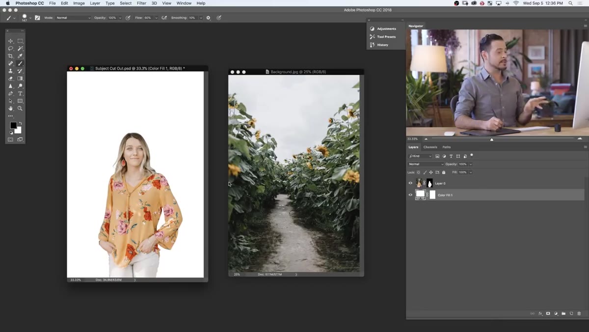 Subject layer and background image open side by side in Photoshop
Start with your subject already masked and sitting on its own layer. In Aaron’s walkthrough, the subject comes pre-masked in a downloadable PSD, which removes the cutting-out step so you can focus entirely on light matching. Open your background image as a separate document, grab the Move tool, and hold Shift while dragging the background into the subject document. Holding Shift centers it on the canvas. Place that background layer below your subject in the layer stack.
Subject layer and background image open side by side in Photoshop
Start with your subject already masked and sitting on its own layer. In Aaron’s walkthrough, the subject comes pre-masked in a downloadable PSD, which removes the cutting-out step so you can focus entirely on light matching. Open your background image as a separate document, grab the Move tool, and hold Shift while dragging the background into the subject document. Holding Shift centers it on the canvas. Place that background layer below your subject in the layer stack.
With both layers visible, do a quick sanity check on positioning. Use Command/Ctrl + T to transform the background and nudge it so the horizon line, ground plane, and any architectural elements feel consistent with the angle your subject was shot from. This isn’t about perfection yet. It’s about getting close enough that the light comparison you’re about to do is meaningful.
Step 2: Blur the Background to Match Camera Depth of Field
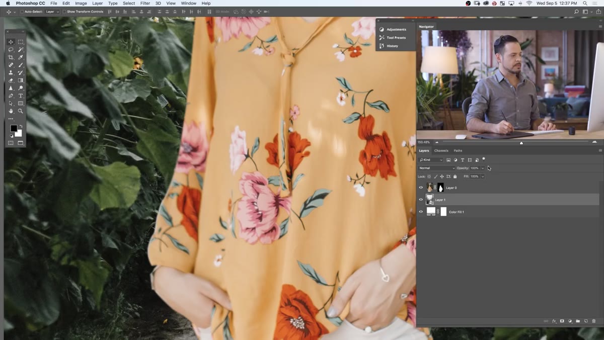 Box Blur filter dialog applied to background smart object
Before comparing luminance, account for focus. If your subject was shot at f/2.8 and your background is a stock image shot at f/11, the sharpness mismatch will distract from everything else. Right-click your background layer and convert it to a Smart Object first. This is non-negotiable if you want to stay flexible. Smart Objects let you go back and adjust any filter you apply later without degrading the pixel data.
Box Blur filter dialog applied to background smart object
Before comparing luminance, account for focus. If your subject was shot at f/2.8 and your background is a stock image shot at f/11, the sharpness mismatch will distract from everything else. Right-click your background layer and convert it to a Smart Object first. This is non-negotiable if you want to stay flexible. Smart Objects let you go back and adjust any filter you apply later without degrading the pixel data.
With the Smart Object created, go to Filter, then Blur, then Box Blur. Aaron specifically calls out Box Blur as his preferred choice for background defocus work, and I’ve come to agree with him. It produces a softer, more optically natural result than Gaussian Blur for this particular use case. Dial the radius until the background sharpness roughly matches the softness you see at the edges of your subject. Don’t over-blur. The goal is visual consistency, not a dream sequence.
Step 3: Add a Threshold Adjustment Layer
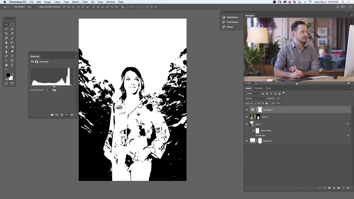
 Threshold adjustment layer added above all layers in panel
This is where the technique becomes something I now use on nearly every composite job. Add a Threshold adjustment layer above everything in your layer stack. Go to Layer, New Adjustment Layer, Threshold. When it lands on your canvas, your entire image will collapse into pure black and pure white. That is not a glitch. That is the point.
Threshold adjustment layer added above all layers in panel
This is where the technique becomes something I now use on nearly every composite job. Add a Threshold adjustment layer above everything in your layer stack. Go to Layer, New Adjustment Layer, Threshold. When it lands on your canvas, your entire image will collapse into pure black and pure white. That is not a glitch. That is the point.
Threshold works by drawing a line across the histogram. Everything to the right of that line, meaning everything brighter than the threshold value, renders as pure white. Everything to the left renders as pure black. At first glance this looks like a broken image. What it actually is: an objective, unambiguous map of where the brightest and darkest tones in your scene live. Your eyes can no longer compensate or lie to you.
Step 4: Use Threshold to Identify Your Brightest Highlights
 Threshold slider pulled far right showing only brightest white points
Drag the Threshold slider all the way to the right. At that extreme, only the absolute brightest pixels in the image remain white. Everything else goes black. Now look at what’s white. Are the brightest points on your subject and your background appearing at similar slider positions? If you have to drag significantly further right before your subject’s highlights appear compared to your background’s, your subject is overexposed relative to the scene. That’s your problem, identified in seconds, without guessing.
Threshold slider pulled far right showing only brightest white points
Drag the Threshold slider all the way to the right. At that extreme, only the absolute brightest pixels in the image remain white. Everything else goes black. Now look at what’s white. Are the brightest points on your subject and your background appearing at similar slider positions? If you have to drag significantly further right before your subject’s highlights appear compared to your background’s, your subject is overexposed relative to the scene. That’s your problem, identified in seconds, without guessing.
Make a mental note of the slider value where your subject’s specular highlights just start to appear. Then check the same moment for the background. The closer those two values are to each other, the better your highlight levels match.
Step 5: Use Threshold to Check Your Shadow Levels
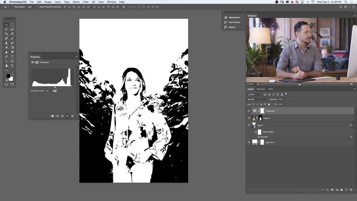 Threshold slider pulled far left isolating deepest shadow areas
Now drag the slider all the way to the left. At this extreme, only the deepest shadow areas remain black. Everything else goes white. Apply the same comparison logic. Where do your subject’s deepest shadows appear relative to the background’s? If the background holds shadow tone at a much lower slider value than your subject, your subject is lacking density in the darks. This is one of the most common compositing mistakes and one of the hardest to see without a tool like this.
Threshold slider pulled far left isolating deepest shadow areas
Now drag the slider all the way to the left. At this extreme, only the deepest shadow areas remain black. Everything else goes white. Apply the same comparison logic. Where do your subject’s deepest shadows appear relative to the background’s? If the background holds shadow tone at a much lower slider value than your subject, your subject is lacking density in the darks. This is one of the most common compositing mistakes and one of the hardest to see without a tool like this.
The Threshold layer is purely diagnostic at this stage. Don’t try to make creative decisions from it. Use it to measure, then turn it off and make your corrections with Curves or Levels adjustment layers clipped to your subject.
Step 6: Correct and Verify
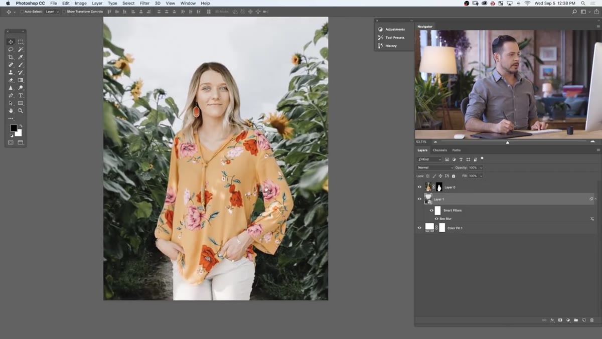 Layer stack showing subject layer with adjustment layer above background
Once you’ve identified the gap in highlight or shadow levels, add a Curves adjustment layer directly above your subject layer and clip it to that layer only. Hold Alt/Option and click between the Curves layer and the subject layer to clip them together. Now your correction affects only the subject. Pull the highlights down or push the shadows deeper to match the values you mapped with Threshold. Toggle your Threshold layer back on periodically to verify you’re closing the gap.
Layer stack showing subject layer with adjustment layer above background
Once you’ve identified the gap in highlight or shadow levels, add a Curves adjustment layer directly above your subject layer and clip it to that layer only. Hold Alt/Option and click between the Curves layer and the subject layer to clip them together. Now your correction affects only the subject. Pull the highlights down or push the shadows deeper to match the values you mapped with Threshold. Toggle your Threshold layer back on periodically to verify you’re closing the gap.
This iterative check, correct, verify loop is faster than any eyeball approach I’ve used before it.
A Note from My Own Work
I’d add one extension to Aaron’s technique that I’ve found useful on jobs with mixed light sources. Threshold reads luminance globally, but composites often have a subject lit by one color temperature and a background lit by another. After matching the luminance levels using this method, I run a second check by temporarily desaturating the composite and looking at it in black and white. Color can mask luminance mismatches and luminance can mask color mismatches. Running both checks gives you a much cleaner result before you move into any final color grading pass. It adds maybe five minutes to the process and has saved me from shipping work I’d regret.
The single most transferable idea in this tutorial is that objectivity beats intuition when it comes to measuring light. Your eyes will tell you a composite looks fine. The Threshold layer will tell you the truth. Use it early, use it often, and stop trusting yourself to eyeball something that has a measurable, verifiable answer.
Watch the full tutorial on YouTube to see Aaron walk through the complete technique, including the downloadable PSD assets and his approach to the initial masking work.
Comments (2)
Solid advice. Especially the part about taking your time with it.
Applied this to my portfolio shots and the improvement is noticeable.
Leave a Comment