Every composite I’ve ever regretted has the same cause. Not a bad mask. Not a sloppy selection. It’s that the subject and the background are living in two completely different light worlds, and no amount of fine-tuning the edges fixes that. The image reads as fake before the viewer can even say why. I learned this the hard way early in my career, and I still catch myself rushing past the light-matching step when a deadline is close. That’s why I keep coming back to tutorials like this one.
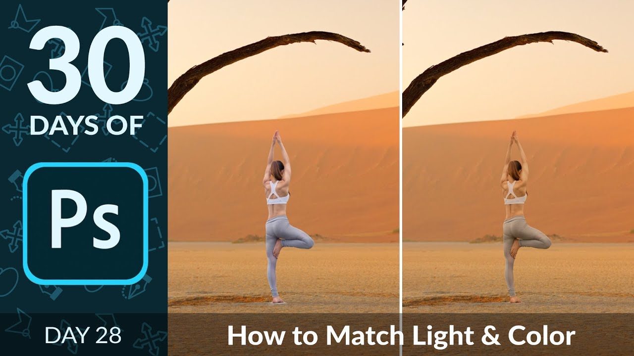
In this Aaron Nace (PHLEARN) tutorial, Watch the full tutorial on YouTube, part of his 30 Days of Photoshop series, he walks through the exact process of analyzing and correcting light and color so a cut-out subject actually looks like it belongs in its new environment. The example is a yoga figure dropped onto a new background, but the technique applies to anything from a portrait to a product shot to a full editorial composite. What I appreciate about Aaron’s approach is that it’s diagnostic before it’s corrective. He teaches you to see the problem clearly before you start reaching for tools.
I sketch every composite on paper before I open Photoshop, and that habit comes from the same instinct Aaron demonstrates here: understanding the image before you touch it. Here’s the full walkthrough.
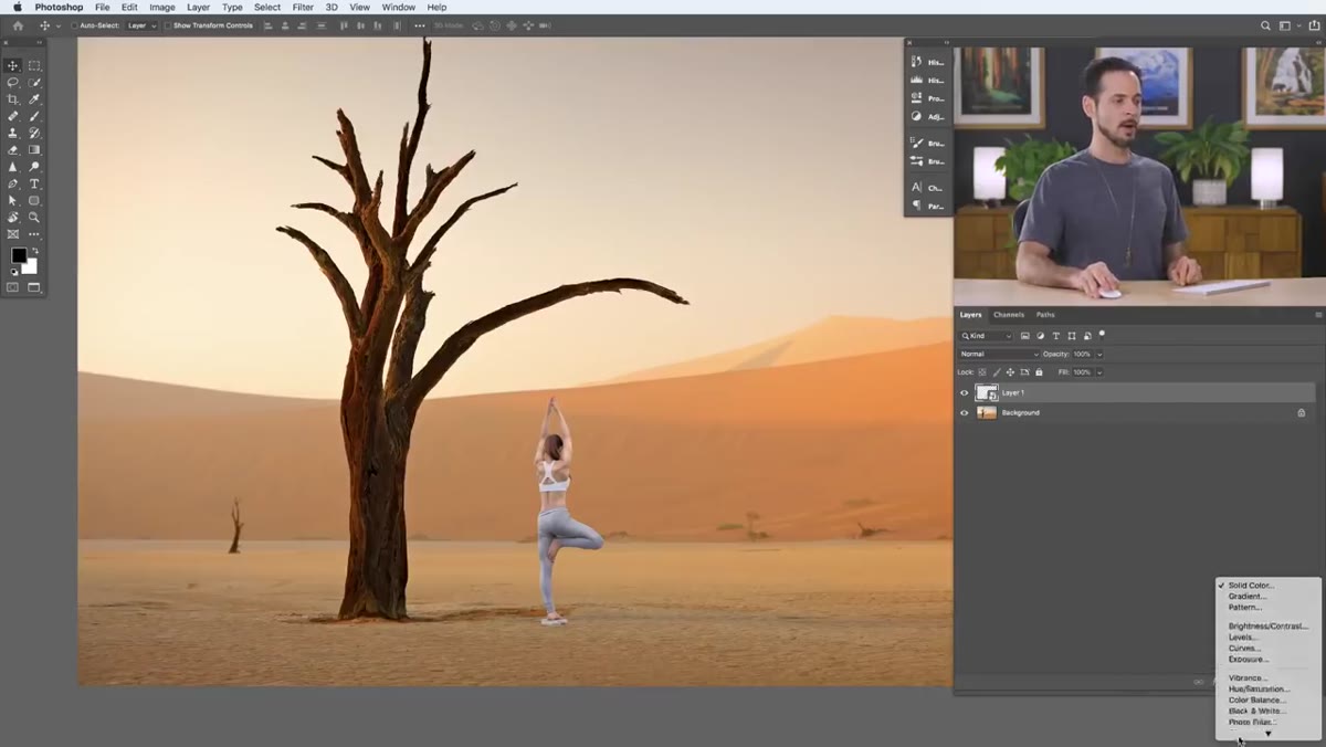
Step 1: Place Your Subject and Convert to Smart Object
 Subject layer being right-clicked, Smart Object option highlighted
Once you’ve dragged your cut-out subject onto the background image using the Move tool, resist the urge to immediately start color grading. The first practical task is converting the subject layer to a Smart Object before you do any scaling. Right-click the layer in the Layers panel and choose “Convert to Smart Object.” This single step protects you from permanent quality loss when you resize.
Subject layer being right-clicked, Smart Object option highlighted
Once you’ve dragged your cut-out subject onto the background image using the Move tool, resist the urge to immediately start color grading. The first practical task is converting the subject layer to a Smart Object before you do any scaling. Right-click the layer in the Layers panel and choose “Convert to Smart Object.” This single step protects you from permanent quality loss when you resize.
With the Smart Object created, use Free Transform (Ctrl/Cmd + T) to scale the subject down or up to fit the scene. Hold Shift while dragging a corner handle to constrain the aspect ratio and avoid any distortion. Get the scale close enough to read correctly in the composition. You don’t need pixel-perfect placement yet.
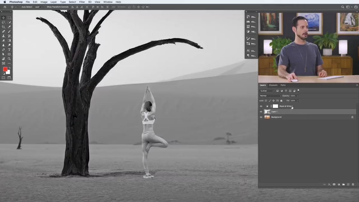
Step 2: Add a Black and White Adjustment Layer to Analyze Luminosity
 Black and White adjustment layer applied over the full composite
This is the step that most intermediate Photoshop users skip, and it’s the one that separates composites that feel real from ones that feel assembled. Add a Black and White adjustment layer above everything in the stack. This strips out all color information and lets you evaluate the image purely on the basis of light and shadow values.
Black and White adjustment layer applied over the full composite
This is the step that most intermediate Photoshop users skip, and it’s the one that separates composites that feel real from ones that feel assembled. Add a Black and White adjustment layer above everything in the stack. This strips out all color information and lets you evaluate the image purely on the basis of light and shadow values.
When color is removed, your eye immediately catches tonal mismatches that were hidden by hue differences. In the tutorial example, the yoga subject reads as significantly brighter than the background once the color is gone. That tells you exactly what needs to happen before any color work begins: the subject’s overall luminosity needs to come down. Use this layer as a diagnostic tool, not a permanent effect. It gets toggled on and off throughout the process.
Step 3: Understand Clipping Masks Before You Apply Any Corrections
 Red paint layer being clipped to the subject layer below it
Aaron takes a moment here to demonstrate clipping masks, and it’s worth pausing on because the rest of the workflow depends on them. A clipping mask forces a layer to only display where the layer directly below it has visible pixels. In practical terms, this means any adjustment layer you clip to your subject layer will only affect the subject, leaving the background completely untouched.
Red paint layer being clipped to the subject layer below it
Aaron takes a moment here to demonstrate clipping masks, and it’s worth pausing on because the rest of the workflow depends on them. A clipping mask forces a layer to only display where the layer directly below it has visible pixels. In practical terms, this means any adjustment layer you clip to your subject layer will only affect the subject, leaving the background completely untouched.
To create a clipping mask, right-click the adjustment layer and choose “Create Clipping Mask,” or hold Alt/Option and click between the two layers in the panel. You’ll see the top layer indent slightly with a small arrow pointing down. Aaron demonstrates this with a painted red layer first, which is a smart teaching move because the effect is immediately obvious. Once you understand the mechanic visually, applying it to adjustment layers feels intuitive.
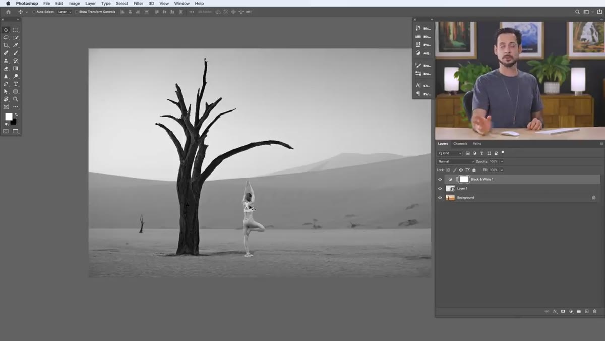
Step 4: Clip the Black and White Layer to the Subject
 Black and White layer clipped to subject, background unaffected
Now the diagnostic and the masking technique come together. Take your Black and White adjustment layer and clip it to the subject layer. Now your luminosity analysis is isolated to the subject only, which makes comparison much easier. Toggle the layer on and off to compare the subject’s tonal values against the background in grayscale.
Black and White layer clipped to subject, background unaffected
Now the diagnostic and the masking technique come together. Take your Black and White adjustment layer and clip it to the subject layer. Now your luminosity analysis is isolated to the subject only, which makes comparison much easier. Toggle the layer on and off to compare the subject’s tonal values against the background in grayscale.
This is the moment where you make a clear decision: does the subject need to get darker, lighter, or does the contrast need to change? In the tutorial, the answer is clear. The subject is too bright relative to the background. Write that down mentally or literally before moving to the next step. Knowing what you’re solving before you start adjusting is the difference between purposeful editing and endless tweaking.
Step 5: Apply a Curves or Levels Adjustment to Correct Luminosity
 Levels/Curves referenced as correction tools for subject brightness
With the Black and White layer still on for reference, add a Curves or Levels adjustment layer directly above the subject layer and clip it the same way. Now any tonal changes you make apply only to the subject. Drag the midpoint of a Curves adjustment down to reduce brightness, or move the output sliders in Levels to compress the tonal range until the subject’s light values visually match the background.
Levels/Curves referenced as correction tools for subject brightness
With the Black and White layer still on for reference, add a Curves or Levels adjustment layer directly above the subject layer and clip it the same way. Now any tonal changes you make apply only to the subject. Drag the midpoint of a Curves adjustment down to reduce brightness, or move the output sliders in Levels to compress the tonal range until the subject’s light values visually match the background.
Toggle your Black and White diagnostic layer on and off repeatedly as you adjust. The goal is for the subject to stop reading as a separate element in grayscale. When you turn off the Black and White layer and look at the full color image, the shift will already feel more grounded, and that’s before you’ve touched a single color correction.
A Note From My Own Work
The process Aaron outlines here is essentially what I run through on every composite I build, but I’ve added one habit that’s made a measurable difference. Before I even start placing a subject, I pull two small sample areas from the image into a separate document: one from the brightest highlight in the background, and one from the deepest shadow. Those two values become my ceiling and floor for everything I do to the subject. No part of the subject should be brighter than that highlight sample or darker than that shadow sample, unless the scene’s logic explicitly calls for it.
This forces a kind of tonal discipline that the eye alone can’t always maintain, especially after you’ve been staring at the same composite for two hours. If you keep a reference folder of finished composites you admire (and I keep an embarrassingly large one), look at how consistently the darkest darks and brightest lights align between subject and background. That alignment is the invisible scaffolding holding the illusion together.
The single most important takeaway from this tutorial is that light matching is a diagnostic process, not an intuitive one. Strip the color out first, read the tonal values honestly, and then make corrections with clipping masks so you’re only touching what needs to change. Everything else in compositing is easier once you have this foundation in place.
Watch the full tutorial on YouTube to see Aaron walk through the complete process with the sample images, including the color-matching steps that follow the luminosity work.
Comments
Leave a Comment